If you’ve put time into creating a mobile app for your business, then you need a captivating logo to go with it. App icons are used to distinguish between different apps, making it easy to recognize them and tell them apart.
Have you noticed that when you browse your phone to open an app, the simple, clean icons are often the ones you will gravitate towards first? That’s because the creators put careful thought into their logo design, because they know that a strong logo will ultimately decide whether users click on their app or someone else’s.
App icons aren’t everything when it comes to your design process; your app still has to work well to be considered a good app.
Still, app logos are important. They often reflect how much expertise was part of the design; an amateur logo is likely to reflect an amateur app build. And, they tell your audience who your app is for, and (hopefully) why they should use it.
Let’s take a look at how to design an app logo that shows your audience how valuable your app really is!
Here are a few tips to get you started on designing your app logo:
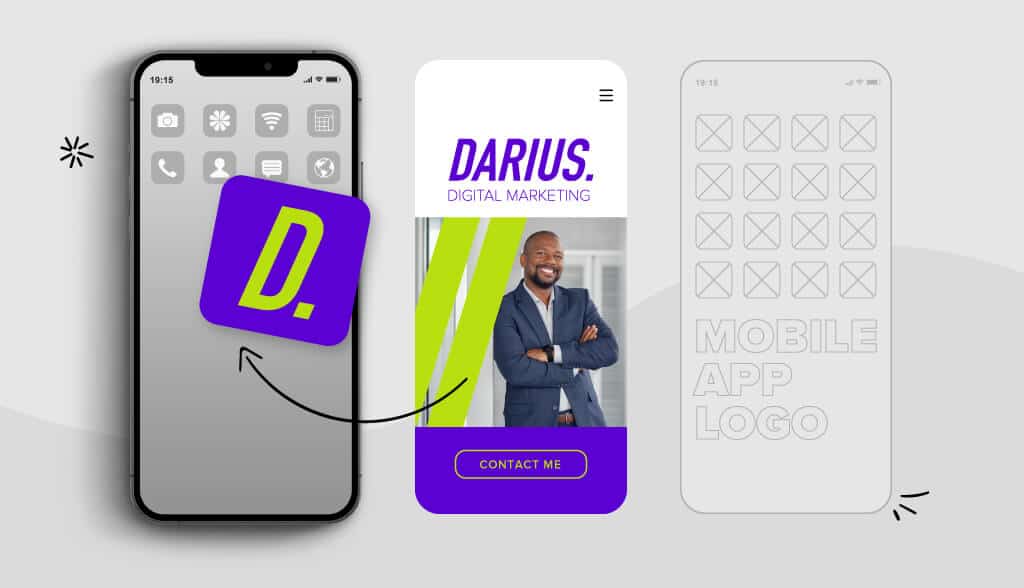
First and foremost, your app logo HAS to fit the required guidelines. There’s nothing more amateur-looking than squashing (or cropping) your design because the final size requirements don’t actually work with the size of your final design.
It’s important to create your design in a way that looks flat, with no transparency. And, you’ll want a full square design; the app platforms will handle rounding the corners and/or adding shadows when applicable.
You aren’t designing your app logo for just anyone! You want it to be especially appealing to the people who are likely to use and appreciate your app. Make sure you design with that audience in mind.
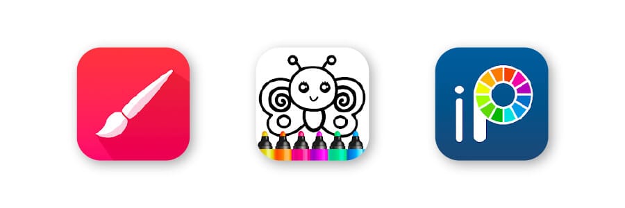
For example, check out these painting apps. They’re trying to convey audience age and skill level, so you immediately know if the app is right for you just based on the image (before even reading the name):

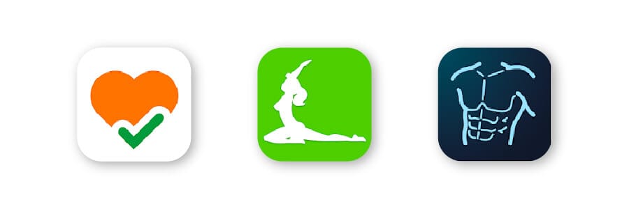
Or, look at these fitness apps that are trying to convey a more male/female target audience, based on the common audience for the various exercise types:

The goal here certainly isn’t to be exclusive and push other users away; it’s simply to try to be the most attractive option out there for your target audience.
You do NOT want to have a logo that’s extremely similar to a competitor’s icon. This can cause brand confusion that makes it hard for users to know which app is which. It can make your logo look generic, like a wannabe knock-off.
You might take some inspiration from other logos, but you need your app icon to be uniquely your own in order to succeed.
Too much detail gets lost with a logo that is kept so small. You need your icon to be a “quick read.” This means that information should be immediately clear from the first moment someone glances at your app logo; you only have a split second to make them really consider your option in their search!
Having a minimalist logo, or a clean, simple design, will help you to do this, because they’re so easy for our brains to process and remember. (Not to mention that minimalism is very on-trend right now in logo design! Just look at the Twitter, Apple, and Nike logos for reference.)
It’s usually a good idea to avoid words in app logos, since they’ll be too small to read on many screens. If you feel text is a must, keep it short, or use initials. And, don’t use a real photograph, since these rarely look right in the app icon format and will make your design seem amateur.
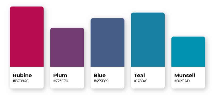
Color is a powerful part of your design when you use it correctly. Different colors convey different meanings, and they help to grab the eye.
Typically, you don’t want to use many colors in your design, unless the rainbow look conveys a meaning or message you think is important for your audience to get. Most icons use just 1 or 2 colors that contrast well, in order to quickly convey information.
Consider how your colors will look on different background, since the user could have any kind of background image established on their phone. This is another reason a simple design with a flat, one-color logo background is helpful, to ensure your logo pops out no matter the background choice.

Your entire goal with your icon should be to send an immediate message to your audience. Choose an icon that tells your app’s story and sells the unique features it offers to your audience. Make it recognizable and easy to spot.
Here are some examples of apps that convey their message well. You should be able to get a feel for what they’re offering without actually knowing what they do:
You can use popular and successful logos to get inspiration for your own design. Here are some of our favorite app logos.
It’s said an elephant never forgets, and Evernote is promising to help you with your own memory.
The little dog-eared page in the corner of the elephant helps the audience distinguish that it isn’t an app about nature or elephants, but an app about writing and lists. The name also clearly helps you identify with the purpose of the app, while the icon is more memorable, so it’s easy to find once installed on your phone.

When you need to save your passwords for easy access, this app is ready to be used. 1Password will remember all your passwords—which is why it looks like a vault with a lock. The blue and grey reinforce immediate feelings of security to reassure users of its capabilities.

Ready to jump on a flight? Hopper helps users book flights and hotels at the best prices. The app is visually simple and represents the name as well as movement.

There is a lot more going on in the Clash Royal icon, but it shows the warring aspect of the game using the game imagery.
It’s very common for games to use their graphics within their icon. While there are several different colors and gradients used here, the background is kept simple and contrasting, creating the feel of competition. The lightning bolt adds to immediate feelings of division and excitement.

This extremely simple logo has a calming and intriguing nature. The circle represents harmony and unity—the connection between mind and body. Orange logos represent happy energy, and the color is said to spark brain activity.

Here is the perfect example of lettering being used without creating tiny details. A single-letter logo can help your users recall your brand name faster, because it offers that “starting” sound.
And, the simple measuring marks along the side of the M illustrate the idea of measurement. With this app, you can use your device camera to measure any straight line.

A classic icon, Spotify is well known as a listening device. The black-and-green combination gives off an edgy, energetic vibe (geared towards the energy drink crowd). The sound waves clarify that this is an app used for listening to a variety of media.

Created to look like the iconic Amazon shipping boxes, the Amazon app is easily recognizable, and the unusual cardboard brown color helps it stand out.
It used to have more text with a shopping cart, but Amazon is flexing its ability to be recognized with two colors and an arrow-shaped smirk. Initially, the box tape mark on top resembled a certain notorious mustache, so Amazon made the quick change to a different tape shape just two months later.

Now that you’ve seen some effective app logos and know what the best practices are, it’s time to design your own!
Remember, in the app store, your icon helps your app stand out from the sea of other apps. The more professional and eye-catching your logo is, the more likely users will try out your app to see if it fits their needs.
You can create your own app logo with our logo maker tool. Try it out today!
This portion of our website is for informational or educational purposes only. Tailor Brands is not a law firm, and the information on this website does not constitute legal advice. All statements, opinions, recommendations, and conclusions are solely the expression of the author and provided on an as-is basis. Accordingly, Tailor Brands is not responsible for the information and/or its accuracy or completeness. It also does not indicate any affiliation between Tailor Brands and any other brands, services or logos on this page.
Products
Resources
©2025 Copyright Tailor Brands