
Want to know one of the things people tend to neglect in DIY logo design? The background.
All logos have a background, though many are white or transparent. But those aren’t your only options, and the right logo background can help your design stand out even more.
When you’re creating a logo for your brand, there are multiple factors that will drive your choices. You’ll likely be concerned about imagery, representation and clarity—but as you start to wrap up your process, you may wonder, “Should I use a background for my logo? Are there rules to follow for logo backgrounds?”
While there are a few things to think about for your logo background design, there are no hard and fast rules. This blog will cover some of your options and how they’ll affect your logo down the road.
As you choose a logo background, you will want to consider how that background will benefit or complicate your logo. Here are the 5 things that should affect what you use for a background and how you incorporate it.
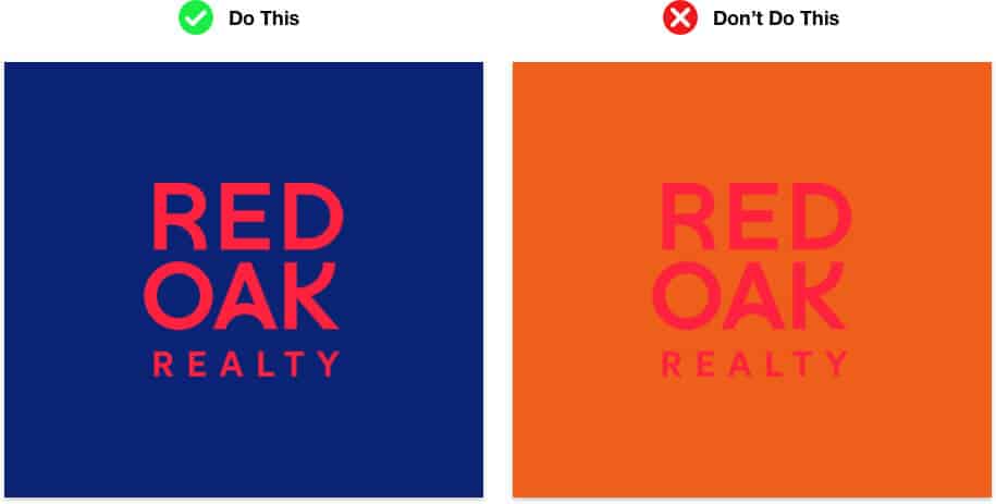
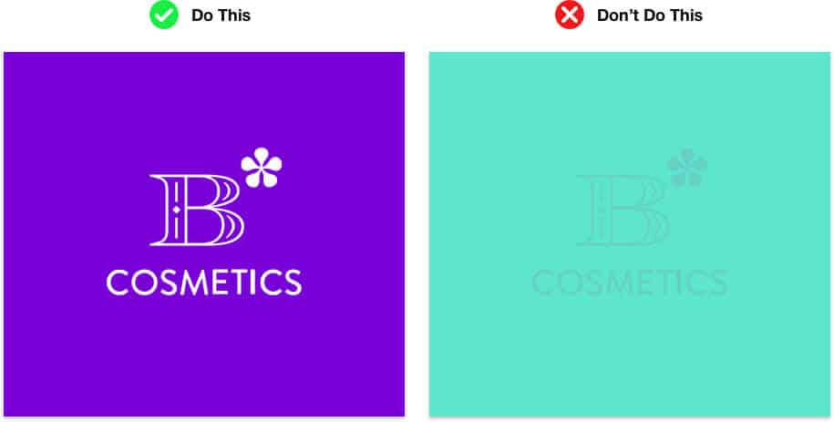
Colors and textures can be used to help increase or decrease the contrast. Your background should make the rest of your logo pop off the surface, because the goal of your logo is to grab and hold attention. You want to create a memorable logo, so use the background to help you do that. Contrast can be created in a few different ways:
If your logo is dark, try lighter backgrounds. For a flat and simple logo, experiment with a texture or detailed background. Or, if your logo is a bright color, try another bright color that is across from it on the color wheel. Finally, if your logo is detailed, go with a flat, solid color for the background.
Your color combinations themselves will also affect your logo, because they will change its meaning. Colors naturally spark subconscious feelings in us, and color combinations can further shift the meaning. So, while you can go with just one color, choosing a second color may help add depth, contrast, and additional cues about your brand’s personality.
For example, if you use fiery red to spark action, adding a friendly yellow to the bright red, like McDonald’s or Kodak, will create a feeling of high energy and speed. If you were to add a brown or burgundy, like Chipotle, then you’d have a more natural vibe that could give the feeling of spice or warmth. Red paired with a royal blue will change the meaning to feel patriotic and American — like Pepsi, MLB, NBA and NFL.
Ultimately, the colors you choose should help your target audience understand your brand better. So, be aware of what you want to convey before choosing your color combinations. (We’ll cover this more in depth below!)
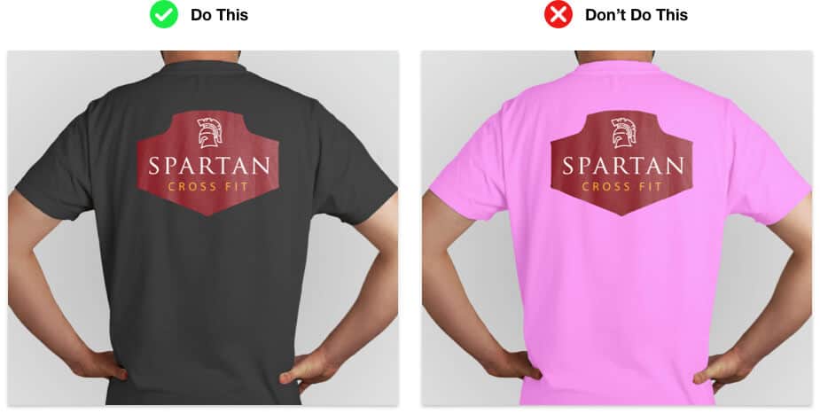
Another thing that will affect the logo background is the way you use your logo on printed items. A detailed background or smooth gradient could be very difficult to print on certain surfaces. So, if you plan to print your logo on merchandise or promotional items — like pens, clips, bags and t-shirts — you need to make sure you won’t run into issues.
Some printing processes (like screen printing) will limit how many colors you can use. Others won’t have the ability to create gradients easily or won’t have the capability to include tiny details (like embroidery on hats or shirts).
You may end up limited in what kind of printing you can do if you choose a complex background. You could also create a logo version that doesn’t include the background for these situations.
You will likely need your logo in several shapes, depending on how you use it on the web. For example, a Twitter profile picture is round, but an Instagram post is square. Your logo’s background will affect how your logo is used in those spaces.
Also, while many websites are white, that’s not always the case. How will your logo look when it’s on a black or solid-colored page? If you’re using a confining space — like a circle or square — then it’s easier for your logo to sit on top of any color. With a transparent background, like the USA TV Network logo, you’ll have to think about how it will impact the design if the background color doesn’t go with your typical logo colors.
Now that you understand the basic factors to consider, here are some logos, designed with our logo maker, with some of the most popular choices for backgrounds:


White is one of the most commonly used logo background colors. If you use white, it means that when your logo is printed on another surface, the background will stay white (which isn’t the same as a transparent logo background; we’ll get to this below). You’ll need to have your logo confined to a set space with a white background.
Brands across all industries use logos with white backgrounds, including the USA TV Network, Target, NFL and Burger King. Many high-fashion brands in particular rely on white as the backdrop for their logo, like Dior, Prada, Gucci, Louis Vuitton, Alexander Wang, Fendi, Valentino and Versace.
White is a safe choice for a logo background. It’s a neutral color that gives off vibes of peace, power, clarity and goodwill. And, it offers strong contrast and works with all other combinations.



Black is another popular logo background color, because it’s also a neutral that works well with most other colors. It offers a more “dangerous” vibe that can help your logo look a bit edgier. Powerful and dark, it’s a powerful color— signifying calm, evil or maturity depending on its use. Black goes well with most other color combinations and can offer a lot of pop when paired with lighter or brighter colors.
The exclusive vibe of black is great for mature or high-end fashion brands, like Nordstrom. It’s often used by nightlife brands — especially when they plan to have their location sign black. Lots of gaming logos use dark colors or black—like Headshot, Overwatch and Call of Duty—to make their logos pop and signify the more serious elements of the game. Twitch gamer logos and banners often use black in their backgrounds as well, like Lirik or DrLupo.



Like we mentioned above, there’s a lot of meaning associated with most colors. So, if you choose to go with a different color for your logo background, it needs to look good with your primary color scheme, and it still needs to represent a characteristic of your brand. Here are some basic meanings for colors (though they are often slightly different when paired with other colors or used in a different hue, tint or saturation level).
Green: The color of life and money, green is often used to represent value. Green signifies energy and could also represent growth or nature.
Blue: The color of dependability and loyalty, blue is a classic. It can be calming and tranquil or full of energy, depending on the vibrancy.
Purple: Royalty traditions have long helped associate the color purple with prestige and quality. Purple is a friendly and happy color in most cases.
Red: Fiery and dynamic, red is a color of passion and lust. It’s the kind of color that helps spark consumers to action.
Orange: The warmth and enthusiasm of orange is unmistakable. Orange can represent joy, nature, optimism, and extroverted energy.
Yellow: Yellow is also a warm and sunny color. It can be used to promote a cheery disposition or contagious excitement. Yellow can represent friendship or positive energy.
There are many other colors and color mixes (like teal, silver, gold and periwinkle) that will have different emotions and meanings associated with them. Know your color meanings before settling on the right color for the background of your logo.


In some creative industries and specific settings, a gradient may be an option. Gradient logos offer a feature that can be unexpected and beautiful when used correctly. A gradient background works well for logos that use very simple shapes/linework or letters. And, logos with monograms or wordmarks can often get away with a more complex background, like a gradient.
The Instagram logo, for example, uses a gradient from orange to pink and purple behind the white camera icon for their logo. From 2003-2012, Skype used a variation of their logo with a subtle gradient that shifted from a lighter color to a darker color.
This is a good option if you plan to only use your logo online for the most part. While a gradient works really well on the screen, it won’t print nearly as easily.

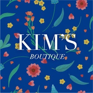

A pattern can be used to help bring more context to a brand logo. Patterns can also offer a simple contrast from a logo that’s flat on top. Many logos these days are fairly flat and simple; but, there are still brands that do use texture within their logo design.
One example of a logo with a pattern in the background would be the last Uber logo. Before its most recent shift, the Uber logo existed as the kind of industrial gear shape with a textile/fabric pattern in the background.
Patterns can be:
While a pattern can add a lot of intrigue and is a dynamic element, it can also add complex printing issues. At a small size, the texture may not translate well. A texture or pattern can also make it harder to focus on the primary image, causing a distraction. Patterns and textures are more likely to be used in gamer and gaming logos.
In some logos, you may choose to pull out a part of a scene in the background. This could include a still shot of your game in a game logo, or it might include an illustration of nature that helps give your brand an earthy or eco-friendly vibe.
Scenes are not very common in logos, because they’re harder to reproduce in many cases. While a scene can add context, it can also make the logo too cluttered.


One of the most common logo backgrounds is one that’s fully transparent. That means that all the “white” parts of the logo will show through whatever is behind it. You can create a PNG to keep your logo transparent for web use.
Keep in mind that your logo may not look good on top of all other colors. If you’re going to keep your background transparent, you’ll want to have a light and dark version of your logo, so you can use them based on which background they’ll be sitting on top of.
When done correctly, transparent backgrounds can showcase flexibility and versatility.
If you are ready to make your logo, try out our automated logo maker and start picking your background colors! Our tool makes it easy to swap out backgrounds and find just the right fit.
This portion of our website is for informational or educational purposes only. Tailor Brands is not a law firm, and the information on this website does not constitute legal advice. All statements, opinions, recommendations, and conclusions are solely the expression of the author and provided on an as-is basis. Accordingly, Tailor Brands is not responsible for the information and/or its accuracy or completeness. It also does not indicate any affiliation between Tailor Brands and any other brands, services or logos on this page.
Products
Resources
©2025 Copyright Tailor Brands