While the rest of us went about 2020 with a pondering gaze on our faces, a group of dedicated revolutionary logo designers was focused on changing how we see the world.
They knew the 2020s needed a rebrand!
As the rush hours ceased and the dust settled across the busy little beehive of human existence, we became more simplistic in our ways.
Much like the logos of 2020, they too became simplistic in their design, removing unnecessary clutter and replacing it with bold fonts that instantly grabbed our attention.
Let’s take a quick trip back if we dare and see how those brave designers changed how we now view the world by looking at the 21 best logo redesigns of 2020.
Let’s start with a controversial redesign that divided the jury.
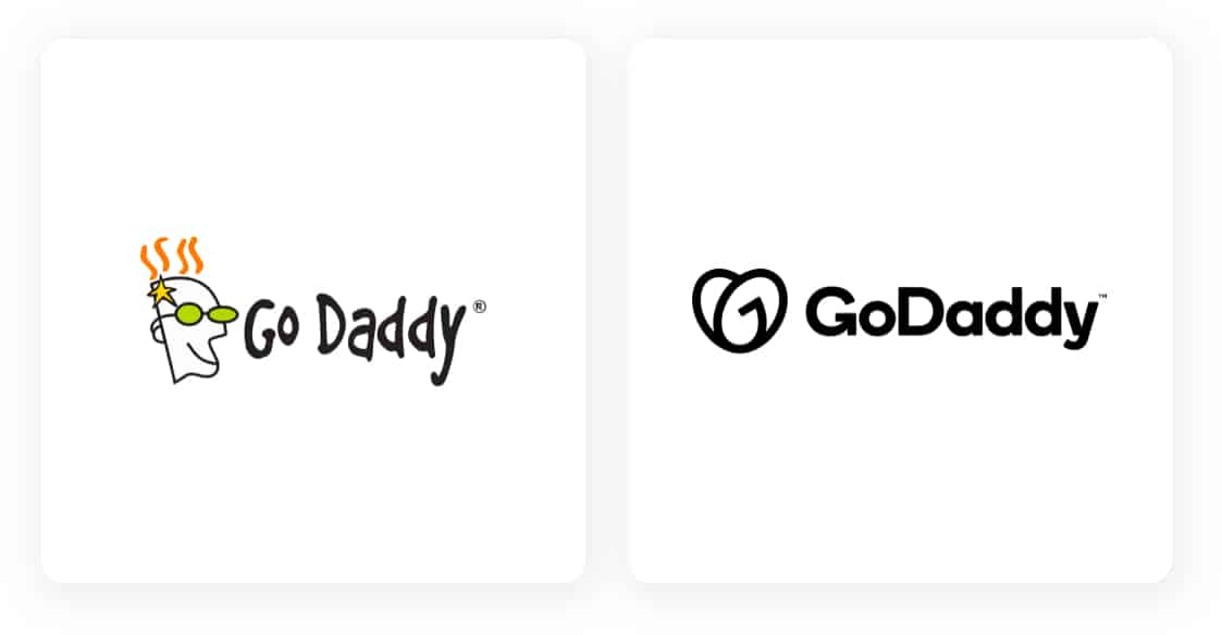
In 2018 GoDaddy ditched their daddy mascot, opting for a plain wordmark style logo in a single color. And in 2020 promptly changed their mind, reinstalling an icon in the way of the heart you see today.
Some say it looks like the new Airbnb logo turned upside down, but if you look again, it’s clearly a “Go,” supposedly to evoke a sense of entrepreneurialism.
You saw that, right!
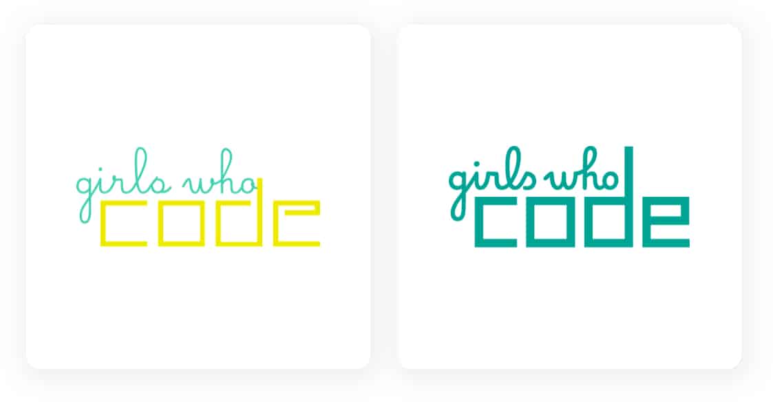
Girls Who Code is an innovative non-profit that encourages women and girls, of course, to enter the technology market as engineers.
Their original and easily recognizable logo had significant brand equity but needed updating to enable versatility. Redesigned to instill visual balance with a thickened font, simplified coloring, and optimized for where it’s used most on their website and social media platforms.
The result is a bold logo with enhanced momentum and immediate presence that can quickly adapt to numerous contexts.
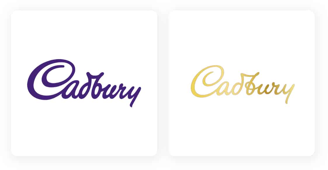
Cadbury’s first major redesign in 50 years drew scorn from critics, panning it for lack of innovation and a high price tag.
However, they were short-sighted as the update is part of a larger global rebranding strategy. Like many other brands in 2020, Cadbury is recreating historical elements in their logo. And they’ve also added a human touch by using the original signature of William Cadbury.
The result is melt in the mouth delicious!
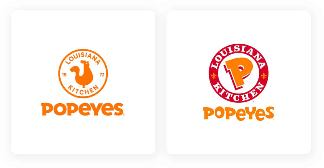
Popeyes Louisiana kitchen recently unveiled its revamped logo with sights set on global expansion, or domination?
Either way, opting for a minimalistic two-dimensional approach, simplified contemporary typeface, and a single intense color that pops, their new logo is clean and striking.
It’s a bright revamp that manages to retain the original logo’s spirit while injecting a modern feeling.
Making it ready to take on the world!
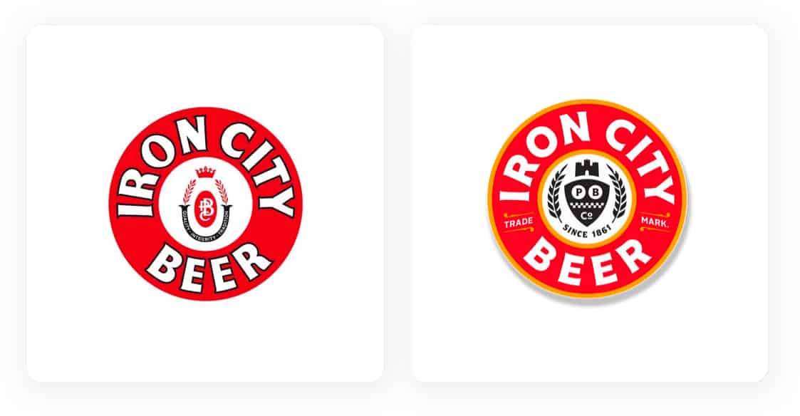
Voted the number 1 best logo evolution in 2020 by Brand New, this rebranding of a famous icon that’s been with us for over 150 years is an excellent example of the less is more revolution that recently took logo design by storm.
Top Hat took over Iron City Beer in 2018, setting out on revamping the original design. They refreshed the classic emblem logo by introducing a bold sans-serif font and intense coloring. Their updated version shows us how to keep original design elements while keeping the beer cool.
And now another new logo design that’s got people talking.
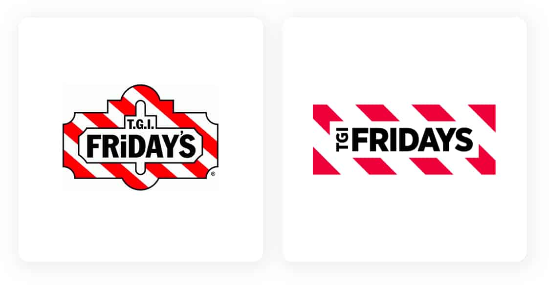
TGI Fridays took a giant leap by removing the TGI from their new logo. A bold step considering the “Thank God It’s Friday” lettering had been with them since opening in 1965.
However, the goal was to retain the quirky old American feeling while injecting a more-trendy modern vibe – that suits their recent venture into home delivery – and one that’s more usable on modern-day advertising platforms.

While you might not be familiar with their name, you might inadvertently know their technology.
National instruments produce measurement tools that aid research into new technologies and odds are you use them every day.
Their new simple monogram logo aims to strike a cohesive balance between creativity and rationality, with the hope of inspiring new engineers. They chose a modern monogram logo design, far removed from the original, to emphasize their point.
It’s a drastic and brave move and a fine example of how simplicity leads the way in modern design.
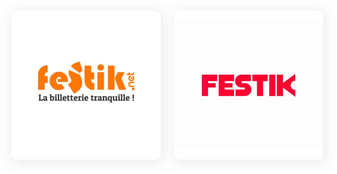
Festik’s logo design was always a creative use of word combination, but they too decided that 2020 was the right time for a change, and boy, did they!
Gone is the bright orange surround with a fun font. Replaced with a single vibrant, energetic color, with equally innovative use of negative space emphasizing a ticket stamp.
It uses simplicity and minimalism to hit a perfectly balanced note.
Who says you can’t change your mind!
From the Atlanta Brewing company to Red Brick Brewing and back again. Georgia’s oldest running craft brewery has completed a full circle with its brand name to consolidate multiple product lines and a brand identity under one banner.
And what a result, combining a sans-serif slogan text and an eye-catching script logo mark in vibrant red, resulting in an enriched 1950’s feeling logo with a modern twist.
This faultless logo has it all, the perfect recipe for a beer brewing company.
Flat is back, baby.
In keeping with the recent drive-by companies to make their logos more suitable for digital formats, BMW recently revealed its new minimalistic, transparent 2D logo.
BMWs’ first logo makeover in 20 years was released in line with their electric Concept i4 car. We’re told the logo represents “openness and clarity” for this much-loved car manufacturer.
And while you’ll mostly find it in print and online, the few sightings of the new logo on a car hood scream instant modern classic.
What a difference a small change makes!
OnePlus proves that less is more with their approach to redesigning their logo. Opting for a curvier number 1, removing the vibrant red background color, and using it in their new, improved font.
The result is an instantly readable, flexible logo.
And while the update is minor, they’ve achieved a major result.

There’s a trend evolving here; did you spot it?
Tripadvisor also took the less is more approach by reducing the logo’s design elements to give it more punch.
And by removing color, capitalizing the T, and using a bolder font, they’ve successfully infused immediacy and energy into their logo and brand.
Again, reduce to enhance. I’m loving what these designers achieved in 2020, aren’t you?
A nip here, a tuck there, and BAM, you have a new logo!
Fnatic’s new simplified, sharper, cleaner version of their logo is a free lesson in design that’s worth taking notice of. It shows us how minor adjustments and an infusion of color can dramatically transform a logo’s engagement levels while retaining its original DNA.
Bravo Fnatic.
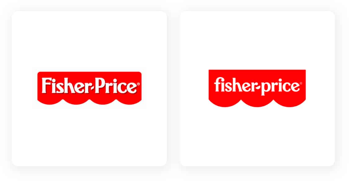
When the world needed a smile, Fisher-Price gave us a great big one, with their new fun-filled logo, celebrating play, silliness, and joy.
Their mission statement “put the fun back into functional” and the “play back into playtime” has been amplified in their logo by simplifying the original canopy from four scallops to three and infusing it with exuberant color and an unconventional typeface.
And the hyphen has been changed to a semicircle, representing the smiling faces of the world’s children. Ahh.
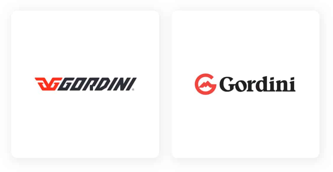
Gordini’s new logo matches their reputation of heritage and style.
This independently-owned Vermont based ski and snowboarding clothing manufacturer, founded in 1956, recently underwent an entire brand identity makeover.
California-based Libra Design Studios purposely went about designing the new logo based on Gordini’s alpine origins.
We think the mountain inside the new G encapsulates this perfectly.
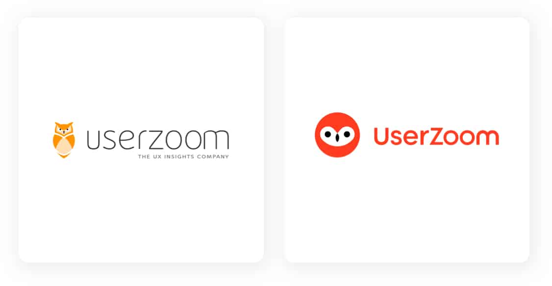
Red was definitely the color choice for logos in 2020, and Userzoom used it to significant effect in their new (yep, you guessed it) minimalized logo design.
They reduced the overall coloring, replacing it with two contrasting colors. They also increased the font’s boldness and used negative space wisely (get it)?
By doing so, they’ve pulled off quite a cool look.
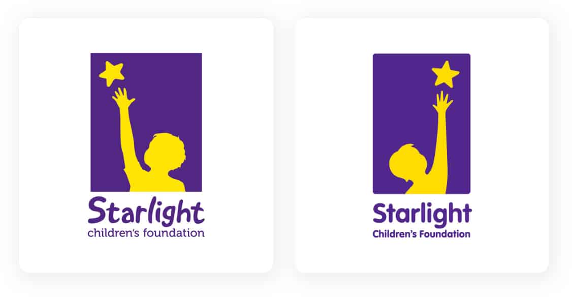
Starlight Children’s Foundation employed Design agency Hulsbosch to increase their logo’s readability and finesse the child icon while retaining their brand familiarity.
Take a bow Julia Morris, senior graphic designer at Hulsbosch; we take our hat off to you.
Because the new design achieves precisely what was requested.
The child icon and star have been simplified, and the up-weighting on the writing enables readability from afar, ensuring the updated version loses none of the original logo’s uniqueness.
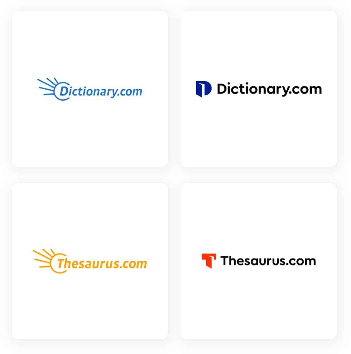
Lexico had a problem caused by the speed of growth. Its advertising had become vague, column widths inconsistent, URL redirects confusing, but most worryingly, the differences between logos eroded brand cohesion and recognition.
How small changes make a big difference!
The Dictionary.com and Thesaurus.com redesign, rebuild, overhaul, renovation, refurbishment (sorry, I couldn’t resist) is an excellent case study of how a logo can encompass a full brand identity and instantly increase recognition and cohesion.
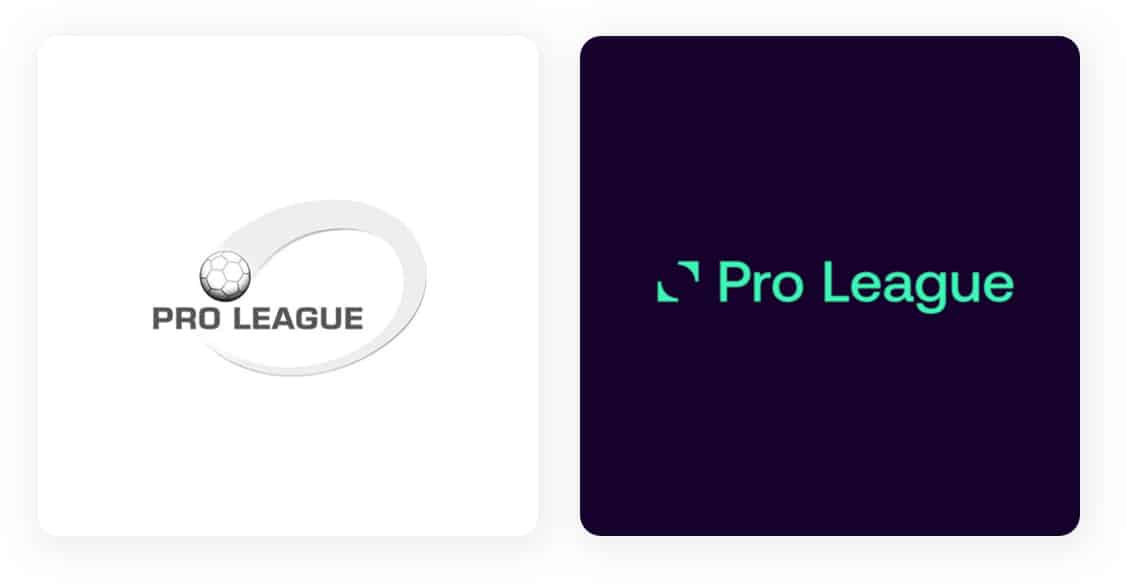
The Pro League redesigned its logo after 10 years, and the result is simple, clean, sharp, and beautiful.
Designers Mirror Mirror scored a goal here by using a single bold color and negative space to pass the test. Serving to modernize the logo and the league’s image.
A perfect logo for the digital age.

International Triathlon not only changed their logo, but they also changed their identity.
This bold and innovative move is in keeping with this wonderful organization by pushing the boundaries of what’s possible. The new logo has motion, unity, and a driving force that’s felt as soon as you set eyes on it.
Almost makes me want to go for a run!
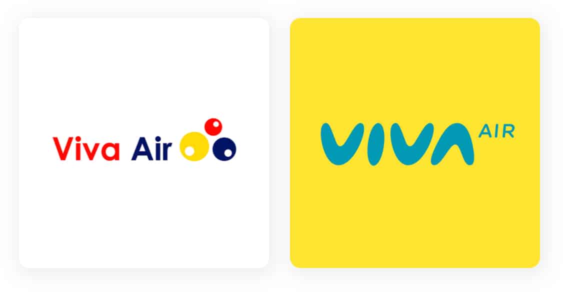
Viva Air showed us that when s*** hits the fan, the best thing to do is smile.
Their new logo cleverly represents aerodynamics, inspired by a boomerang by all accounts! Smart Brands says “it’s an aerodynamic logo that projects agility, confidence, closeness, modernity, and simplicity.”
We say thank you for bringing some light and fun to what was a challenging year for everyone.
We hope our choice of the 21 best logo redesigns of 2020 met your approval and put a smile on your face.
But more importantly, if you’re considering redesigning your own logo, or just about to create a logo design that they’ve given you the inspiration needed for creating your own eye-catching, memorable design.
This portion of our website is for informational or educational purposes only. Tailor Brands is not a law firm, and the information on this website does not constitute legal advice. All statements, opinions, recommendations, and conclusions are solely the expression of the author and provided on an as-is basis. Accordingly, Tailor Brands is not responsible for the information and/or its accuracy or completeness. It also does not indicate any affiliation between Tailor Brands and any other brands, services or logos on this page.
Products
Resources
©2025 Copyright Tailor Brands