1. Burger King
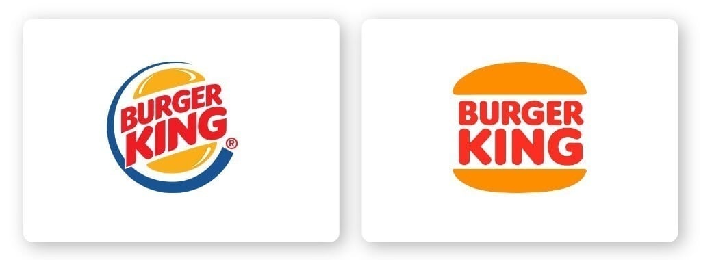
Burger King’s logo was stale. They hadn’t rebranded in over 20 years and were falling behind McDonald’s who are positioning themselves as a healthier option over other fast food chains.
The rebrand was meant to improve negative perceptions of Burger King’s fast food, which is now free from colors, preservatives, and flavors from artificial sources.
Everything from the new color palette, custom typeface, photography, and tone of voice are purposefully meant to move away from feeling artificial or cheap.
2. Udemy
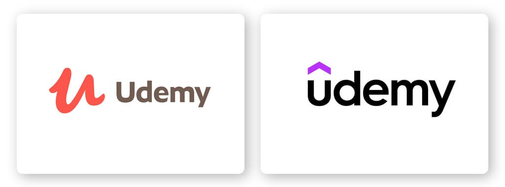
As a platform made to connect instructors and learners around the world, Udemy’s mission is to create new possibilities by opening knowledge to all.
Udemy’s logo redesign captures the desire to seek knowledge with an arrow, a universal symbol for growth. Their brand color is vivid and optimistic, with shades of purple symbolizing growth and possibilities.
3. Pfizer
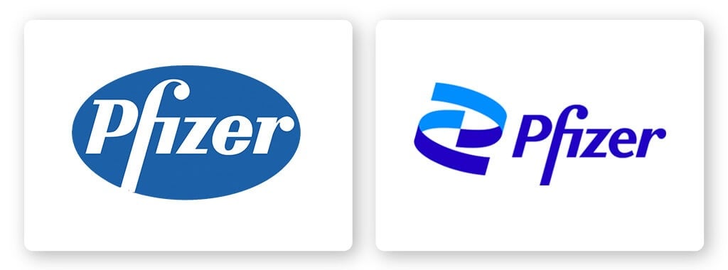
Pharmaceutical giant Pfizer has unveiled its most significant rebranding in about 70 years. Their new logo has dropped the blue pill shape for a double helix-inspired mark.
The company said its new logo visually represents Pfizer’s desire to honor its legacy while looking towards the future. The past is represented by “Pfizer” written in a familiar font, while the future is represented by what the company calls the “ribbon helix.”
This redesign works because it maintains all the elements that are the foundation of the company, while adding in elements that convey future goals and breakthroughs.
4. Renault
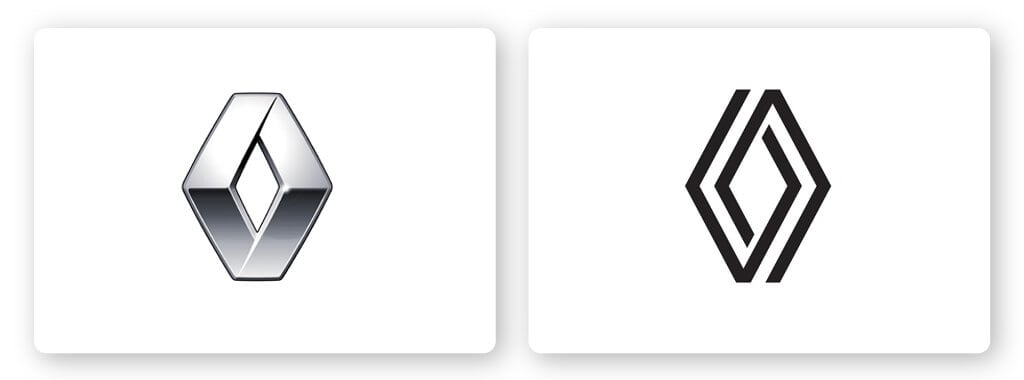
Renault has revealed a new logo, a geometric version of its diamond-shaped design which has been in use since the 1920s.
The new flat logo is made up of 2 intertwining diamond shapes, which can be animated for digital media. It appears without a wordmark and can also be lit-up on vehicle grilles.
The simple style of Renault’s new emblem adds movement and depth that was lacking in the old one. With the double lines symbolizing a car’s wheels on the road, the simple use of lines to create depth gives this logo a forward-thinking direction.
5. Planters
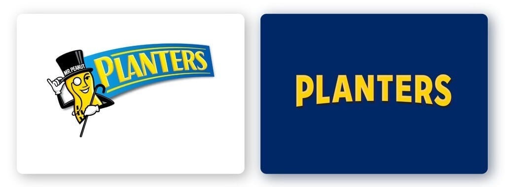
The American snacking brand’s new logo is a good example of how to build off existing elements of an already recognizable logo. Without losing the essential elements of the original, the new Planters logo is sleek, stury, and traditional.
The brand’s 105-year-old mascot, Mr. Peanut, has been reborn with his usual hat, walking stick, and monocle, after he was killed off in late 2020. What I love about this logo redesign is that every detail has been refined to celebrate the brand. The color palette now centers around a darker shade of blue which achieves a look that demands attention.
6. Volvo
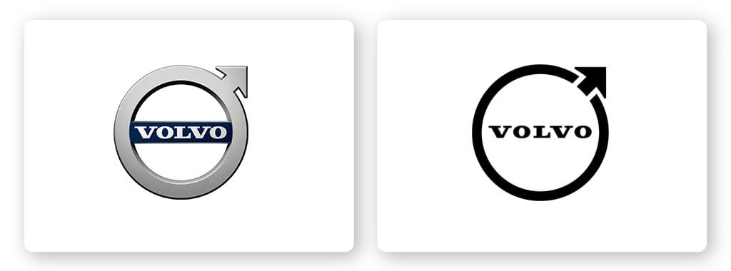
Volvo is yet another car manufacturer to reveal a flat logo redesign. According to Volvo, the new look is a modern reinterpretation of the original logo. The logo has ditched its previous 3D look with silver and blue colors for an all-black, flat design.
They’ve lept the circular shape, but it’s instead thinner than previous, which only adds to its streamlined, modern look. Volvo’s logo redesign is a trend that we’d seen a lot, especially in the car industry, that switched from 3D to flat designs.
7. San Diego Zoo
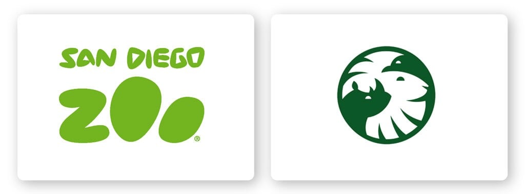
The San Diego Zoo’s new identity has a new logo that features 3 animals thanks to some ingenious use of negative space! A well designed logo is meant to capture a brand’s mission and values and convey it to audiences. The 3 animals depicted in their logo are hugely important to the history of the San Diego Zoo Wildlife Alliance.
A lion is joined by a California condor, a species brought back from the brink of extinction by the organization, and a white rhino, which the organization is also saving.
As well as the new name and logo, the rebrand includes a new typeface that features “animalistic qualities” like swooping tails and sharp horns.
8. Peugeot
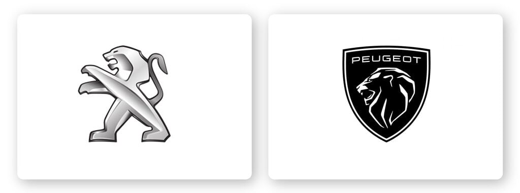
Peugeot has unveiled a redesigned logo that appeals to a modern audience. The French car brand ditched the silver-toned lion in favor of a clean, modern, and monochrome design set on a shield.
Featuring a structured lion head inside a shield, it’s a modern meets classic design that captures the upscale vibe Peugeot was aiming for. The brand introduced the redesigned logo to mark the company’s transition towards producing electric cars.
9. Rolls Royce
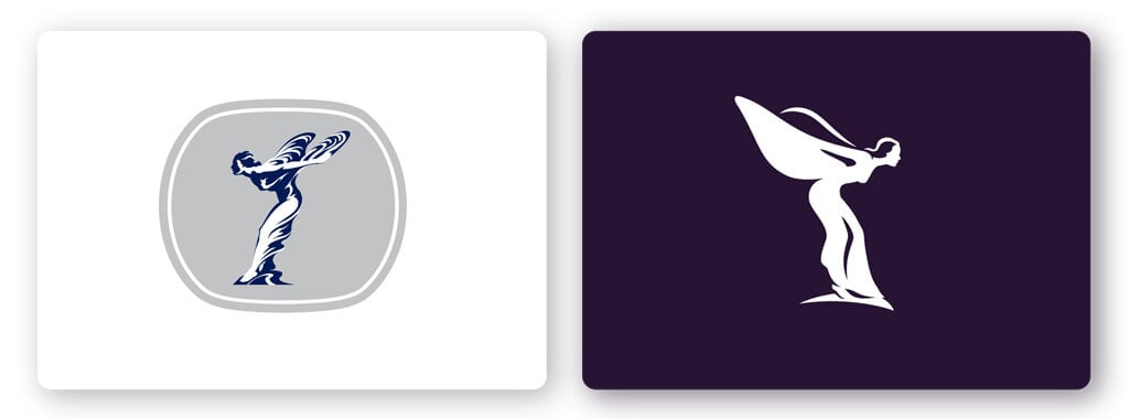
The stunning Rolls-Royce rebrand is a detail-driven logo that expertly blends luxury with contemporary.
The car manufacturer has placed their new Spirit of Ecstasy icon front and center. The symbol has been flipped to face the right and all major details have been erased to allow a more minimal design that will appeal to a younger audience.
10. Mind
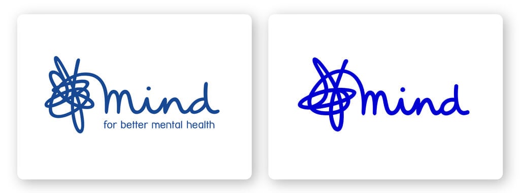
The past few years has seen a hugely positive shift in attitudes towards mental health issues, and mental health charity, Mind, decided to reflect that through their logo. The designers were careful not to stray too far from the identity that had garnered so much recognition.
The goal was to make the brand more accessible and relatable to a growing audience. They managed to do so by including a more vibrant shade of Mind’s original blue. The logo has been simplified so that it works better across various digital mediums.
11. Magnum
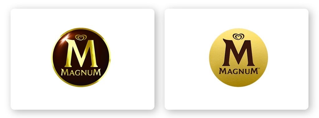
Ice cream king Magnum has received a sensuous and delicious new logo and it’s lickin’ good! The new logo is basically an inverted version of the old one. The brown setting and gold lettering have been flipped to create a gold stamp with the wording etched in chocolate-brown. It’s cleaner, richer, and simply on point.
12. Hotjar
Hotjar, a tool that lets you see the online behavior of your users, has released a hot new look that’s more inclusive and approachable.
Their old logo included a flame that looked really similar to Tinder’s logomark and replaced it with 2 lines that represent both the individual user journeys and human connection. The squiggly lines are what Hotjar calls ‘trace lines’ and represent how people move around on a webpage.
13. Pringles
The beloved snack company has rebranded with a new logo, font, and packaging design in 20 years! The logo mascot is still good ol’ Julius Pringles, but he’s gotten a flat design makeover.
Pringles new logo is meant to be more youthful, eye-catching, and was even meant to give Julius Pringles an emoji-style look.
I also personally am a fan of the new typeface design; the word Pringles has been shaped to look like Mr. Pringle’s famous red bow tie. Genius level rebranding!
14. Paramount
In the modern world, we’re seeing a lot of flat designs, right? Well, Paramount has decided to go for a retro and modern look at the same time.
The core element—the summit—has a new form that still projects strength and authority. The wordmark is tied closely to the mountain, serving as the base to the peak. The new logo is flatter and more streamlined, yet nostalgic and adventurous at the same time.
15. CIA
America’s Central Intelligence Agency introduced a new logo identity aimed at attracting more diverse employees. A lot of people think the rebranding is similar to that of a trendy start-up or a music festival, which, to be fair, it really does.
The new black and white circular logo depicts ‘CIA’ against a background of parallel and intertwined lines. Although the design has been criticized as being off-brand, it certainly seemed to accomplish its mission to aid the agency in recruiting!
16. ABC
You don’t need to reinvent the wheel (or logo) to make a big impact! Simple logos, like flat logos, use a single, versatile design that can be applied across backgrounds and mediums. And now more than ever, companies are simplifying their designs.
The American Broadcasting Company (or better known as ABC) has redesigned its 60-year old logo in favor of a simple, flat design. The 3D gloss effect is gone and the font has been tweaked slightly. Although these are minimal design changes, no one said you can’t stick with a similar design!
17. Yelp
The new Yelp logo icon drew strong reactions online. The restaurant review platform recently revealed a 3D look designed to look “simple, modern, and cohesive.” The new design is nostalgic, retro, and fun.
The glossy and embossed style feels fresh, vibrant, and unconventional in the best way. In a marketplace that is overdone by straight lines and flat design, it’s cool to see Yelp embracing 3D.
18. Sports Direct
Sports Direct, the British high-street mecca of trackies, trainers and more, has unveiled a new design. The new look logo puts the brand name within two horizontal bars denoting the equal sign. The symbol is meant to put values like equality and inclusivity as the main focus.
The logo redesign was created by global brand company venturethree, whose creative partner Graham Jones said: “We love the idea that we are all equal through sport. We wanted to create a brand that boldly makes that statement. An extroverted, super sporty brand that keeps it simple and helps people to feel empowered.”
19. Shelter
Shelter, the UK’s housing and homelessness charity, has revealed a new bold logo. The charity’s new logo features a red upwards arrow, made from rough brushstrokes that looks as if it was drawn by hand.
The old design was a clean and simple wordmark, with the house shape crafted into the ‘h’. While the triangle in the new logo references the shape of a roof, it doesn’t have the subtle hidden meaning of the original.
20. Standard Chartered
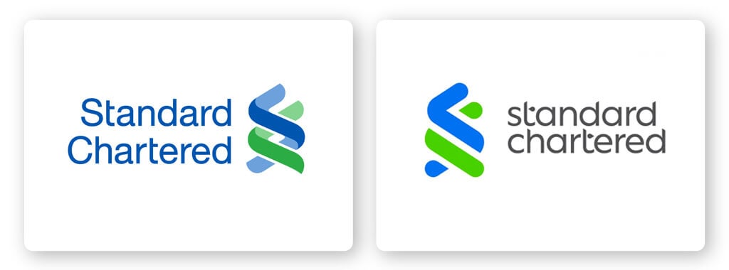
The financial services company has taken the key qualities of their original logo design and created a fresh new look. The new logo keeps the colors and inspiration of the old design; the blue and green reflects the bank’s professionalism and trustworthiness.
The depth and shading was removed from the icon and the text changed as well. The words ‘Standard Chartered’ are written in all lowercase and in a different font. The design may seem modest, but the impact is big. The small tweaks created a new logo that’s immediately more powerful and recognizable.
Over to You
There you have it, folks! A round up of the 20 best logo redesigns of 2021. From bold new looks to simple tweaks, this past year has seen it all. I hope that this has given you some inspiration to create your own eye-catching logo design.
