Colors tell the story of your business. They can both attract and repel an audience, and they’re a crucial component of any brand.
Like other design elements, the way colors are used constantly changes depending on how careful or daring designers are willing to be at any given moment. For this reason, we update this post every year with the latest trends in the world of color and brand design – trends you should use to your advantage!
Whether you’re trying to keep your brand ahead of the curve or you need your daily dose of design inspiration, we’ve got you covered. Check out some of the top color trends killing it in 2020!
If you’re someone that follows style blogs, aviation headlines, or any industry rankings, think of this trend as the color equivalent.
Every year, Pantone, the grandfather of color matching, releases their top color pick. Their prediction is so influential that what they choose truly sets the tone (ha!) for fashion design, product design, graphic design, and all other industries that leverage design.
Pantone is known for their fan decks – a series of bound cardstock cards with varying shades of color swatches – which is what helped them gain notoriety and loyalty by the design community at large.
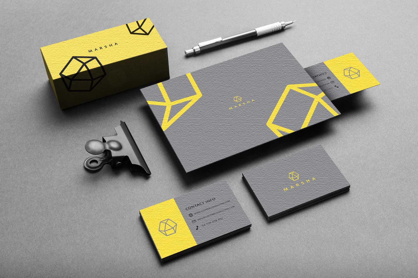
Although the event is titled the “Pantone Color of the Year,” for 2021, they announced a collaboration of color between Illuminating and Ultimate Gray. This combination emits a message of strength and hopefulness that is enduring and uplifting – necessary after 2020.
You should expect to see a lot of these two colors throughout the year as well as other trends that follow the softer palette approach.
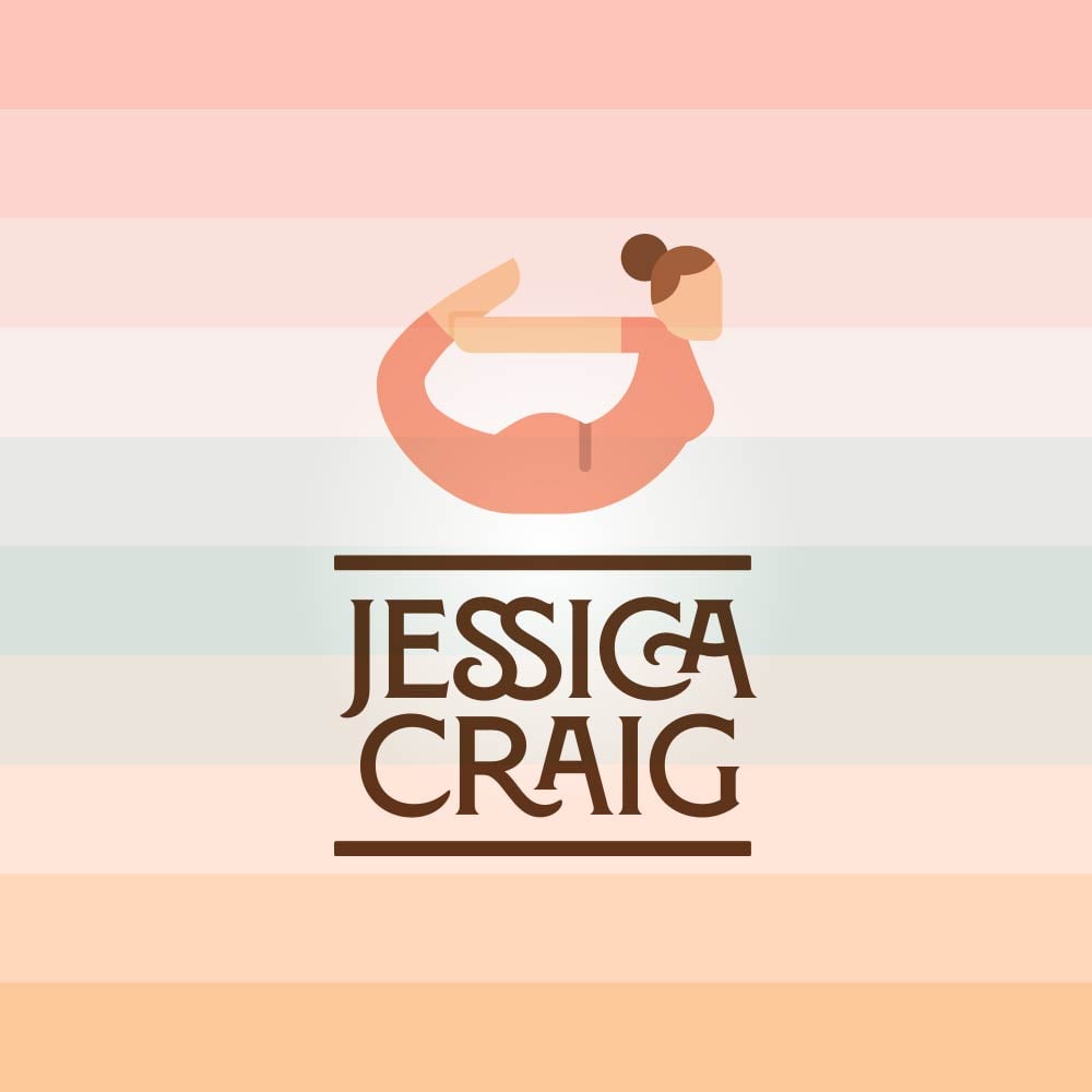
The soft tones are taking the Gold, or shall I say Champagne, this year.
Yep, that’s right, soothing, natural, and faded tones are in!
Remember that simplicity and minimalism doesn’t mean boring, it means easy on the eyes but still memorable. Take this approach with your color scheme and you’ll see how beautifully everything will start to take shape.
You want to choose colors that will work together and be soft on the eyes; think of worn reds, blues, and greens, and don’t be afraid to incorporate skin- and earth-toned colors too.
The key is to use a combination of colors that is balanced and simple.
If you want something a little bit louder, then you should consider the next color trend on our list.
To make your branding materials pop, keep it simple, but get funky with it. The simple part is the base of your color palette – think grayscale monochrome (remember Pantone’s Color of the Year?) – and the funky part is what will make your brand intriguing.
This is the modern take on monochromatic themes. The splash of color will give your brand a level of expressiveness that it wouldn’t otherwise have.

Think of making a sign that you’re going to hold up on one end of a football field while your friend stands at the other end. What’s catching their eye? The pop of color!
They can still get the message of your brand across because the color plays with the negative space created by the monochrome to boost your design, which is all the more powerful when it comes to simple color design done right.
If you haven’t figured it out yet – monochrome is super powerful when it comes to design and branding.

A “tonal” logo just means taking one color and using several different shades. Bakeries, book stores and baby boutiques may want to consider using a tonal pastel logo in order to signify the various products you offer. Choose different tones – both light and dark – in order to have color contrast and keep the logo visually interesting.
If you don’t know, analogous colors are a grouping of colors that lie next to each other on the color wheel. And they go together really well.
It’s kind of similar to monochrome palettes but those take one color and then divide it into different shades to create the monochrome grouping.
With analogous schemes, you have a lot more room for variation while still keeping your designs simple and cohesive.
This trend is great for brands that want to give off the feeling of harmony. Your color picks will belong together and will blend well no matter what because of how color theory is established.
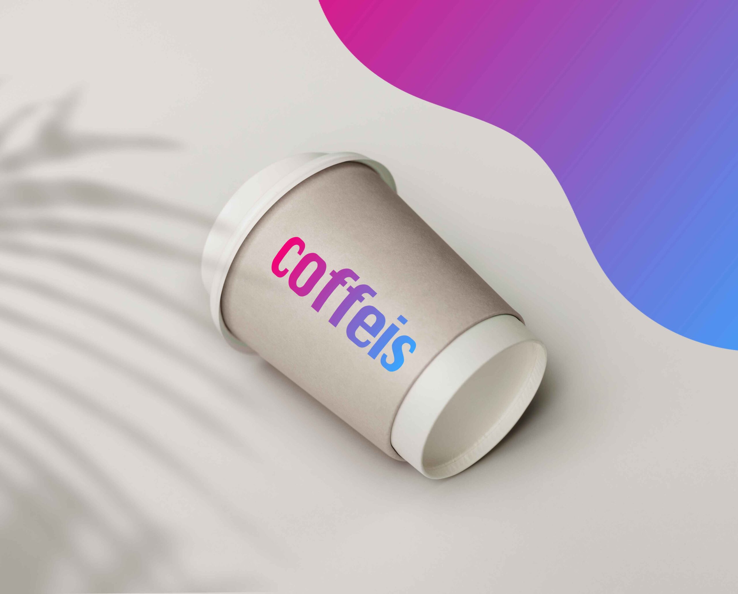
This trend is a result of the gradient we’ve been seeing for a couple of years and breathes new life into your next re-branding project.
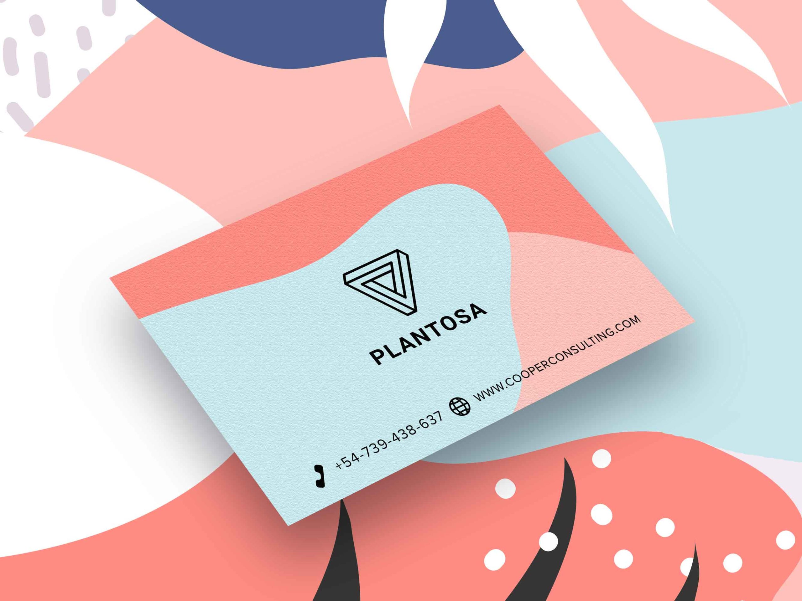
We’re continuing with the overarching theme of wanting to give off the feeling of security, endurance, strength, and harmony.
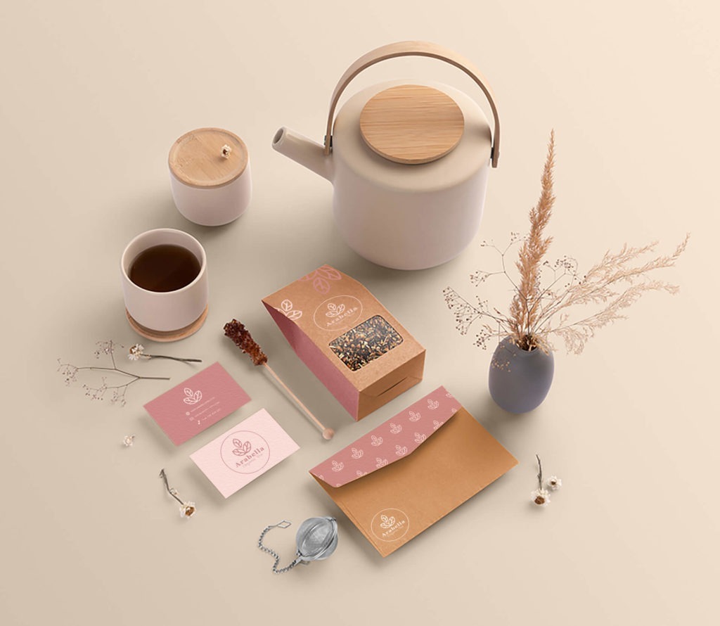
What I mean when I say “Organic Color Blocking” is taking the – now retro – trend of color blocking and letting the “blocks” morph into more free-flowing abstract shapes with soft curves.
Think of a blob as your best friend. It’s easy to layer more different colored blobs on top because the rules of symmetry go out the window.
You do still need to be cognizant of balance within your brand design, but let the colors move freely on your webpage, business card, or t-shirt.
Feel the movement of your brand and take a chance on this trend, even if it may be a little out-of-the-box.
Everything in moderation.
If there’s one thing to take away from the color trends for 2021 is that a little goes a long way.
The same goes for loud colors. Bright splashes of color are a super fun way to bring energy into your branding. It doesn’t really matter which color it is as long as it’s saturated and stands out.
But remember, only use a touch of this. We’re not going for the pop-art vibe, we’re going for themes that are a bit more fun and upbeat or mysterious and expressive.
Once you know your brand voice and vibe, you can play around with these brighter colors and see what works.
Choose 2-3 colors max to be the focal point of your brand and let the rest be a solid, but soft, supporting background color.
Combining your brand colors like this will give you a cool edge that will set you apart from the crowd.
There’s no one right way to use color this year, regardless if you’re completely rebranding or adding spice to a campaign. That said, there are definitely a few wrong ways! Don’t be afraid to try new things and experiment with what works. Whether you opt for a multicolored approach or get the most out of a single, loud hue, make 2021 work to your design benefit.
When in doubt, take a look at paint company color trends predictions (like Pantone, Behr, and Benjamin Moore). Don’t use all the colors at once, but it’s a great place to start getting an idea and maybe pick out the first color for your brand.
Products
Resources
©2025 Copyright Tailor Brands