Easter, cupcakes, babies; these are usually the first things that come to mind when someone mentions pastels.
But pastels are bigger than egg hunts and playmobils. These soft, relaxing colors can add a unique twist to your brand and its designs.
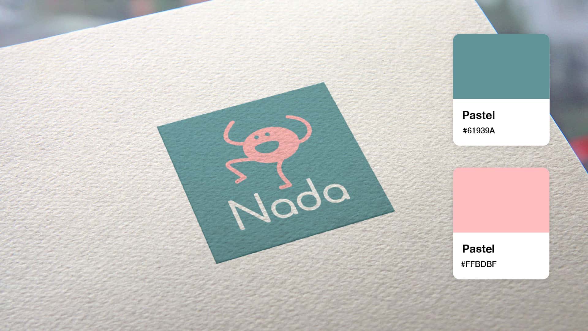
Pastel logos are non-confrontational. They turn yellows into butter, blues into powder, purples into lilacs; you get the drift. They generally give off a light, soothing vibe, which is why they’re commonly used by bakers, artists, wedding vendors, florists, photographers – the list goes on.
Let’s take a look at some of the characteristics of a great pastel logo, with inspirational tips for you to create your own!
In technical terms, pastels refer to hues that are high on lightness and with low (or medium) saturation. But for the non-designers out there, just think of pastel logos as logos that use soft colors, or colors that have been mixed with a large amount of white. The more white you add to a color, the more pale a pastel will be.
So why does this matter? Because, logo colors can inspire feelings, associations and emotions in your audience – often causing them to take action. This is known as color psychology, and it plays a huge role in logo design.
Rather than looking washed out, a good pastel logo will inspire ease. (And let’s be honest; these days, everyone could use a little calm.) At times, they’re reminiscent of spring – with it’s hopeful, new beginnings – and they might even seem romantic. They’re a pause from the rat race, telling the customer to take a timeout and just enjoy whatever’s around them – your spa, your bakery, your boutique baby store, etc.
Designed with our logo maker, here are examples of the most common pastel logos to help inspire your logo design.
A “tonal” logo just means taking one color and using several different shades. Bakeries, book stores and baby boutiques may want to consider using a tonal pastel logo in order to signify the various products you offer. Choose different tones – both light and dark – in order to have color contrast and keep the logo visually interesting.
See how the Rosen logo catches the eye, even though it’s not full of bright colors? That’s because pastel logos can also use muted tones to get the job done.
A muted palette can actually help highlight a specific part of your logo, like an icon or your brand name. You can always experiment by blending muted pastel colors with a brighter accent to give it a unique look that pops off the page.
Beauty businesses, step right up. Pinks and purples are a great combination for anyone looking to capture feelings of royalty and indulgence. You might consider adding an accent of black to give the logo an air of sophistication, or softening it even more with baby blues.
We LOVE blue logos at Tailor Brands, not least because blue is one of the most popular colors in logo design. Pastel blues add a calming spin on an otherwise loyal and trustworthy vibe, which is the main advantage for business owners using blue.
Check out these business logos; notice how pastel blue can work for brands in all sorts of industries? From the Finepack venture capital firm to a dog walker and aquarium, each company uses blue to tell their own story.
Ready to create your own pastel logo? Here are some tips to get you started:
Pastels don’t just look nice; they pack a meaningful punch! Before you start designing your own logo, it’s important to think about what you want to say to your audience.
We discussed some of the most resonant pastel logo messaging above – new beginnings, feelings of ease, peace and romance – and it’s up to you to decide what exactly you want to communicate with your logo. Once you have that down, you’re ready to start playing with logo designs.
We saw some of these pastel shades in action already. Notice how the colors of some logos were much brighter than others? Play with the brightness levels of each logo color and see which aspects of your logo you can emphasize by doing so.
Contrast plays a big role here, so if you have 2 colors in your logo, try to up the brightness of one color while dimming down the second, in order to highlight your brand name, your icon, etc. Don’t be afraid to experiment until you found the right level of “pastel” to work for your brand.
Though you’re using soft colors, not all pastel logos have to give off a sweet vibe. Any brand can use pastels to their advantage, including law firms, film studios – anyone who wants to switch up their logo and create something unique.
For a more professional and sophisticated look, you can try using just one pastel color in your logo, while keeping the other two colors (don’t use more than 3 in total!) sharp. Try using the pastel as an accent, even just as a line in the logo, so that it really pops.

Are you feeling inspired to create your own pastel logo yet? We definitely hope so! Remember to think about your brand message, and don’t be afraid to experiment with different color shades and tones.
This portion of our website is for informational or educational purposes only. Tailor Brands is not a law firm, and the information on this website does not constitute legal advice. All statements, opinions, recommendations, and conclusions are solely the expression of the author and provided on an as-is basis. Accordingly, Tailor Brands is not responsible for the information and/or its accuracy or completeness. It also does not indicate any affiliation between Tailor Brands and any other brands, services or logos on this page.
Products
Resources
©2025 Copyright Tailor Brands