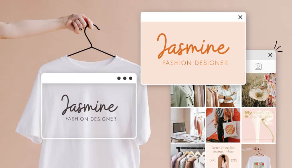
Designing a great logo should be at the top of your branding to-do list. The perfect logo will showcase your business’ creativity, quality, and commitment to your target audience.
The right logo makes an important first impression and, most importantly, create a connection with consumers.
Here are some tips to help you create a unique fashion logo that speaks to your fashion brand. Plus, I’ll go over existing fashion brands who really nailed it with their logo.

When creating a fashion logo, you should consider several things, including its appeal to your target audience and how it matches your brand aesthetic. A good fashion logo is carefully thought through and chosen to best fit the brand it represents.
Here are five things you want to keep in mind when designing your fashion logo.
Scalable. Whether your logo is printed on a billboard or a clothing tag, you need something that will look good in every size. A scalable logo means it won’t be blurry at a smaller size nor will it look pixelated if large.
Recognizable. Your logo must be instantly recognizable to audiences. A logo plays a major part in creating a lasting brand identity that brings back returning customers.
Readable. Many fashion brand logos have the business name incorporated in the design. If that is the case for your brand, you want to ensure the font you choose isn’t too hard to read at a glance.
Appealing. You are creating a logo to target a specific consumer group, so that means you need to design according to their taste. A great logo will have the colors, style, and imagery that appeals to the customers who want to buy the products you offer.
Original and Cohesive. Consistency is key when it comes to branding. You need a logo design that is different from the competition while it remains true to your brand.
Understanding the various types of fashion logos may help you get a better idea what works well for your niche within the industry. Here are five major types of markets in the fashion industry, as well as some different types of brands and how they use their logos.
Luxury brand logos represent the high-end fashion companies targeting the wealthy and famous crowd. The designs behind luxury brands are often sophisticated with limited color palettes.
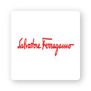
The brand has flip-flopped between its logo featuring a logotype and a more complex combination logo. Since 1960, the brand has used a handwritten font that is simple and unassuming. In the ‘80s, the logotype front changed from appearing handwritten to a sophisticated script font.
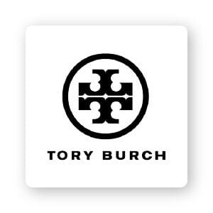
This beloved designer went with a monochromatic lettermark logo in a classic shape. The Tory Burch emblem conveys a historical vibe with a modern twist. The intricate style is attractive, clean, and readable.

Although the Stella McCartney logo is simply the name of the designer, it still manages to stand out among its competitors. What makes it so special is the unusual pattern used for the letters. In place of solid lines, the letters are replaced by black dots.
The fast fashion segment of the industry capitalizes on quick there-and-gone trends. Fast fashion logo designs are typically trendier and bolder than some of the popular designs and styles of other niche groups.
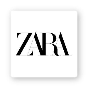
The bold, mashed look of the Zara letter breaks the rules of kerning (letter spacing in graphic design) making a bold statement. The all-caps serif wordmark logo has a very Vogue-esque feel, which is perfect for the audience the brand wants to target.

Bold and slashy, the H&M logo is an eye-catcher in the fashion world. The symbol features a vivid monogram, featuring only the letters “H” and “M” with an ampersand between them. Some have criticized the mark for being too generic, but it is one of the few instances in which a fashion company can make simple work in its favor.
Forever 21’s wordmark logo is strikingly bold on top of a bright yellow background. It’s a look that is definitely hard to miss. This allows the wordmark to become more legible even at smaller sizes and from far distances.
Athletic clothing brands are, as expected, centered around sporty style and performance design. The brand logos for sportswear are often easy to see from a distance—making them perfect to add to sport jerseys, shoes, bags, t-shirts and more.

The iconic sportswear brand is an interesting case because they have multiple logos for their different clothing lines. Known for those three slanted lines, the Adidas logo has become iconic in the sportswear sector.

Puma’s slick panther illustration conveys power and speed, defining the products in this popular performance wear brand.

You don’t have to be a sports fan or athlete to instantly recognize the Nike swoosh. The checkmark is simple and pairs well with the “Just Do It” slogan that has come to define Nike.
To attract younger audiences and their parents, children’s clothing brands often use bright colors and fun, juvenile designs. Let’s take a look at how they do it.
The bright and straightforward logo for The Children’s Place is reminiscent of a book cover. A grown, serif font in all caps contrast against a sky blue. The logo has a classic, yet playful feel signaling it is designed for children (if the name didn’t already give it away!).

The use of red in the Cat & Jack brand works perfectly with their parent brand Target. The company uses a curvy script font that has a playful, innocent look. Target has worked to make its clothing line something that stands on its own as a top children’s clothing line with can’t-be-beat pricing.
Their unique design is a highly popular choice with modern parents and influencer parents. The Primary icon is extremely playful, morphing into different shapes and colors with a pair of black dots for eyes.
Gritty, grungy, and down-to-earth, streetwear brands tend to speak to a younger and more rebellious audiences.
This in-your-face logo takes a handwritten logotype and adds a unique twist. The aggressive, angled lines are paired with knobby ends for a logotype that is slightly edgy without being abrasive. Product lines created by Stussy are practical, comfortable, and stylish, matching the streetwear brand’s logo.
Simple brand, simple logo. HUF prides itself on its unapologetic approach to streetwear. The three capital sans serif letters on a simple green square background makes up its primary logo. They do, however, use its name in a variety of other fonts and styles for different lines.
Obnoxious, loud, artsy- BAPE represents the kind of streetwear brand that takes it all the way to the edge with no regrets. The company’s name stands for “A Bathing Ape,” which is a slightly sarcastic approach to the overindulgent streetwear audience.
The icon for BAPE is a shadowy portrait of a hairy ape head with two flat colors (tan and brown). The logo is often paired with a simple sans serif logotype and a solid background color.
As you can see, there is a vast range of possibilities for your fashion logo. Especially in the fashion industry, creating the perfect logo design is an extremely important part of building a name from yourself.
If you are currently in the fashion logo design process, I hope you’re inspired to make your very own!
Use these examples as a jumping board to design a fashion logo that will have create a brand that connects to customers to keep them coming back.
This portion of our website is for informational or educational purposes only. Tailor Brands is not a law firm, and the information on this website does not constitute legal advice. All statements, opinions, recommendations, and conclusions are solely the expression of the author and provided on an as-is basis. Accordingly, Tailor Brands is not responsible for the information and/or its accuracy or completeness. It also does not indicate any affiliation between Tailor Brands and any other brands, services or logos on this page.
Products
Resources
©2025 Copyright Tailor Brands