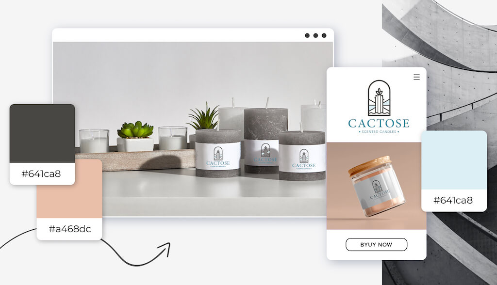
The color you choose for your logo can make the difference between mediocre and outstanding. Now, you might not have considered grey for your logo color since it has rather gloomy connotations, but truth be told, grey could be the perfect color for you!
Your logo color is an important decision, as it can communicate to your audience what your business is all about, and visually distinguish you from competitors. So, I’m here to help you decide if grey is the right choice!
Below, I’ll talk about what people think of when they see grey, how you can use it in different contexts, and which industries most commonly use it in logo design. By the end of this post, you should know whether it’s the right color for your business!
Colors have a profound impact on our body, mood, and even emotions. However, it’s important to note that culture, experience, and upbringing all play a role in how colors are interpreted.
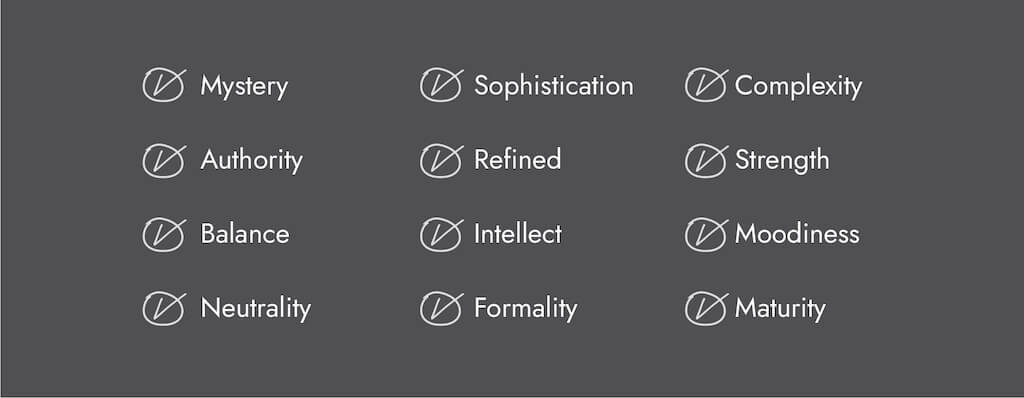
If you want your logo to express attributes like mystery, authority, sophistication, intellect, strength, and maturity, grey is the color for you. Let’s look at how some well-known brands use grey in their logo.
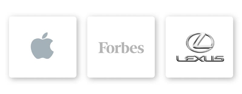
What do the logos for Forbes, Apple, and Lexus all share in common? Each company has a grey logo to mark their authoritative ranking in their respective industries. Their grey logos also exhibit a sense of luxury, refinement, and sophistication.
There are certain design elements that combine well with grey logos and those that don’t.
Choosing the right typography for your logo could bolster your overall brand. Review the 5 main font families to determine which one suits your brand best.
Serif – Using a serif font in your logo design tells your audience that you’re a well-established, traditional, and trusted brand.
Sans serif – Casual, sleek, and modern, sans serif fonts are a great fit for any brand like Infinity that wants to be viewed as cutting edge, innovative, bold, and sophisticated.
Slab serif – A slab serif font makes a bold impact and is frequently used by car and technology companies.
Script – Script fonts can feel whimsical and fun or traditional and old-fashioned, which makes it one of the most versatile type of font.
Decorative – This is a font that’s loud, fun, and entertaining, which is why it works for companies like Skechers.
Of course, these are just general rules, but by no means are they set in stone. Feel free to play around with different font combinations.
The right shape can help you build a psychological and emotional connection with your target audience. It’s important to understand shapes and how they relate to your brand to be able to incorporate them appropriately into your logo design.
As grey is a neutral color that can balance a design, nearly every shape is compatible with grey. Circle logos in particular are great to pair with grey given it’s a shape that’s a sign of mystery, balance, continuity, and strength. From car companies like Volvo to electronics like LG, circle logos work across a variety of industries. Consider using a circle in your logo if your brand is centered around balance, intellect, and maturity.
An icon is another popular choice for logo design given it’s a symbol that conveys immediately recognizable values. Animal imagery can help brands cement their values and characteristics in their audiences’ minds. Animal logo icons work with grey because they can express luxury, mystery, intellect, or virtually any other characteristic your brand is about.
As I mentioned before, colors are subjective and there’s no right or wrong way to use grey in a logo. However, certain colors are associated with specific meanings.
However, you should use grey if it’s consistent with one of your brand messages and/or values. Or, you can use grey to differentiate yourself from competitors’ logos.
If your brand falls under one of these industries, here are a few ideas for how to use grey:
As mentioned, grey represents neutrality and balance, but it’s also a color that’s sleek, chic, and sophisticated. For these reasons, it’s a color that appeals to a mass audience. For technology companies, these are all attributes they want associated with their brand. Think of Apple and LG’s logo—grey upholds the clean, polished look these companies want to express.
Automotive companies need to convey a few meanings through their logo: Safety, authority, refinement, and even glamour. For luxury, high-end car companies like Lexus, Mercedes, and Nissan, all use a grey logo to highlight these characteristics.
To make a positive impression on future and current clients you need to have a strong financing brand. Many finance companies use grey to tell potential customers they’re a strong leader in the industry, intellectual, and formal. These are all attributes you want when trusting finance brands!
Grey is considered to be cool, elegant, and conservative—even a bit mysterious. For luxury brands that want to exude a sense of affluence and opulence, grey is the color for them. Consider Swarovski and Longines—both have classy, timeless grey logos.
Wii and Disney are entertainment brands virtually everyone knows and has personal connections to. Grey is a balanced, dignified, and stable color in logo design. What you see is what you get, so entertainment brands like Wii and Disney are signaling to their customers that they can depend on them to always provide quality, fun entertainment.

If you’re starting or already have a photography business, then you already know that you need a logo that speaks to your audience. And while it’s important to make a logo that shows who you are and stands out from the crowd, it’s also important to appeal to a wide range of people and occasions. That’s why a grey logo works so well for photography logos. Whether it’s a brand that specializes in outdoors and landscapes or portraits, grey is a classic color that inspires your customers to imagine their own vision.
Grey can be pretty versatile depending on the colors you combine it with. Let’s take a look at some examples of grey logo color combinations:
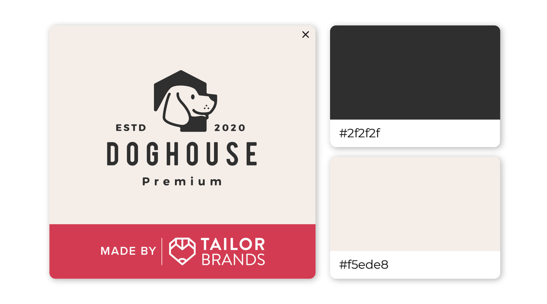
Perhaps grey and tan aren’t the first color pairing you’d think to select for your logo, but as you can see, it’s a winning combination! The dark graey and light tan provide the perfect contrast to help this logo pop.
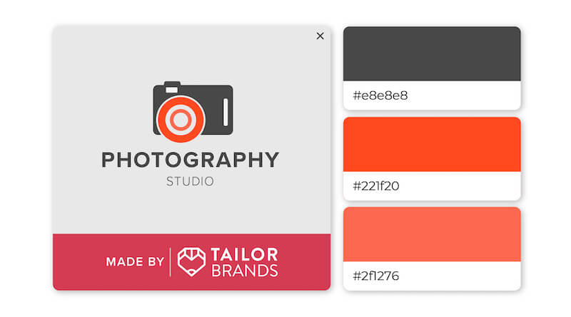
As both timeless and sophisticated colors, pairing red and grey together results in a complementary look. The overall effect is a very polished appearance that exudes a sense of professionalism and modernity.
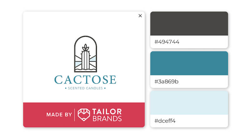
Any shade of blue—from seafoam to deep navy—stands out against a neutral grey backdrop. The dark grey in this logo helps the 2 shades of blue pop even more and highlights the wide range of colors that are related to the ocean.
We’ve seen that grey conveys authority, sophistication, intellect, and strength, but combining it with other design elements can lead to a memorable and unique logo.
If you are considering grey for your brand’s logo, you can head over to our logo maker where you can play around with different design elements, color combinations, and more until you get the design that’s right for you.
This portion of our website is for informational or educational purposes only. Tailor Brands is not a law firm, and the information on this website does not constitute legal advice. All statements, opinions, recommendations, and conclusions are solely the expression of the author and provided on an as-is basis. Accordingly, Tailor Brands is not responsible for the information and/or its accuracy or completeness. It also does not indicate any affiliation between Tailor Brands and any other brands, services or logos on this page.
Products
Resources
©2025 Copyright Tailor Brands