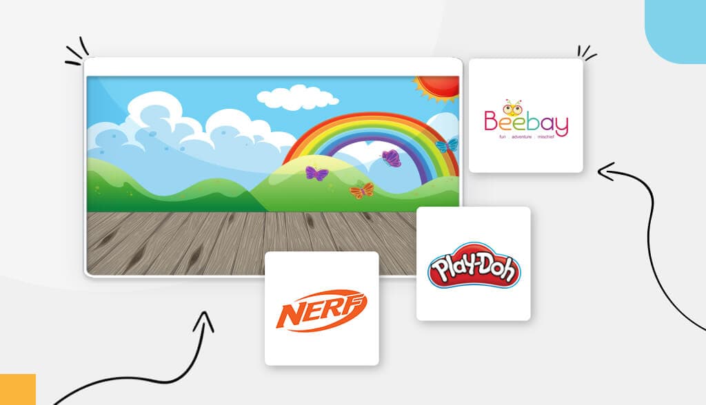
Creating a logo for kids is different from other logos in that you need to reach 2 target audiences: The parents and the kids. A good kid logo will have kids and parents alike excited by your brand. That isn’t an easy feat, but totally possible.
To guide you through it, I’ve compiled a few best practices when it comes to designing logos for kids, as well as examples of great kid logos.
Follow these general design best practices to create a kid’s logo you, the kiddos, and their parents will love.
The specific messages and values you want your customers (both kids and parents) to feel when they see your logo should inform your color palette. For example, a modern children’s boutique store would opt for a minimalist logo featuring one or 2 vibrant colors. But someone who’s a children’s party planner would go with bold colors that grab attention.
In general, older kids prefer bold primary colors while younger kids prefer pastels. Be sure to choose no more than 2 colors (3 is the max) together, and be sure they’re contrasting colors to create intrigue and appeal.
There are 5 broad font families—Serif, sans-serif, slab-serif, script, and decorative—each with their own characteristics. Chances are you’ll want to go with a casual sans-serif, bubbly decorative font, or a warm script font. Again, which font you choose depends on your brand and what messages you want to send.
There are different types of icons and you should take the time to understand each one’s meaning and purpose. Although it isn’t necessary to have an icon logo, icons (especially mascots and animals) are a popular choice for children’s logos. The Jolly Green Giant helps kids eat their vegetables and the goofy Kool-Aid Man makes kids want to choose Kool-Aid over Capri-Sun (a battle still raging to this day). Mascots allow your audience (kids and parents alike) to connect with your brand and make it easier to remember your logo.
If you need some inspiration before heading off to create your own kid’s logo, keep reading. I’ve compiled a list of amazing logos according to different categories.
From birthday parties to Christmas gifts, toys are a huge part of every child’s life. Let’s check out some of the biggest toy companies and their logos to see how they appeal to both kids and parents.
Chances are you’ve played with Lego’s as a kid, but you might not know that the term “lego” is derived from the Danish phrase “leg godt” which means “play well.” The color palette includes red, yellow, and black, colors that stand for happiness, energy, and confidence.
My Little Pony’s logo is truly the thing of pastel dreams. Looking like it’s been carved from a purple cloud, the letter ‘y’ looks like a pony’s tail. Complete with a heart and pink and purple rainbow, the My Little Pony logo is playful, youthful, and imaginative.
Play-Doh is that soft substance kids mold into whatever shape they want. The logo’s shape looks like a cloud or a moldable piece of Play-Doh. The red is young, bold, and playful—the perfect color for grabbing attention even at a distance.
She’s style, she’s grace, she’s Barbie. When you’re an icon, you don’t need anything but a place to put your name. The pink Barbie script wordmark is known by young and old alike. The script looks like a young girl’s handwriting. It gives off feelings of effortlessness, yet cute and spontaneous.
Mr. Monopoly himself is just as iconic and widely recognizable as the board game. The elderly gentleman in a tuxedo has been around since 1936 and is to this day incorporated into the brand’s logo. Mr. Monopoly is a great example of how a mascot can be a powerful branding tool.
From the first indoor ball to the Super Soaker, Nerf toys have been a staple in every millennial’s childhood. The text appears diagonally giving the impression that it’s flying right through the semi-circle it’s enclosed in. The semi-circle itself looks like a football mid-flight. Orange is a great color for a kid’s toy logo since it represents excitement, determination, and enthusiasm.
Amusement parks are a giant playground for children and adults alike, inspiring awe, imagination, and fun. Let’s see how these well-known logos convey the magical moments inspired by an amusement park.
Frank Kent’s Dream Park in Fort Worth is a playground for kids of all ages to explore and let their imaginations run wild. You’ll notice that Dream Park’s color palette consists of a rainbow. It’s best to stick with 2 to 3 colors max, but in this case, it works in their favor to heighten the imaginative thinking and excitement.
Adventure World’s logo has a distinct early 2000s vibe going on. The most noticeable design element is the roller coaster tracks running along the circular frame. The initials “AW” appear to be hugging; the tip of ‘W’ ends in water droplets, which gives the assumption that it’s also a water park.
Many successful businesses use their name to inform their logo design. Playing off of the word “luna,” Luna Park’s logo consists of a waning crescent (the blue sliver) and a waxing gibbous moon (the orange oval). Blue signals to parents that theirs is a respectable, trustworthy place, while the orange tells kids it’s party time.
Playland decided to rely on a wordmark, which is a logo that only features the name of a business, no images or icons included. That means that the only 2 design elements Playland rely on is color and font. Deep blue gives off a sense of security and trust, while the whimsical font adds a bit of mystery and excitement to the overall design. Plus, it helps that ‘y’ and ‘n’ swooshes look like a slide.
You might have noticed by now that a lot of kids’ logos—no matter the kind of business they’re in—use a rainbow of colors in their design. Most logos should use 2 to 3 colors, but kid’s logos tend to have more wiggle room because kids are attracted to energetic pops of color.
Whether it’s a party planning business or a one-stop-shop party supply store, these logos will show you how it’s done in the entertainment business.
The first emoji that pops up when you type “party” on your phone is a balloon. That’s because balloons have always symbolized fun and celebration. The guys over at My Deco Balloon promise to put the fun in your next party with imaginative balloon decorations that are unique to your occasion. The logo covers that promise. “Deco” in black and “balloon” in color are meant to show you the before and after of what your party will look like when they break out the big balloon guns. And the small scratched on “my” like an afterthought is meant to emphasize that it really is catered to the customer’s specifications.
One of the first rules of logo design is to keep it simple. The font’s thin long lines and evenly spaced letters convey a sense of sophistication and professionalism. Notice how “Little Miss” is written in pencil-thin font, while “Party” is a much thicker font. This is a good technique to add depth and intrigue to your logo.
If you need to throw a party but don’t have the slightest clue how, let Party Solvers Entertainment step in. I’m not sure if a balloon-totting detective bunny will show up at your door, but their logo promises they’ll bring energetic fun and excitement to your party.
Even if I weren’t to tell you Goin’ on an Adventure was, from the name alone and the Indiana Jones-esque font, you’d probably be able to guess it’s an entertainment company. As an interactive party experience for children, the rather plain logo allows the kids to become part of the story and create their own adventure.
Party City might’ve been the place I spent hours in as a kid trying out dozens of Halloween costumes, but it’s also the go-to store to find everything you need to throw a party. The block text and colorful color palette tell customers they’re fun and ready for every occasion.
There’s no better way to show off your children’s fashion brand personality than with a stunning logo. Check out these great logos below to see how successful brands use their logo to capture their audience’s attention.
Primary promises soft, simple clothes that kids and babies will love. The yellow abstract squiggle is actually one of many characters called Primaries. In their words, the new logo “is simple and true to our roots, in the shape of a rainbow which is so signature to our clothing and our brand personality.”
You know that baby in the stroller who looks way cooler and more put together than you? Yeah, they’re probably wearing Kinderkind, the coolest toddler brand for fashionable youngsters. To give off that cool, modern vibe, they went with a simple sans-serif font with wide gaps between the letters. And gold stars because these kids all get gold stars for their ootd.
Inspired by the innocence of childhood, the mother-daughter duo behind Little Moony creates hand-crafted, original designs. The key word most customers use to describe the brand is “magical”, which the script font and dandelion icon only confirm.
It’s always a good idea to use your business’s name to shape your logo design. Something I really like about this logo design is the layout. The stacked text grounds the design while the little kid releasing the red balloon lets your imagination take off of the ground.
Beebay Kids prides itself on creating unique, high-quality clothing for over a decade. Those 3 words fun, adventure, and mischief tell you everything you need to know about the brand. It’s why they use 6 colors in their logo as opposed to a max of 3. The cute bee icon hovering above the “bee” part of the logo adds a sweet touch, too.
Decadent and sweet or tangy and sour, check out these famous candy logo designs that satisfy any sweet tooth.
The Hubba Bubba logo is surprisingly subdued for a beloved gum that defined millennials’ childhood. The only remarkable thing about the Hubba Bubba logo is the serif bubble letter font written on a slight diagonal.
The most noteworthy comment about the Skittles logo is the red background. Especially when used in logos, red is known to increase hunger and excitement making it a perfect color combination for a candy company. The Skittles logo uses the power of the rainbow and all its colors to attract kids while grounding the overall logo with a clean design that appeals to adults too.
M&M’s are timeless—the candy you pass down the row at the movie theater and eat every Halloween until you (almost) regret it. The famous chocolate brand doesn’t need a flashy logo to remain at the top. The serif font emphasizes timelessness and brown conveys reliability. Those are 2 qualities that sum up M&M’s perfectly.
Who said kids just want sweets? The Sour Punch candy brand offers all kinds of sour candies, straws, and bites. Funnily enough, the lightning bolt punching through the word “sour” conjures up the image of what you might look like when your face scrunches up when you eat something sour (green face included).
When it comes to logo color palettes, the rule of thumb is to stick with 2 colors, 3 max. But only Nerds (and Skittles) broke this logo design principle and made it work in their favor. The 2 shades of blue act as a solid backdrop to the eye-popping circles meant to represent the actual candy.
As you might have noticed, a few of the same themes kept coming up repeatedly. First, kids’ logos should be playful and exciting to kids and trustworthy to adults. Second, kids’ logos need an eye-popping visual like a rainbow assortment of colors, fun mascots, and playful font. And third, use your logo to tell your brand’s story or play off your business name. My last bit of advice: Putting a lot of thought and care into your kid’s logo design will pay off in the long run. Happy designing!
This portion of our website is for informational or educational purposes only. Tailor Brands is not a law firm, and the information on this website does not constitute legal advice. All statements, opinions, recommendations, and conclusions are solely the expression of the author and provided on an as-is basis. Accordingly, Tailor Brands is not responsible for the information and/or its accuracy or completeness. It also does not indicate any affiliation between Tailor Brands and any other brands, services or logos on this page.
Products
Resources
©2025 Copyright Tailor Brands