If your business is targeting millennials you should keep the below findings in mind when creating a logo.
Millennials are people born between 1981 & 2000. According to demographics, they comprise 25% of the US population, and they account for 21% of all consumer discretionary purchases. In USD, that amounts to $1 trillion + in purchasing power, and they have a significant influence on the buying behavior of their family, friends, and relatives.
A recent market research survey of over 8,000 Americans to find out what brand logos resonate best with consumers, finds that logo’s stick in the minds of millennials when compared to other generations.
It is notable that millennials are just as drawn to time-tested brands as Generation X.
“Companies with a strong brand presence are easily identifiable by logos that evoke a sense of kinship, comfort, and familiarity.”
There is something intrinsically valuable about identifying with a brand vis-à-vis the insignia it chooses to display the company’s prowess to the world. In a world characterized by an ever increasing mass of competitors, brand awareness, brand loyalty, and brand marketing is becoming the most challenging and exciting area of research for marketing professionals.
Millennials like their parents before them are attracted to companies they trust. Bigger brands have an established presence in the market, and are easily identifiable through their logos which have seen a degree of evolution over the years.
Top-selling brands like Chicken of the Sea, Arm & Hammer, McCormick, and Mrs. Butterworth are the stars of the show.

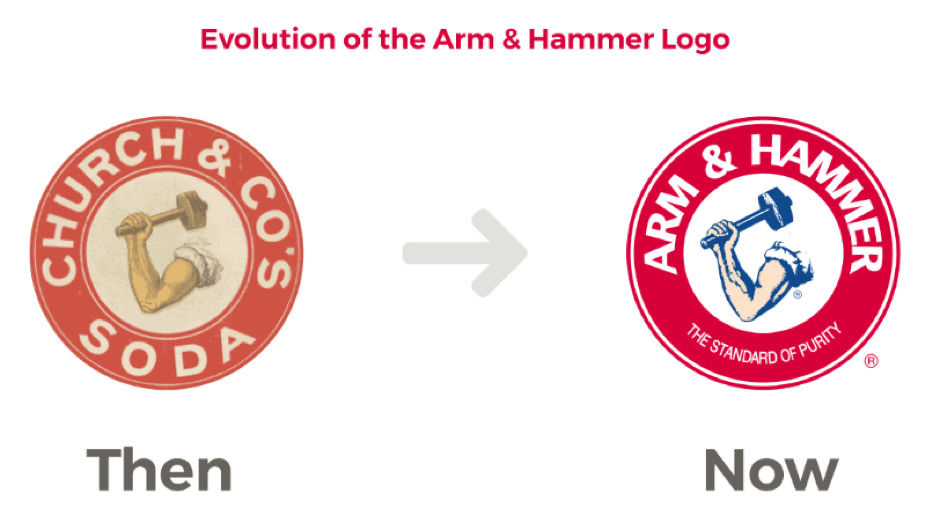
It is interesting to point out that many notable brands such as Arm & Hammer® have undergone dramatic transformations in terms of company growth and development, and even their logo over time. Despite the dramatic changes in the Arm & Hammer logo since inception in 1867, the core of the logo remains intact.
Based on the market research, 35% of Americans chose the right logo when asked to identify the Arm & Hammer company logo, while there were incorrect selections made based on fonts & tagline alterations, orientation of the image, incorrect colors etc., the image itself was correctly selected by a large number of respondents.
The intensive market research also found that 9% of women and 16% of men were more likely to choose a variation of a logo based on color, and people are particularly sensitive to generational trends.
For example, woman over 65 years old remember Arm & Hammer’s motto as bicarbonate soda as opposed to standard of purity. The ubiquity of this product in refrigerators, and grocery aisles has allowed it to remain a household brand over the ages. It’s one of those products that gets passed down from parent to child, and millennials have also noticed this in their own homes too.
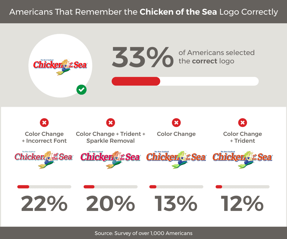
Healthy eating and healthy living is an intractable component of the millennial way of life. It comes as no surprise therefore that 40% of millennials can pick out the correct logo for Chicken of the Sea® as opposed to 27% of Baby Boomers.

The logo of a mermaid with a green tail, purple bathing suit and blonde hair is one of the most recognizable brands among millennials, especially among men. Men under 25 (18 to 24-year-olds) pick the right logo 45% of the time, compared to men over 65 who pick it right 28% of the time. Chicken of the Sea remains a hearty favorite in the US, especially among millennials.

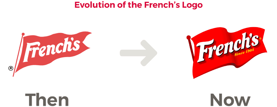
Another logo which is instantly recognizable to males and females is French’s mustard. Over the years, there have been slight modifications to the logo (a red flag bearing the company name), yet some 33% of polled Americans instantly remember the French’s logo correctly.
The company began in 1904, and it is the 24 – 34-year-old age group that wins out when it comes to correctly identifying this logo. Some 40% + of that age group accurately picks out French’s logo, compared to 31% for the 35 – 34-year-old age group, and 32% for the 45 – 54-year-old age group.
Women are marginally better at picking the logo correctly than men, with 34% versus 28%, yet both genders got the length of the flagpole wrong when picking up the logo.

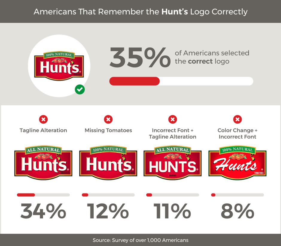
Hunt’s ketchup is another top-selling food brand that wins out with millennials. Since the caption on the logo reads 100% natural, that already resonates at a deep level with millennials. The 18 to 24-year-old age group correctly identified the logo 41% of the time, versus 28% for people aged 65+.
There is a degree of confusion between the words all-natural, and 100% natural, and this warrants further attention in terms of better defining the contents of the products in question. Nonetheless, this logo and the multiple elements that comprise it is easily one of the most recognizable in the grocery house, and millennials have no problem picking it out correctly.
What makes a logo recognizable? As part of the overall branding process, a logo comes to signify all the virtues of a product. When a company does a good job at marketing its wares to its consumers and does a good job at engaging the community on an environmental, and socially responsible manner, it is more likely to enjoy plaudits from consumers.
Good publicity, environmentally sustainable practices, and fair working conditions at companies often give rise to widespread adoption of their products in markets. The most important features of a logo are simplicity, engagement, memorability and colour. Timeless logos are more a product of their company’s performance and appeal in society than anything else. BP, FedEx, UPS, Coca-Cola and Nike enjoy that timeless appeal since they engage their customers in so many ways, on a daily basis!
Take the hassle out of designing a blog logo with Tailor Brands Logo Maker. Simply tell us a few details about your blog and we will take care of the rest. Get an awesome logo design in less than 5 minutes
This portion of our website is for informational or educational purposes only. Tailor Brands is not a law firm, and the information on this website does not constitute legal advice. All statements, opinions, recommendations, and conclusions are solely the expression of the author and provided on an as-is basis. Accordingly, Tailor Brands is not responsible for the information and/or its accuracy or completeness. It also does not indicate any affiliation between Tailor Brands and any other brands, services or logos on this page.
Products
Resources
©2025 Copyright Tailor Brands