
Company logos are more than a symbol of professionalism. Not only does a logo put a face to a business, but it is also a symbol meant to foster emotional connections with the company’s target audience.
Because of these “relationships” that form between a brand and their customers, all industries (especially media) face intense public scrutiny when they try to rebrand, which is why revamping your company logo design can either boost the company’s popularity or send their stocks into the gutter.
And, this year has witnessed a record-breaking number of rebrands – some of them successful, other ones less so. Since 2019 is coming to a close, we’ve decided to take a look at this year’s biggest logo changes and see what the major takeaways are.
Here are the top 10 logo design lessons we learned in 2019!
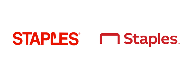
Staples isn’t just about office supplies anymore. The company, which now refers to itself as the “Worklife Fulfillment Company,” is rebranding itself as a one-stop-shop for everything workplace-related, from pens to electronics to office furniture.
The central part of this rebranding campaign? A fresh logo.
After more than 25 years, Staples has ditched its iconic logo—in which the “L” was shaped like a bent staple—in favor of a sleeker version. Now, the company’s name is written in title case for a slimmer design that’s less harsh on the eyes. The staple icon has also been moved to the left side of the word—leaving room for reinterpretation as an office desk.
Lesson: Consumers tend to love logos with hidden meanings—in this case, the staple-desk icon—because they’re both clever and memorable. You can pack a punch with your logo by elevating the concept, while keeping your design slick and clean.
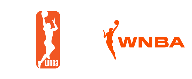
The Woman’s National Basketball Association’s new logo is one of the best rebrands of the year. While the former logo literally boxed the player in, the new logo lends the player new life and momentum.
Also, the figure in the new logo has a longer, more athletic physique. Her movements are broad and expansive. She’s graceful and balletic, yet powerful and free. As women break down boundaries in athletics, the new logo is both empowering and relevant to 2019.
At the same time, the swift movement of the basketball player is balanced with bold, broad lettering that brings to mind a wide, firm stance. This lends the logo an official, authoritative tone.
Lesson: There are many lessons here, but one big takeaway is to pay close attention to the role of white space in your logo. Boxing in your visuals can feel constrained, while surrounding them with ample white space gives them room to breathe.
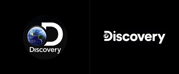
Discovery, the popular science and nature TV network also known as the Discovery Channel, has given itself a new look. The company has replaced its historic photorealistic globe with a two-dimensional, black-and-white rendering pinched by the “D.”
The new logo shifts its focus from the globe icon to the word “Discovery” itself, emphasizing the brand’s name. The sans-serif typeface is simple and minimalistic, making it clean and easily readable.
While the globe is static, it does show every continent, symbolizing not only the TV channel’s content but also the company’s global reach.
Lesson: Simple and snappy two-dimensional logos will be trendy in the coming years. When executed with creativity and precision, minimalistic logos exude confidence and are easy for audiences to remember.
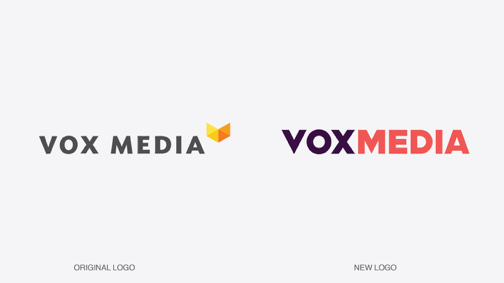
Vox Media—the owner of publications like Vox, New York Magazine, The Verge, and more—completely overhauled its logo this month. The decision to rebrand came when the company merged with New York Media and they wanted a logo that would better reflect their position in the market and their evolution as a company.
While the grey of the former logo lacks character, the new logo is loud, edgy, and confident. Rather than use the yellow icon to add a splash of color, Vox opted to abandon the icon altogether in favor of a bold, dynamic font.
The contrasting colors—and the unconventional combination of orange and deep purple in particular—showcase Vox Media’s original and occasionally unorthodox tone, and directly appeal to an audience that’s young, urban, and indie.
Lesson: If you’re looking to create a loud logo that steals the spotlight, go for contrasting color combinations and bold fonts.
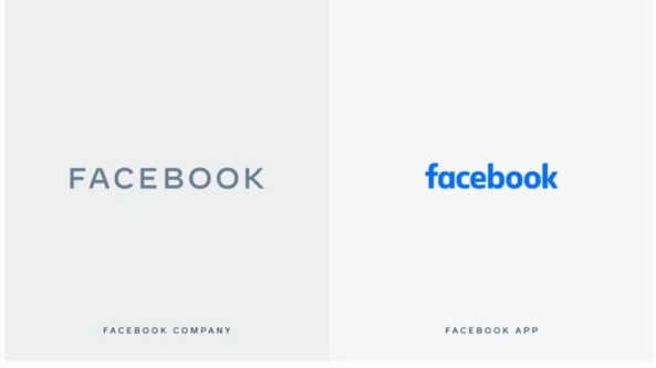
At the core of Facebook’s logo rebrand was the decision to create a visual distinction between the company name and the social network.
While the lowercase blue lettering will continue to be used for its social network, the company name is now rendered in a rounded capital, sans serif typeface. The sleek capital letters evoke professionalism and authority, an appropriate contrast from the social media app’s playful, cartoonish “f” icon.
The rebrand also gives the company the opportunity to include its name on subsidiary platforms without confusing its audience. The new logo will appear on Facebook-owned services such as Instagram and WhatsApp, with its color adjusted to appropriately suit each brand. For example, in WhatsApp the new Facebook logo will match the messaging platform’s signature green, while on Instagram it will appear in pink, purple, and yellow hues.
Lesson: In cases where a product shares the name of the umbrella company, logo design provides an opportunity to visually distinguish the company from its products.
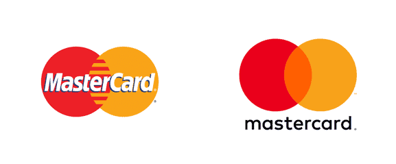
While Mastercard kept its interlocking red and yellow circles, it’s made sweeping changes to its logo this year.
The link between the circles is smoother and more interesting, with the left-hand circle’s seemingly translucent yellow adding visual depth.
More controversial is the removal of the company name from the logo itself. The logo now appears as a wordless image, with Mastercard confident that its signature circles are recognizable on their own.
The absence of the company’s name also symbolizes an even bigger shift—one away from credit cards and towards cardless digital solutions. With its new logo, Mastercard is promising to adapt to these changes and stay competitive in a cardless future.
Lesson: Stay modern and relevant by adapting to changes in technology and audience needs. As you rebrand, keep up with shifts in modern trends or changes in your company’s mission or services.
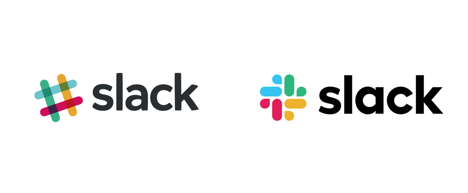
Slack has undergone a big new rebrand, transforming the original hashtag into a new kind of octothorpe (read: Pound sign). While the new burst icon retains the playful colors of the old logo, it uses only 4 colors in contrast to the original’s 11.
The main reason for Slack’s rebrand was that its original logo was extremely difficult to implement on a practical level. Because the former octothorpe used 11 colors, it was difficult to place on any color other than white. It also had a precisely described 18-degree rotation, making it challenging to apply across different channels.
In contrast, the new, burst-like icon follows a clear vertical grid. This, combined with its more minimal color palette, makes the new logo more versatile.
The most creative element of the new logo are the shapes within the burst icon itself. The icon is comprised of two shapes—lozenges and speech bubbles—and the speech bubble subtly alludes to users’ experiences on the platform.
Lesson: A great logo design doesn’t just look good—it’s also easy to implement across channels. Think about the impact color, angles, and white space has on your logo’s versatility.
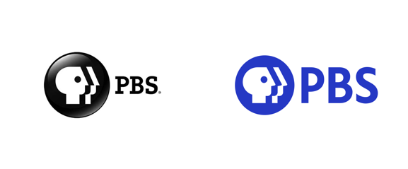
American public broadcaster PBS gave a welcome update to its logo this year. The larger typeface makes the logo name stand out, while the brighter blue logo color, clear logotype, and two-dimensional icon are more relatable and approachable for the modern viewer.
PBS opted to keep the central feature of its logo—the circular symbol with the human faces—while shifting the faces’ gaze slightly upward to make them appear more engaged. The symbol, while evolved, is timeless and continues to be relevant for PBS, a public television network with the slogan “for viewers like you.”
Lesson: If it ain’t broke, don’t fix it. If you decide to rebrand, don’t scrap your logo; instead, identify and keep the parts of your logo that work.
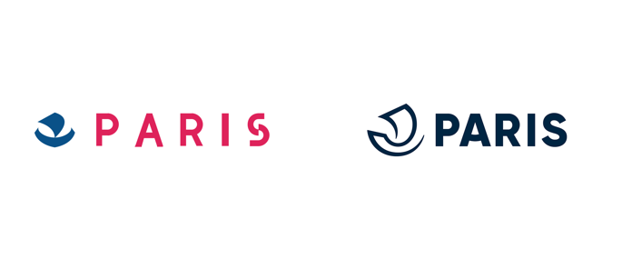
This year, the City of Paris revealed a brand-new visual identity with its new logo. The logo, designed by branding agency Carré Noir, is even sleeker, a rebranding trend we’re seeing across all industries and organizations.
As with Staples’ logo, Paris’s new look has multiple interpretations. The most literal interpretation is that of a nautical nave, a type of ship belonging to water merchants that played an integral role in the city’s historic growth. The other is a kind of spiral, a sweeping inward that represents the city’s welcoming, energetic atmosphere. As Carré Noir explains, the single-stroke nave icon showcases Paris as having a rendezvous with itself.
Though officially set in a monochrome navy blue to play off its nautical connotation while keeping it modern and mature, the simplified new logo is also suitable for a variety of color schemes and backgrounds.
Lesson: Changing the stroke of your logo is a simple way to convey a whole lot of meaning. Go for single-stroke visuals with playful, organic curves to suggest energy and movement.
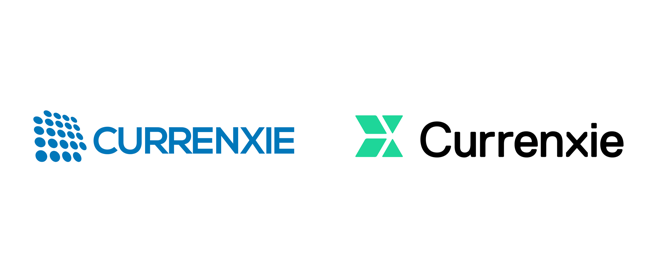
Currenxie recently updated its logo to include a title case and a brighter, friendlier shade of green. The series of circles in the former logo, while connoting digitization on the one hand, also seems to resemble coins. Currenxie’s new logo, in contrast, uses an arrow image to represent a forward-thinking, cashless future.
The switch over to title case is the new logo’s biggest advantage over the original. The capital “X” in the original logo made the pronunciation odd and unintuitive to those not already familiar with the brand. The new logo maintains the original spelling of the company name, but the use of title case makes it easier to read and more intuitive to pronounce.
Lesson: If your company name is included in your logo, think about how your logo design will impact the readability and pronunciation of your brand.
A logo design needs to match the spirit of a brand—its mission and values, its product, and its target audience. In 2019, several companies rebranded themselves and redesigned their logos to showcase their evolution as a brand and stay relevant to modern audiences.
Take a look at these brand redesigns, and think about what worked and what didn’t. How do these new logos successfully represent their evolved brands? Is there anything they could have done better?
As you create your own logo, take the lessons these new logos teach—like the preference for minimalism, the simulation of movement, or the versatility of certain shapes and colors—and use them to inform your own logo design strategy.
If you’re ready to create your logo, read this post to find out how much a logo will cost you this year, and learn about your best value-for-money design options!
Products
Resources
©2025 Copyright Tailor Brands