You need a logo that sets you apart from your competitors, captivates your target audience, and expresses the core essence of your brand. The key to doing that is by choosing the right color for your logo.
The color you choose for your logo shouldn’t be an afterthought or a random decision. It’s important to know the meaning behind colors in order to pick the right one for your business.
If you’re considering a gold logo, this post will help you decide if it’s the right choice. I’ll cover the message a gold logo sends, how to use it with different design elements, and which industries benefit most from using gold logos. Let’s jump in!
Colors have a significant impact on our body, mood, and even emotions. It’s important to keep in mind, however, that culture, experience, and upbringing all play a role in how colors are interpreted.
If you want your logo to express attributes like wealth, success, confidence, luxury, elegance, and accomplishment, gold is the color for you. Let’s look at how some well-known brands use gold in their logo.
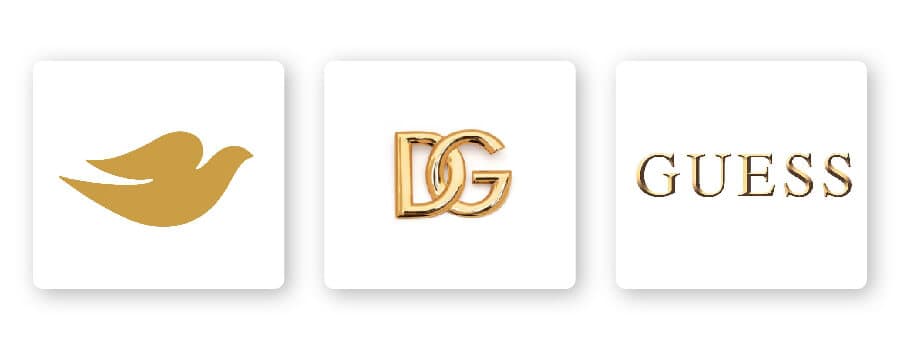
Many fashion brands use a gold color scheme for their logo. Consider Dolce & Gabbana—a gold logo is fitting for the Italian luxury fashion house. The same is true for clothing company Guess; they chose a gold logo to elevate their brand and instill confidence and glamor in their target audience. As a personal care brand, the golden Dove logo symbolizes messages of wisdom, passion, and elegance.

Certain design elements combine well with gold logos. Let’s check them out:
Bolster your brand by using the right typography for your logo. Review the 5 main font families to determine which one suits your brand best.
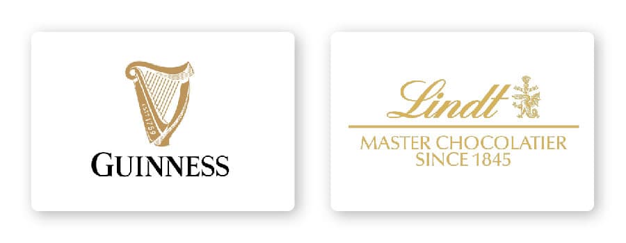
Serif – Using a serif font tells your audience that you’re a well-established and traditional brand. Guinness’s logo, for example, is a serif font, which helps reinforce the message that the gold icon sends.
Sans serif – Sans-serif fonts, or fonts without the “feet” at the edges, can work with powerful and sophisticated brands–the perfect pair with gold!
Slab serif – A slab serif font has block-like letters that make a bold impact. This type of font is often used by car and technology companies, but you’ll also see it in brands that want to mimic a typewriter feel.
Script – Depending on how it’s used, script fonts can feel whimsical and fun or traditional and timeless. Lindt, for example, pairs script with the color gold to promise their customers a luxurious chocolate experience.
Decorative – Loud, fun, and entertaining, decorative fonts work for brands looking to make their mark.
Of course, these are just general rules, but by no means are they set in stone. Feel free to play around with different font combinations.
Whether it’s a circle, square, or abstract design, the right shape can allow you to forge a strong emotional and psychological connection with your audience. In order to choose the right shape and incorporate it into your logo design, it’s important to understand what each shape means and how it relates to your brand.
As discussed earlier, gold represents attributes such as wealth, success, confidence, luxury, passion, accomplishment, and power. With that being said, there are certain shapes that pair well with gold.
Emblem logos work with gold because it’s a shape that signifies mystery, balance, and strength. Ever since the Porsche emblem was introduced to the U.S. market, it became an instantly recognized symbol of luxury and power in the automotive industry. Similarly, the Versace logo is an emblem depicting the head of Medusa, a Greek mythological figure. Versace chose this particular design because Medusa symbolizes beauty, strength, and power.
An icon is another popular choice for logo design given it’s a symbol that conveys immediately recognizable values. Animal imagery can help brands cement their values and characteristics in their audiences’ minds. Animal logo icons work with gold because they can express luxury, mystery, intellect, or virtually any other characteristic your brand is about. Going back to the Porsche example, a black horse is the centerpiece of its emblem logo representing power and strength.
As mentioned earlier, colors are subjective and there’s no right or wrong way to use gold in a logo. However, you should use gold if it’s consistent with one of your brand messages and/or values. Or, you can use gold to differentiate yourself from competitors’ logos.
If your brand falls under one of these industries, here are a few ideas for how to use gold in your logo:
Entertainment companies such as Metro-Goldwyn-Mayer (MGM) and Warner Bros. Entertainment use a gold emblem logo to convey qualities such as excellence, accomplishment, and Hollywood glamor.
For luxury, high-end car companies like Chevrolet, Lamborghini, and Porsche, all use a gold logo to highlight particular characteristics their target audience is seeking. Customers who purchase from these auto brands want to prove their success, feel sophisticated, and have a sense of accomplishment for having the best car on the road.
Cadbury, Lindt, and Toblerone—each of these tasty chocolate companies use gold as their logo color. Chocolate is decadent and indulgent, which makes gold a great color to complement those brands.
Gold is possibly the most luxurious color. For luxury brands that want to exude a sense of sophistication and elegance, gold is the color for them. Consider Rolex and Chanel—both have rich, affluent gold logos.
Self-care is all about allowing yourself to indulge and pamper yourself, which is why bath and body brands like Pantene and Dove have a gold logo. These brands attract customers by using gold to help promise they’ll have a quality, luxurious self-care moment.
Law services need to express intelligence and accomplishment, power and strength. This is why law services benefit from utilizing gold in their logo design. A gold logo helps prove they are industry leaders and motivated to be the best.
I’d advise you to look at what your competitors are doing and see if gold is a commonly used color. If it’s too common in your industry, then you might want to use an alternative color to stand out. If it isn’t used enough, however, ask yourself if the psychology of the color will work with your brand before choosing it.
Gold can be pretty versatile depending on the colors you combine it with. Let’s take a look at some examples of gold logo color combinations:
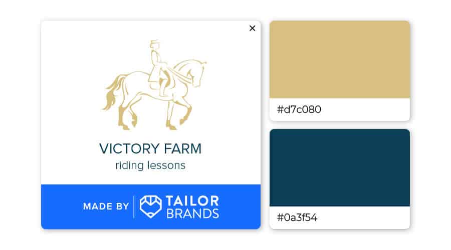
If you’re wondering what goes with gold, any shade of blue works like a charm. I love how Victory Farm’s logo paired gold with blue (almost green) to create a sophisticated, established look.
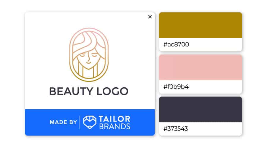
Who would have thought to pair dark gray, pink, and golden brown? This is giving calming yet elegant vibes. Love to see an unexpected trio! It’s a great reminder to have fun with logo color combinations.
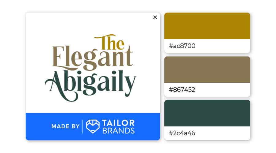
Gold, brown, and green are classic pairings. Brown and green are colors found in nature, so it’s pleasing to the eye. When you add gold, like in The Elegant Abigaily logo, you’ll have a winning design.
Gold can either be bright and happy or serious and traditional depending on the other design element it’s used with. If you’re considering a gold logo, head to our logo maker to play with different design elements, color combinations, shapes, and more until you get the design that’s right for your business.
This portion of our website is for informational or educational purposes only. Tailor Brands is not a law firm, and the information on this website does not constitute legal advice. All statements, opinions, recommendations, and conclusions are solely the expression of the author and provided on an as-is basis. Accordingly, Tailor Brands is not responsible for the information and/or its accuracy or completeness. It also does not indicate any affiliation between Tailor Brands and any other brands, services or logos on this page.
Products
Resources
©2025 Copyright Tailor Brands