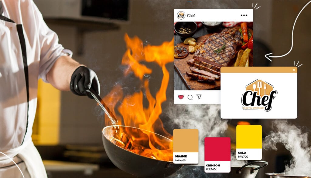
Creating a one-of-a-kind logo for your restaurant is kind of like deciding what you’ll offer on your menu. An upscale restaurant might offer only select chef specials, while a diner would go with classic American fare. The same is true for your logo.
Scroll down for tips to help you make a 5-star restaurant logo. Then keep scrolling to check out some restaurant logos by niche for some inspiration.
Designing a 5-star logo is like following along with a recipe. Carefully consider all the ingredients that go into making a good restaurant logo before diving right in. Here are 5 things to keep in mind when designing your restaurant logo.
Appeal to your target audience. friendly, gluten-free menu not found elsewhere in the area. Your customers are those who have food allergies and celiac disease, and they’ve chosen your restaurant because they finally have a restaurant where they know they can eat anything on the menu without fear. The point is to make sure your logo speaks to your target audience.
Storytelling. What’s special about your restaurant? Do you offer a unique dine-in-the-dark experience? Or maybe your menu consists of unique ingredients. The reason why you started your restaurant and the food you serve are pieces of a bigger story. Convey that story to your customers through your logo and they’ll flock to your restaurant.
Creativity. Creativity is an all-important yet sometimes elusive thing to achieve. Everyone wants their logo to be a creative masterpiece, but it’s definitely not easy. Creative logos are eye-catching and create emotional connections between your brand and customers.
Differentiation. It goes without saying that you want your restaurant to be different from others. A good logo can help you stand out by presenting your brand’s unique identity. Tying back into storytelling, when your brand has a mission and values, it’s easier to create a unique logo. Wendy’s is a good example: The freckled red-haired girl is the founder’s daughter. Sure, they serve burgers like other chains, but only they emphasize strong family values in their logo and brand. Check out more ideas for creating a different, totally unique logo here.
Simplicity. All that being said, you might have tons of ideas bouncing around your head. And that’s amazing! However, it’s key to keep it simple. If you have a lot of details in your logo, it can bog down the overall design making it hard to read and illegible.
Taking a look at the various fashion logo types may help you figure out what works for your niche. Scroll down to check out 6 types of restaurant logos:
Fine dining restaurants are high-end, fancy restaurants catering to an upscale clientele serving high-quality food. Many logo designs share certain characteristics such as unique fonts and limited color schemes.
Fine dining restaurants are high-end, fancy restaurants catering to an upscale clientele serving high-quality food. Many logo designs share certain characteristics such as unique fonts and limited color schemes.
Dining at Attica is, according to their website, “a commitment of time and money” which tells you a lot. Everything from their cutlery to their music taste is as carefully curated as the rare and unique ingredients on their menu. The most striking element of Attica’s logo is their unique shape. A logo shape holds a lot of meaning; circles, ovals, and ellipses tend to give a brand an air of mystery and draw attention. Attica’s black blob is simple yet elite and intriguing.
Sometimes a wordmark logo (solely featuring the name of a business, no icon included) can be a powerful statement. Two important parts of a wordmark logo are weight (how thick or thin the characters are) and casing (uppercase or lowercase). Often, a wordmark logo is ideal for businesses that have been around for a while. Gage & Tollner has been a mainstay in Brooklyn for more than a century. So all the restaurant needs is a slightly funky, not so ordinary font to stand out while also standing the test of time.

The team behind Mélisse consists of Michelin-star chefs, sommeliers, and master chefs. To capture that expertise and excellency, Mélisse’s logo is punctuated by its beautiful, effortless font. There are various types of font families, each with their own meaning and purpose; script fonts resemble handwritten calligraphy. Defined by their artistic curls and flourishes, script can add a beautiful and sophisticated touch. Also notice how the logo uses 2 fonts to add more dimension and create a design hierarchy.
There is a growing interest in vegetarian diets and surveys report many people are adopting a vegetarian diet. These types of restaurants attract individuals who eat vegetarian food and prove that vegetarianism is more than just boring broccoli and brussel sprouts!
Dirt Candy’s motto is “because vegetables are just candy from the dirt.” And for anyone who’s never eaten there, that probably sounds crazy. But trust me, I’ve eaten there and it’s really good! On a mission to make vegetarian fun, delectable, and memorable, Dirt Candy’s logo captures all that and more. When used right, an icon helps your logo stand out. What really stands out is their icon. A spoon and fork resembling the leaves on a flower, a hypnotic hot pink pinwheel as a flower, Dirt Candy’s icon jumps right out and claims a space in the vegetarian restaurant world.
Meme’s Twisted Potato promises flavorful comfort food produced from local farmers. They decided to have some fun with their logo by going with a unique icon resembling a meat kebab with a vegetarian twist. Plus, the small little salt shaker in the corner is a cute touch! Using an icon to your advantage is a great way to differentiate your restaurant from others and draw attention.
A logo is meant to clearly indicate what your business is all about to your target audience, and sometimes choosing a simple logo is the best way to do so. What Rawlicious’ logo does right is their use of font. From the all lowercase font, the way each letter is spaced apart, and using black to create a design hierarchy, this logo is a 10/10.
Who doesn’t love a play on words? The Daily Beet designed their logo taking inspiration from their restaurant name. The circular, paint-like strokes evoke a laid-back, homemade approach. They followed through on theme by using a beet-red and green color scheme. The Daily Beet proves that taking inspiration from your restaurant name is a great way to build brand recognition.
Travel the world through food! International cuisine allows you to taste authentic recipes from every country around the world. If you’re in the international cuisine business, boundless inspiration is right at your fingers!
Korean for “skewer”, Kochi offers a 9-course menu of skewered dishes inspired by traditional Korean cuisine. So what better way to showcase the skewer theme than by skewering right through the logo? As I mentioned before, taking inspiration from your restaurant name is a great way to ensure your logo is unique, stands out, and is memorable.
Oxomoco is an airy Mexican restaurant offering authentic dishes and creative cocktails. There are 2 design elements featured in their logo that make it memorable. The first is the color palette; pairing light brown with blush purple evokes a welcoming and classy vibe. The second standout here is the all uppercase, tight sans-serif font. It could have been overcrowded and hard to read if there were additional design elements, but by itself, it only emphasizes the warm Mexican culture Oxomoco is all about.
Hoppers menu features dishes inspired by Sri Lanka and South India. Judging by the hopping shirtless waiter in the logo, Hoppers is a come-as-you-are and everything goes kind of restaurant. It’s safe to say this is one logo that you’re not likely to forget anytime soon!

Flower Drum is a reputable, food critic flocking Cantonese food in Australia. Playing off their name, Flower Drum chose a flourishing font with each letter blooming. The thick, bold font also demands attention. If there were any other design elements (loud colors, icon, shapes, etc), the logo would’ve looked messy and potentially turned people away. Instead, the fascinating logo intrigues and invites people in to grab some authentic Cantonese food.

There’s nowhere better than a diner to grab an inexpensive bite. From Caesar salads to classic hamburgers and milkshakes, you know what you’re getting when you go to a diner.
San Diego’s oldest and most beloved diner, Harry’s Coffee Shop is truly an institution. The first thing to note is the smart use of red. If you think about popular restaurants, many of them feature red in their logos: Pizza Hut, McDonald’s, Wendy’s, DQ, and so many more. The reason is that red makes people feel hungry.
The Pantry Restaurant & Deli has been providing quality food and service to their community since 1978. I’m not sure if I love this logo’s orange bubble font (fun fact: Orange is a color that makes people hungry) or the apron-wearing cartoon mascot. A mascot logo is a unique way to set you apart from the competition (especially in a crowded space like restaurants) and become instantly recognizable.

Winstead’s Steakburger has been serving Kansas City for 70 years. To pay homage to their long history, Winstead’s went with a vintage logo. Vintage logos convey a promise to customers that they’ll experience a flashback in time. And, let’s be honest, vintage has made a comeback in recent years.
In cafés, light refreshments, such as baked goods or snacks, are typically served along with coffee and tea. Many cafés feature cozy vibes that make you want to curl right up with a cup of coffee.
Bluebird Cafe is everything a cafe should be: Family friend featuring Midwestern soul food and all-day breakfast! The varying shades of blue color scheme reinforces their “come on in and relax” vibe. The rectangle shapes with cut outs convey establishment and tradition.
Sightglass is an independent, sibling-owned coffee company in San Francisco. They practice small production methods, which allows them to pay careful attention to detail for each cup. The typography used in their logo is what stands out the most. The all caps, thin, crisp, and clean font wraps around the circle it’s inside of.
According to their website, Blue Bottle cafes are designed to focus on good coffee, daydreams, conversation, and the coffee professionals who make it all possible. In service of that aim, they use “blue bottle blue” and “fog gray” color schemes in their logo. What stands out the most is the pictorial mark (AKA, a brand mark, which is a simple and straightforward graphic symbol) of a blue bottle. The advantages of using this particular image is that it’s easy to remember, sends a quick, clear message to passersby and customers, and translates well when resized.
The founder of 85°C Bakery Cafe, Mr. Cheng-Hsueh Wu, visited a cafe in a 5-star hotel. Despite enjoying gourmet pastries and drinks, he realized they were too expensive for people to eat out regularly. Mr. Wu envisioned a cafe that provides premium coffee and pastries at affordable prices. 85°C Bakery Cafe is not an ordinary cafe and neither is their logo. What’s striking is the red square. Red is an exciting, energizing color that is even known to increase your heart rate, and jumpstart your appetite.
There are upscale restaurants and then there are world-renowned, award winning chef-owned restaurants.
Spanish chef Martín Berasategui has more Michelin stars than you can count. Because Martín Berasategui is the face of his brand, a personal logo was a no-brainer. Personal logos act as the graphic representation of the artist (or, rather, chef). A signature logo here is a great call.
Award winning mastermind Quique Dacosta chose to use his name as his logo. This logo is everything that I talked about earlier: It’s simple, different, and creative. The open letters and clean lines elevate the design even further.
Chef Maezaki is a trained master in the art of traditional sushi and California fusion cuisine. The all cap serif font highlights the world renowned chef and tells customers what kind of restaurant they’re going to.
There’s a lot of factors that go into making a great restaurant logo. Remember the 5 things to keep in mind when designing a logo (target audience, storytelling, creativity, differentiation, and simplicity). Take note which restaurant logo you liked best in your niche. Follow these steps and you’ll be on the way to creating a 5-star restaurant logo.
This portion of our website is for informational or educational purposes only. Tailor Brands is not a law firm, and the information on this website does not constitute legal advice. All statements, opinions, recommendations, and conclusions are solely the expression of the author and provided on an as-is basis. Accordingly, Tailor Brands is not responsible for the information and/or its accuracy or completeness. It also does not indicate any affiliation between Tailor Brands and any other brands, services or logos on this page.
Products
Resources
©2025 Copyright Tailor Brands