
There’s a lot to consider when designing your logo: An organized layout that’s legible at any scale, an on-point icon, and a font that matches your brand. But choosing the right colors for your logo can be a struggle, and rightly so. There’s a lot riding on your decision. Your logo’s color palette can connect with your target audience on a deeper psychological level, stir up specific emotions, and convey your business values.
If you’ve been stuck in a never-ending ping-pong between colors, I’ve got your solution. This is what you do: You choose a neutral color (black, gray, beige, or brown) and an accent color (anything from Rudolph red to sky blue). From that starting point, you have endless options at your disposal by using varying shades and tints.
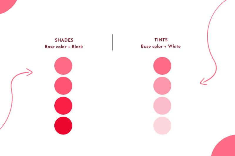
In art terminology, tints and shades are the lighter and darker variations of a single color. A tint is created by adding white to get a lighter version of the color (e.g., pink is a tint created by adding white to red). A shade is when you add black to a color to darken it (e.g., navy is a shade of blue).
Using tints and shades in your logo design can help simplify the color selection process. It also gives your design a polished, united look.
There are different ways to use tints and shades in your logo design. Check out the following ideas and examples:

You can create contrast, visual interest, and versatility in your color palette by varying the lightness or darkness of a base color. Using varying shades of your color palette will automatically make your logo pop. Ashley’s Travel Blog takes 2 shades of blue to create contrast and visual hierarchy. The lighter blue is light like the tan/pink background, causing the business name in dark blue to stand out.
A second point worth noting: You can create contrast by pairing saturated colors next to desaturated ones. As another example, The Guardian’s logo uses a light gray/blue color that almost fades next to the more eye-catching word “Guardian” in a deeply saturated blue.




Gradients are a gradual blending from one color to another color, which makes it a great way to add multiple tints and shades at once.
Globoplay, a subscription streaming service, is an excellent example of a gradient tint with the left side of the logo being true red tapering to orange. Same with Asana’s pink to orange. The Movie Database (TMDB) showcases a lovely gradient of green to blue.
Using gradient shades can add movement and depth to your logo. Luxury car brand Jaguar features a sleek silver and metallic cat mid-leap symbolizing integrity and performance. Imagine if their infamous icon was just silver. It would lose its dimension and pop.


As I mentioned before, tints and shades can create depth and dimension in your logo. PayPal’s monogram is accented by dark and light shades of blue. The darker ‘P’ is brought into the foreground creating depth and intrigue. Similarly, Mastercard’s red and orange circles overlap to add contrast as well as depth.
Urban Strech’s logo took a page from PayPal’s book. Take away the light electric blue corners of the logo, it would be boring, right? By adding the light blue under the dark blue, you’re intrigued.

Applying a colorful shade or tint to your font can tie your whole logo design together. Yumi achieved this idea by applying the brown avocado core to the text. Noema’s logo took a different approach, but still achieved the same effect. The dark blue font is a stark contrast to the electric blue background it sits on.
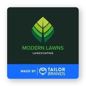

Combining multiple tints and shades to your design can make for a memorable and unique logo. Tailor Brands’ very own Modern Lawns Landscaping logo is a perfect example of showcasing this concept. Their logo took 4 different shades of green to create a visually intriguing logo.
Similarly, Animal Planets’ old logo combined 3 tints of green to organize the layout. By varying the color of the thick block text, they were able to visually separate different parts of the layout. The result: A striking logo design that looks busy without visually overwhelming elements.

Never underestimate the impact a one-color palette can have on your logo. After all, the one tip you should keep in mind when designing your logo is to keep it simple. Single color palettes depend on tints and shades to provide enough variations to keep things interesting. B Cosmetics’s logo features a blush pink background that allows the dark purple text and icon to pop. Clean, striking, and modern.
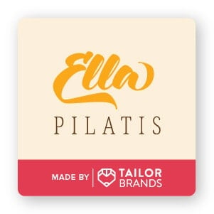
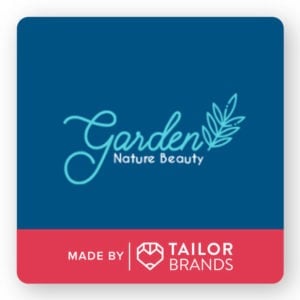
Even if you don’t go with a single color palette for your logo, keeping it simple and similar to the background color will result in an appealing, clear, and uncomplicated design. In addition to the 2 shades of blues, Garden Nature Beauty’s logo includes a white pop of color to accent the design. The same can be said of Ella Pilatis’s logo, which includes a light orange (almost yellow) background as a backdrop to the bright orange and brown text.
Hopefully, I’ve inspired you to add tints and shades to your logo design. Remember to begin by choosing a neutral color and then an accent color. With those 2 colors, you can play around with different tints and shades to get the perfect logo design.
This portion of our website is for informational or educational purposes only. Tailor Brands is not a law firm, and the information on this website does not constitute legal advice. All statements, opinions, recommendations, and conclusions are solely the expression of the author and provided on an as-is basis. Accordingly, Tailor Brands is not responsible for the information and/or its accuracy or completeness. It also does not indicate any affiliation between Tailor Brands and any other brands, services or logos on this page.
Products
Resources
©2025 Copyright Tailor Brands