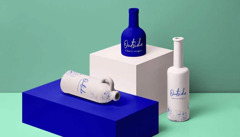
As an avid wine drinker, I won’t deny that the presentation is half the reason I reach for a bottle on the shelf.
Sure, I have my go-to brands, but when I’m feeling adventurous, it’s the packaging that does me in. Hands down, the first thing that draws me towards a new type of wine is the logo.
Once I graduated from boxed wine (anyone who’s been a broke college student knows what I’m talking about), it was all about finding the bottles that looked the best and sticking to them. And now, when I land on a wine I like, I commit – a phenomenon known as brand loyalty.
Take it from a wine enthusiast: A good wine logo will determine whether you attract new customers to your brand and hopefully convert them into lovers of your grape.
So, if you’re ready to put your audience on cloud wine, check out the best styles and design tips before you create your logo.
Before we jump into wine-logo specifics, let’s take a look at some of the fundamentals of general logo design. There’s no one-size-fits-all for a good logo, but there are some universal tips that are important to know beforehand:
Make a logo for your brand. Different styles will work for different brands, depending on the brand’s personality. The muted tones of a relaxing spa logo would not have the same effect on the audience of a tech company that wants to be viewed as innovative.
Likewise, if you want your brand to emphasize the rich history of your family’s vineyard, you’ll probably go with a different font style and color palette than, say, a modern bar that specializes in affordable wine for college students.
So, before you start designing, it’s important to think about your brand’s personality and the image you want to portray to your audience.
Learn the psychology behind different design elements. Shapes, colors, and fonts all pack “emotional power” in logo design.
Triangle logos symbolize movement and action; black-and-white palettes represent sophistication and authority; serif fonts tend to exude elegance where sans-serifs are more modern, etc. Every element you incorporate in your wine logo will say something about your brand, so do your homework beforehand.
Take stock of your industry. Although your logo should be unique, every industry has its logo tendencies, and the wine industry is no different. As you’re browsing through competitors’ logos, take note of the kinds of imagery and styles they use.
Grapes will repeatedly make their way into these logos, as will “appetizing” fonts and color palettes. You’ll also see some more traditional styles that draw on the cultural and historical aspects of winemaking – but we’ll get to that below.
On that note, let’s look at some of the top categories of wine-logo design.
As you’ve probably understood by now, there are a lot of directions you can take when designing your wine logo. However, the wine industry currently shares a few main styles, as many wine-related brands have the same goals in mind.
Let’s take a look at some of the most popular types of wine logos:
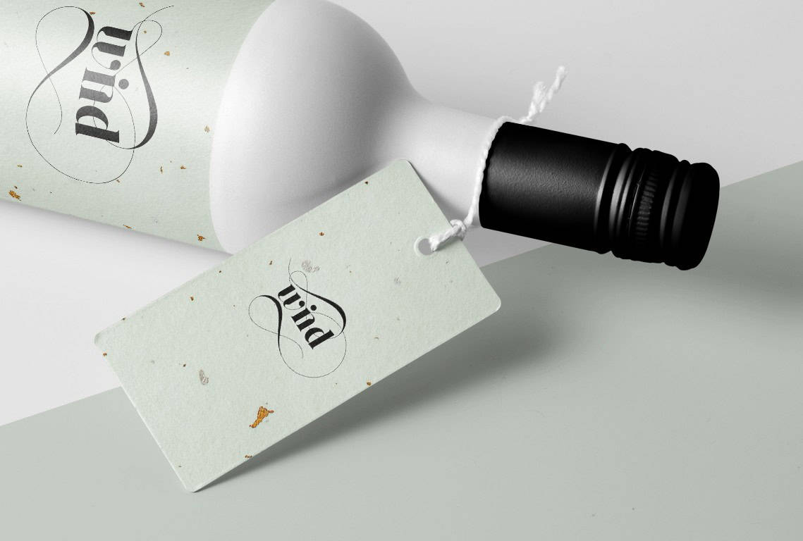
The wine industry loves traditional-style logos, because they give off an air of prestige and elegance – a message that’s perfectly suited to top-tier brands.
What makes a logo “traditional”? There’s a wide range of styles that can check the time-honored box, but a few well-known ones stick out:
Vintage-style wine logos overlap with traditional logos to some degree, though you have more flexibility to personalize this kind of design. In general, vintage logos tend to recall the past for the viewer, which is an advantage for brands who want to seem like they’re established in the wine world.
They typically look hand-drawn and use retro scripts or expressive serif fonts to give the logo an elegant, timeless look. Vineyard owners might want to consider using a vintage design, as they often feature natural scenes, like planes of grass rolling hills.
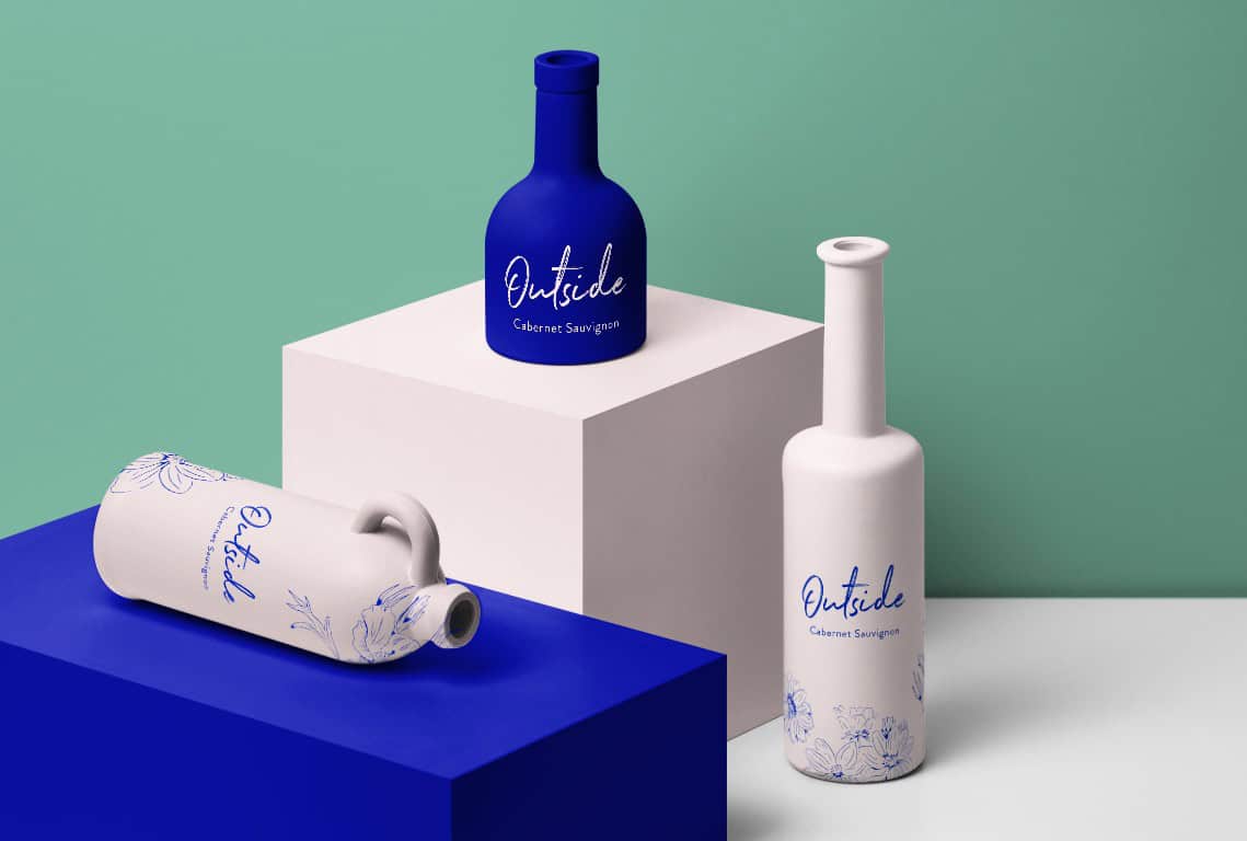
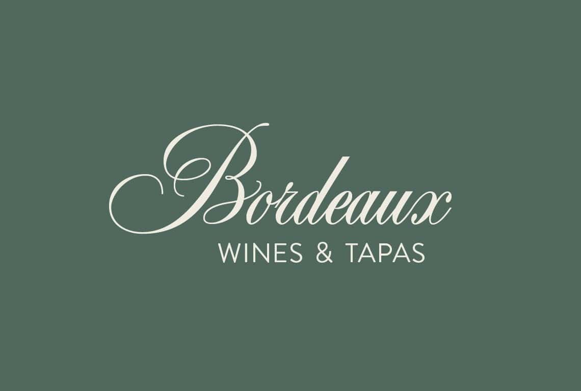
Not every wine logo needs an icon or image to make it powerful; some stand on their own with just a typeface. Wordmark logos are usually stripped down but versatile, and they help foster brand recognition in your audience.
We’ve mentioned serif fonts in particular a couple of times, because they’re reminiscent of class and traditionalism. However, you can also consider using a cursive font to give off a graceful – and even playful – image.
We’ve been talking a lot about traditional styles, but there are also advantages to breaking from tradition and forging your own unique approach. As a brand, it’s super important to distinguish yourself from competitors and make sure that you’re memorable – and sometimes, the best way to do that is to look toward the future.
Modern logos tend to be more abstract, quirky, and favor minimalism. Some designs are big and bold, while others are understated and playful. Don’t be afraid to experiment with logo elements, and see if you can come up with a modern design that still gets your brand message across.
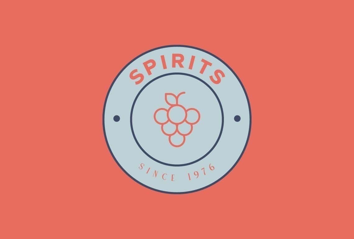
Grapes may seem a bit too on-the-nose for a wine logo, yet the image is often overlooked – and can be used to your advantage. Both aesthetically pleasing and rich in symbolism, grapes will automatically open your audience’s palette.
And, you may want to consider incorporating grapes in your logo if you want your wines to be known for their impeccable taste.
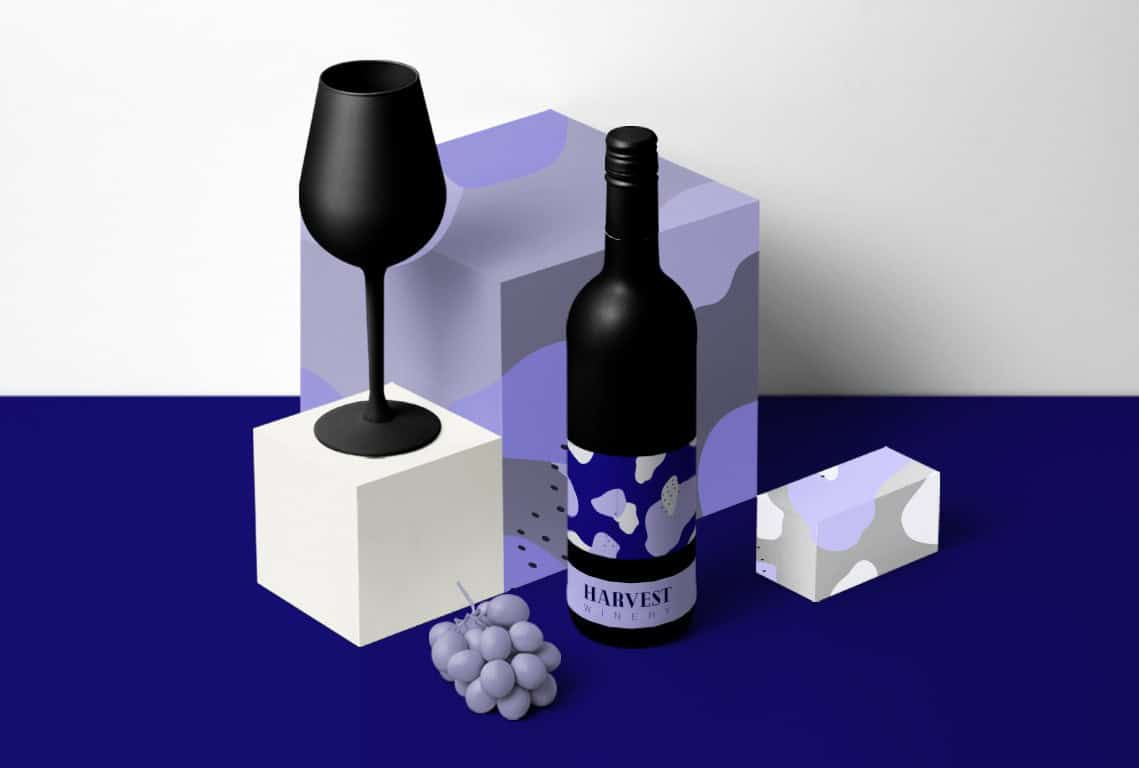
Now that you have an overview of some of the most popular wine logo styles, it’s time to design your own! Remember to think about your brand message and the kind of feelings you want to evoke in your potential customers when they first see your wines.
Need help designing your wine logo? We got you covered! Use Tailor Brands Logo Maker and start creating the perfect logo for your business.
This portion of our website is for informational or educational purposes only. Tailor Brands is not a law firm, and the information on this website does not constitute legal advice. All statements, opinions, recommendations, and conclusions are solely the expression of the author and provided on an as-is basis. Accordingly, Tailor Brands is not responsible for the information and/or its accuracy or completeness. It also does not indicate any affiliation between Tailor Brands and any other brands, services or logos on this page.
Products
Resources
©2025 Copyright Tailor Brands