If you’ve thought about creating a logo, typographic logos should be one of the first types of logos that you consider.
Without icons and abstract images, typographic logos—or text-only logos—get to the bare essentials of who you are as a company. They help you to express your brand’s character through distinct colors, letter style, and clever font tweaks.
The world’s biggest brands, like Facebook and Google, understand the power of typographic logos and how best to use them, and by the end of this post, you will too!
Most logos are made up of a few design elements: Fonts, colors, and icons or symbols.
Typographic logos use the first 2 elements but skip out on the third. They’re typeface-based logos, meaning they usually only rely on text – set in some sort of specific design – to catch the eye of their intended audience.
If you use a typographic logo to represent your business, you’ll still have a lot to play with, like colors, sizing, spacing, and alignment. That said, the thing at the center of any typographic logo is its font.
Different fonts have distinct personalities, and they’re usually separated into families that, as a group, are able to convey varied messages. Now, most typographic logos use 1 of 4 font families: Serifs, sans-serifs, scripts, or decorative fonts.
Serifs have little “feet” at the edge of their letters or symbols, and they’re typically used for brands that want to appear traditional, respectable or sophisticated. Sans-serif fonts, on the other hand, lack those feet (or flourishes), and they make for a clean, honest, modern look (great for digital print!).
Scripts are cursive-like fonts that often resemble signatures, and they give off an elegant, personalized feel. Finally, decorative fonts have a more unique style, and they’re best suited to shorter typographic logos that want to come off as casual, fun or creative.
Now that you know what typographic logos are and how they use different font families to make their mark, let’s take a look at 12 clever typographic logos, and what they do to draw their audience in.
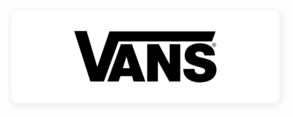
The Vans logo looks pretty simple on the surface. It uses one color, it’s in all-caps, and the font itself isn’t overly exciting, unique, or exotic.
But, it does have one design element that causes it to look wildly different from similar logos: a ‘character feature’ added to the V. Not only does the feature make the logo stand out, but it also signifies forward movement, so that the vans audience can imagine themselves running or being active in vans shoes just from looking at the logo.
Consider using a character feature in your own logo that says something about the type of service you offer or value you provide your customers.
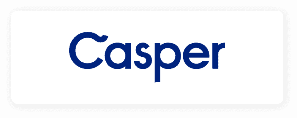
Similar to Vans, Casper’s logo has a unique character feature, uses one color, and boasts straightforward typography to create a clear wordmark logo that’s easy to recognize. The extra curl added to the C helps the logo stand out and remain unique, even if someone else were to use the same font and color scheme.
While the text is the main attraction in a typography logo, you can create a unique look using color to catch your audience’s attention.
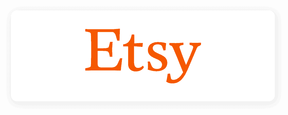
The Etsy logo uses a regular serif font, with a lighthearted, yet not over-the-top orange. Primary colors red, blue, and yellow are much more commonly used in logo design, so choosing a non-primary color is an excellent way to separate yourself from the crowd.
If you’re a reliable brand with a respectable history and traditional values, try using a serif font like Etsy does. You can experiment combining bold colors with different typefaces to create a unique logo that represents your brand.
Another way you can use color effectively is to change the color of one letter or word in your logo. For the best results, change the color on the letter that you want to emphasize the most. Flickr changed the ‘r’ in their logo to bright pink. Compared to the rest of their logo, it immediately stands out.
Mobil used a similar tactic to Flickr, switching the color of the ‘o’ in their otherwise blue logo to red. The color change contrasts brilliantly against the rest of the logo to create a unique brand identity.
It’s hard to talk about logos and not include the FedEx logo. Even though it was designed over 20 years ago in 1994, it’s still used as an example to showcase how a simple typographic logo can remain as fresh as it was two decades ago.
They use two colors to represent the different sectors the company works with, along with the hidden arrow to signify speedy delivery—showing how thought-out spacing can create double meanings in your logo.
Did you know that the Cadbury logo was based on William Cadbury’s signature? It’s remained unchanged since 1921, with only minor tweaks to the design. Deep purple is a color that strongly represents royalty and high-quality, which serves the brand’s image of having once been Queen Victoria’s favorite brand of chocolate.
Like we mentioned above, note that the color of your logo is just as important as the typeface, spacing, and layout.
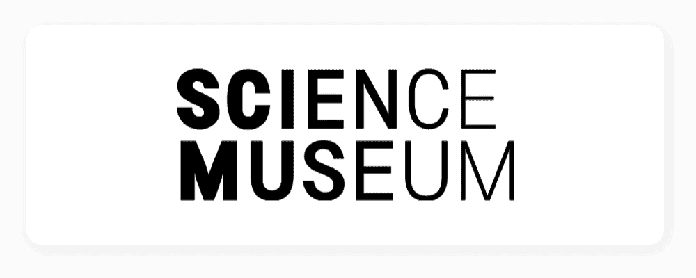
The London Science Museum recently rebranded their logo and even caused a bit of controversy, after the previous design agency tweeted some unkind comments.
The new logo features a sans-serif font, which slowly turns from a bold font into a thinner, regular-sized font. The gradient color palette works well with the design, helping to form a logo that’s in motion.
If your brand is modern, with a clean history and strong digital presence, consider using a sans-serif font. And, nothing is stopping you from using varying font weights in your own logo in order to tell a story.
Coca-Cola’s unique script typeface manages to evoke feelings of happiness and maybe even sets off your taste buds. Script types that mimic handwriting are elegant, personal, and can showcase a brand’s creative side. And, red logos are often used by food and drink companies because we tend to subconsciously link it to hunger—and excitement.

Using an older-looking font is an excellent trick designers use to showcase how mature and well-established a brand is.
The New York Times calligraphy typeface does a great job of communicating how long the brand has been working in the news industry. It may not be the most legible font, but it highlights their experience over newer competitors.
Using a handwritten font can help portray your brand as friendly and casual. MailChimp’s brand appeal stems from its laid-back nature and cute monkey mascot (not pictured in this version of their logo). Their lightweight calligraphy font comes across as playful and approachable when paired with a light teal background.
Google pioneered the web design ethos. Instead of creating logos for packaging, shops, and tv ads, they designed their logo specifically for use on the internet. It’s easy to see on small screens, and because of the different colored letters, it’s both recognizable and memorable—2 important traits for a company logo design.
Over the years, Google has changed its font style to remain modern. Today, they use a flat, sans-serif modern font, which is a trend used by many digital companies such as Twitter and Facebook.
When creating your own typographic logo, it’s essential that you keep in mind your brand values and what you’re trying to communicate to your audience. Your logo is your brand’s main message, so it needs to be focused on telling your story and evoking the emotions you want it to.
Fonts are one of the most expressive ways you can communicate who you are. Explore the many different font styles available to choose one that best conveys that message.
Be sure to check out your competition, and analyze what works for them and which designs are falling flat. While you don’t want to be a copycat and imitate them 100%, you can apply what you learned to your own designs.
And finally, ensure your logo is simple and easy to read. If your audience can’t understand your logo at a glance, you’ll find it hard to make an impact at all.
You can always use our logo generator to kickstart your typographic logo. Simply enter some details about your business, and our logo design tool will do the rest!
The information provided on this page is for information, educational, and/or editorial purposes only. It is not intended to indicate any affiliation between Tailor Brands and any other brand or logo identified on this page.
Products
Resources
@2024 Copyright Tailor Brands