Every business needs a logo to create an immediate connection with its target audience, potential partners, and future customers. And, if you’re creating a beauty brand, then you need a look of your own that’s going to compete with the best.
Here are some tips to create a stunning beauty logo that is memorable and effective, plus 22 existing beauty brands that are rocking their own logos
There’s a right way to design a logo that boils down to design best practices. When it comes to beauty logos, the things you express become an intimate part of your relationship with the customer—convincing them to trust your products on their skin.
Here are some tips to help you make a good beauty logo:
You need to know your target audience and what’s going to move them. Beauty is a pretty vast industry; what’s the angle that your brand is going to take on it? Your “hook”—and branding approach—could be:
Ask yourself how your products or pricing are differentiated from those in your industry, in order to help you figure out the ideal customer for your brand. Once you understand your angle, it’ll be much easier to create a logo that appeals to your target audience.
You’re going to be using your logo on a lot of different-sized surfaces, especially if you’re selling products.
So, you need a design that looks good both on very small packages or labels and scaled up on billboards or signs. It shouldn’t pixelate when you blow it up (you’ll need a vector-based design), but it should be easy to understand even at the smallest size.
The easiest way to make this happen is to keep your design simple, without heavy details. And, before you commit to any design, try it out in various sizes to make sure that it scales well.
Your logo’s color should be compatible with different backgrounds and should stand out from the crowd. The colors you choose should communicate your brand’s appeal.
For example, if you make baby clothes, you’ll probably want soft pastels in your logo to reflect that. An avant-garde makeup artist, on the other hand, would probably want to pair colors that form a bold contrast, such as shocking pink and black.
In other words, different colors are going to have different meanings that convey information immediately to your customers (as we’ll see in the below examples). When choosing your color palette, make sure not to use more than 2-3 colors, as any more than that will clutter your design.
Many beauty brands don’t use words in their logo at all, but you may need to choose fonts for your logo name (usually your business name, or a monogram of your business’s initials). And, if you have a tagline, you’ll need to select an additional font to complement your logo’s.
There are a ton of different types of fonts, which can be broken down into font families. Serifs, or fonts with “feet” at the edges of the letters, convey a traditional and sophisticated vibe, while sans-serifs are more modern and down-to-earth. Script fonts can seem very personal, as they look like hand-drawn signatures, where decorative fonts tend to be original and niche (though aren’t typically used for long logo names).
Think about the message of your beauty brand, and then select a font family that best matches that mood.
Also, fonts should be easy to read at a tiny size. If you pick a script or hand-drawn font that is harder to read for brand initials in your logo, you could balance it out with a tagline font that is very clear.
Lastly, you may use images or icons to give your logo a visual representation of your brand’s aesthetic. You can use shapes within the logo (or containing the logo) to convey meaning as well—both abstract and geometric.
There’s a ton of meaning packed into different shapes that’s beyond the scope of this post, but you can learn about the psychology of shapes to understand what subconscious feelings you can create when your audience views your logo.
Not all beauty brands are within the same segment of the industry or target the same groups of people, and yours is no different! Try to think about which niche you fall into and how to best appeal to your specific audience.
Here are some different types of beauty brands and how they use their logos successfully to help give you some inspiration:
Skincare brands typically have a softer feel, because they want to appear gentle and trustworthy. Here’s how a few famous skincare brands did that:
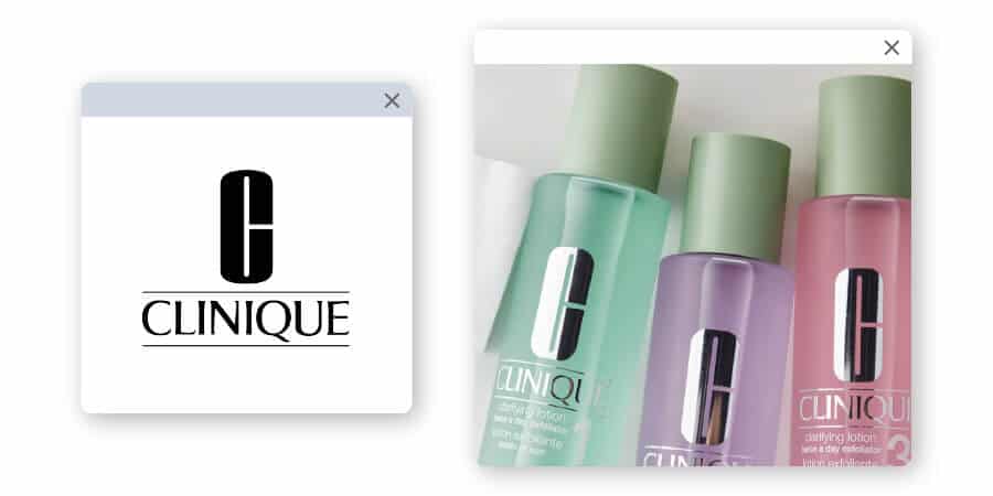
This luxury brand has been offering makeup, fragrances and skin care products since 1968. Their logo is a large sans-serif slab font, with a stylized serif logotype in all caps. Though their logo is often black or white, their products use a soft and natural-feeling green color that showcases potential and healing.
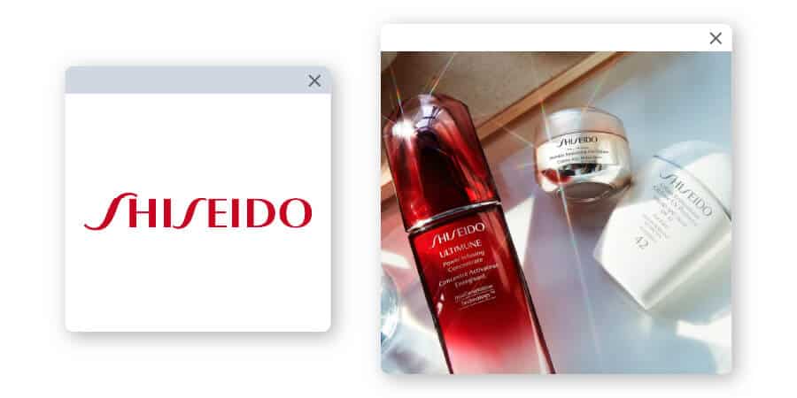
Though the brand’s original icon includes the Camellia flower in an organic, diamond-like shape, Shishido usually just goes with their logotype (a word only logo) now.
You may find the flower on the product packaging, representing Japanese beauty. The logotype includes a simple sans-serif font with two very dramatic “S”s to help customize the font and create a wave-like motion.
The bold red color is an unusual choice for a beauty brand, but powerfully points customers back to its Japanese roots with a color that also represents a classic red lip.
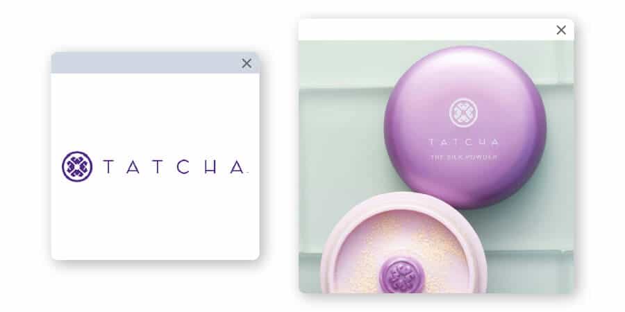
This brand’s signature line uses algae, green tea and rice that calls back to old Japanese skincare knowledge. The emblem for this beauty brand represents petals of a flower since the name Tatcha (short for Tachibana) means “standing flower” in Japanese.
The symbol is called a “mon” and is used in Japanese culture to decorate everything from kimonos to beauty products and banners as a family crest. Gold is often a color of luxury, and Tatcha usually pairs it with purple—another color that represents luxury and quality.
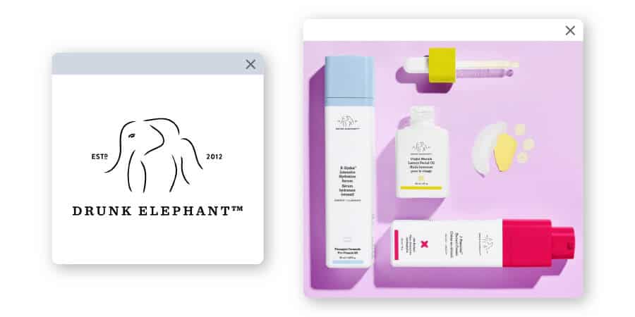
Designed for the Millennial and Gen Z audiences, the entire Drunk Elephant brand is essentially clickbait – in a good way. The packaging is minimal to reflect its position as a clean brand, and the product names are creative to get attention.
The logo image is a simplistic elephant implied by disconnected lines, and the somewhat sloppy and minimalistic elephant is anchored by a strong, serif logotype in all caps below
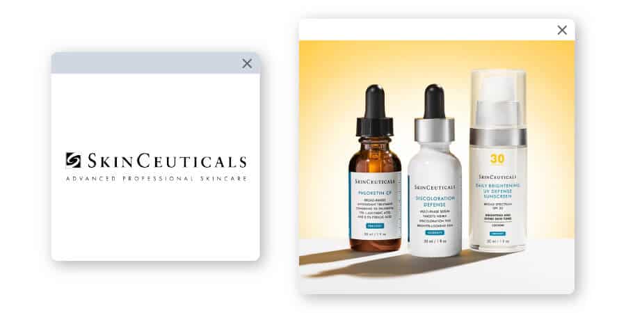
This brand takes pride in products backed by science. The no-nonsense approach of the brand uses black and white to present a powerful, classic brand with a straightforward mentality.
The emblem for the brand is 2 swirling lines coming together, much like the products are mixed together as they are created and packaged. An “S” is created by the swirls for a creative play on a monogram logo.
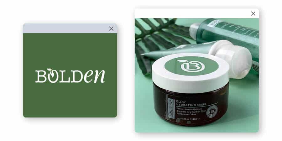
This black-owned beauty brand markets itself “for the black and brown girls” and promises all-natural ingredients.
The simple logo has a unique choice in typeface, setting apart “Bold” from the “en” by using 2 different fonts. The “O” in the word includes a vine shape with leaves to represent its commitment to natural ingredients. And, the green color of the brand is highly reminiscent of Clinique, perhaps drawing the connection as being the POC luxury brand ready to rival a common classic.
Brands that are primarily in the makeup business tend to have a desire to showcase their creativity and commitment to quality. While makeup doesn’t have the same intimacy as skincare does, it is still something many depend on to provide the color and wearability it promises without causing breakouts or side effects.
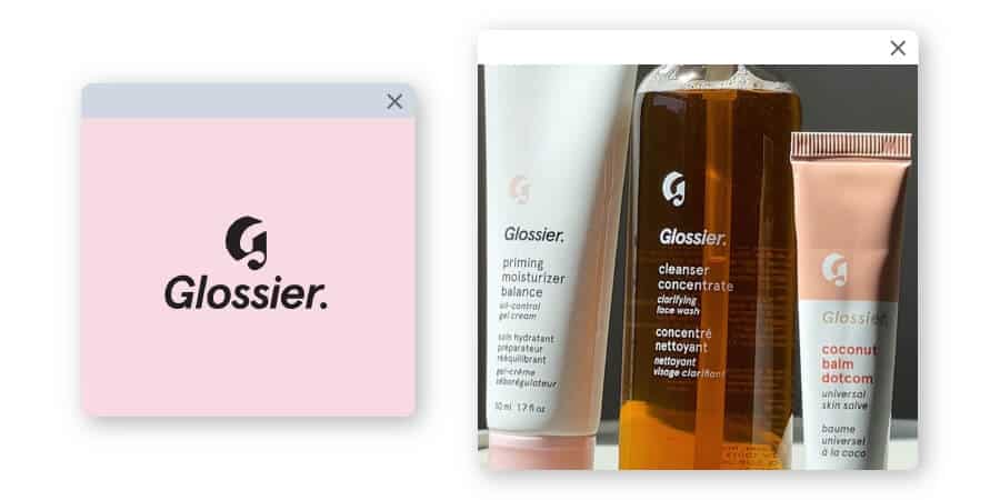
This brand takes its commitment to skincare seriously with a “skincare first, makeup second” tagline.
Though the brand is primarily makeup, it communicates its dedication to simple quality with a very minimalistic approach to packaging and logo. The sans-serif font is italicized and followed by a period to set it apart. In some cases, a highly stylized “G” is used as the emblem.
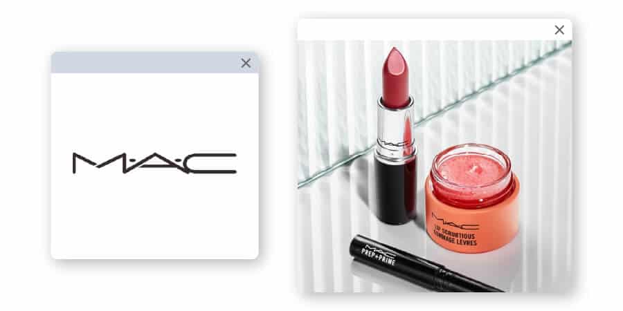
As a subsidiary of Estee Lauder, MAC offers a highly creative edge to cosmetics—setting up counters with makeup artists ready to go to work and create the perfect look for the customer. To showcase the modern, classy characteristic of the brand, MAC uses a very simple and powerful sans-serif font that offers a callback to the art deco era. The lettering of the brand name is separated by 2 dots and limited to black or white. MAC’s packaging, uniforms, website banner and beauty counters are black, creating a sleek and sophisticated look for the brand.
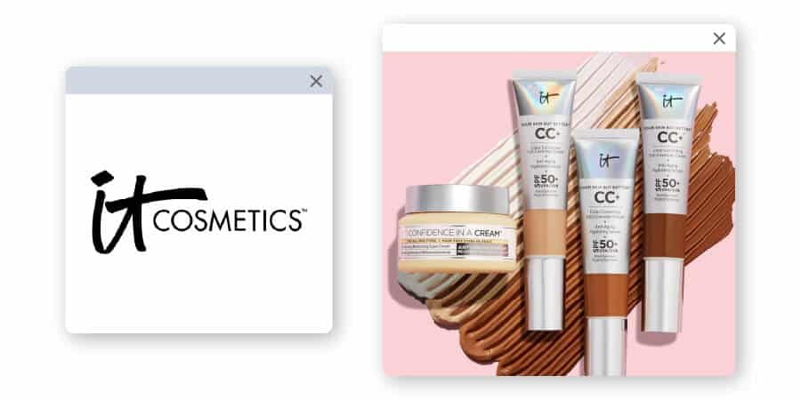
This makeup brand is committed to “problem-solving skincare” with its products.
The hand-drawn “it” provides a down-to-earth feel for the logo. It is then paired with a bold title for the product name that describes exactly what it’s meant to do (“BYE BYE PORES,” “BYE BYE UNDER EYE,” “CONFIDENCE AS A GEL LOTION,” “CELEBRATION FOUNDATION,” etc.). This creates the perfect blend of creative and professional, that a crowd of all ages could trust.
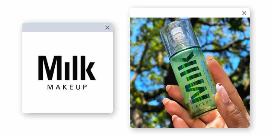
This NYC brand has a very Big-Apple feel.
The brand logo is a simple logotype using a slab-sans serif font in black or white lettering that exudes understated confidence. The clean lines completely skip the typical dot on the “i” to create a visual negative space that catches the eye.
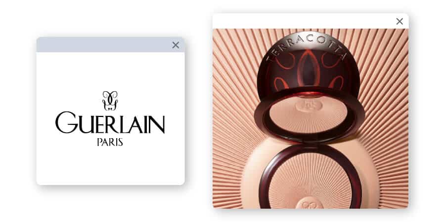
As a French brand, the design of Guerlain is much fancier, with a classic approach to luxury perfume, skincare and makeup. The Paris brand used a bee emblem for most of its history, now using a script “G” with a reflection to create an elegant design.
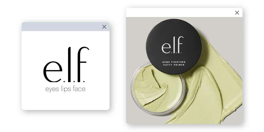
This subtle logo is unassuming and almost immature, leaning towards a youthful crowd of teens and young adults. Though the fonts look simple, the lines use shape and stroke size to create a unique font for the logotype, followed by the simple tagline “eyes lips face.”
When a product is based on more natural ingredients or is committed to sustainability, it wants to let the consumer know. These products offer a unique benefit to the consumers who are looking for something more earth-friendly.
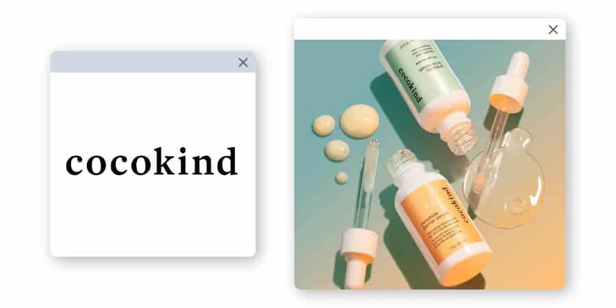
This business has a lighthearted and fresh approach to skincare products.
Using bright pastels for the product packaging, the simple logotype has a down-to-earth serif that offers welcoming curves—conveying a sense of transparency and honesty.
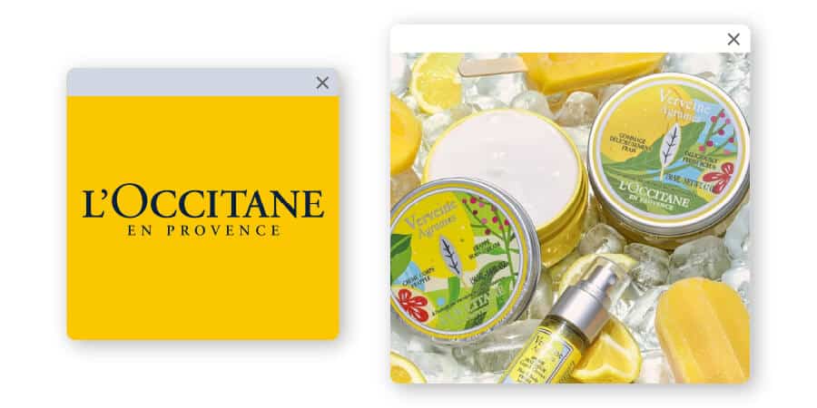
This French brand was established to preserve the traditions of the local Provence, committed to naturally derived ingredients and organic plant extracts.
The L’Occitane en Provence logo uses a classic serif in all caps—a font that is reminiscent of European vineyards, general stores and other classic signage.
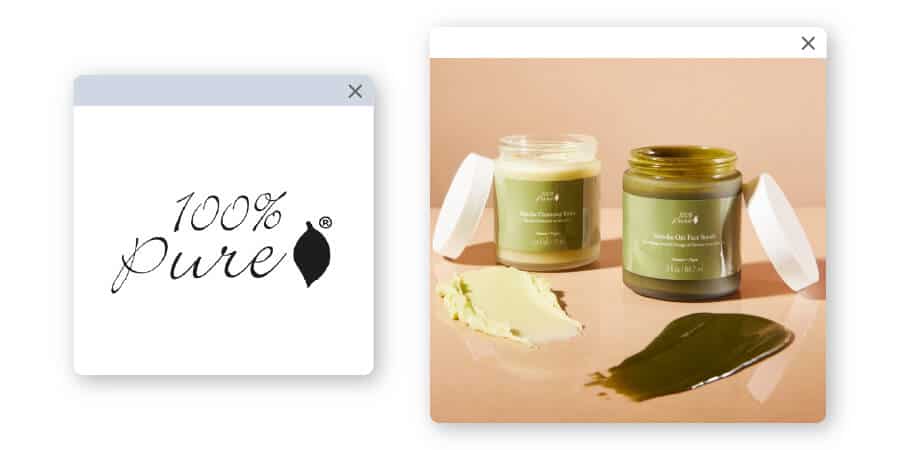
Promising to create organic cosmetic products without animal testing or harmful toxins, 100% PURE says they remain free of all artificial colors, artificial fragrances, synthetic chemical preservatives and more.
The script font gives the brand a more hand-crafted feel, and the leaf image next to the logotype represents the brand’s commitment to nature.
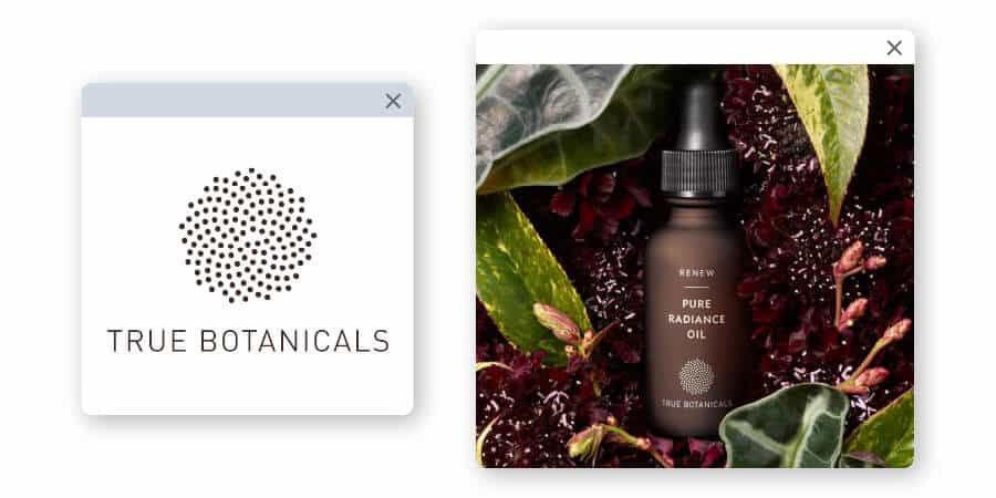
Not only is the name a clear call to a natural product mission, the logo of True Botanicals has a down-to-earth feel as well.
The gold color creates a clear connection to the refined precious metal, backed by the brand’s signature brown bottle color that is warm and inviting.
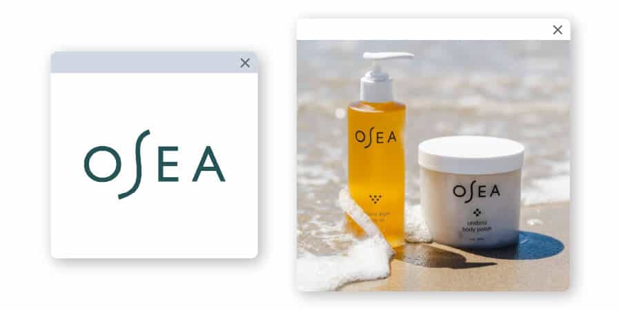
Dubbing itself “safe, clean skincare,” OSEA offers vegan and cruelty-free, plant-based products that are sustainably sourced.
The logo makes it apparent that the “S” breaks up the name, pronounced “Oh, See ya!” The sans-serif font and deep jade color helps this logo look like a brand straight from the beachfront.
The products that are used for bath and body can usually take the direction of luxury, fun or clean. Here are a number of brands that have a different approach to the bath and body care logo:
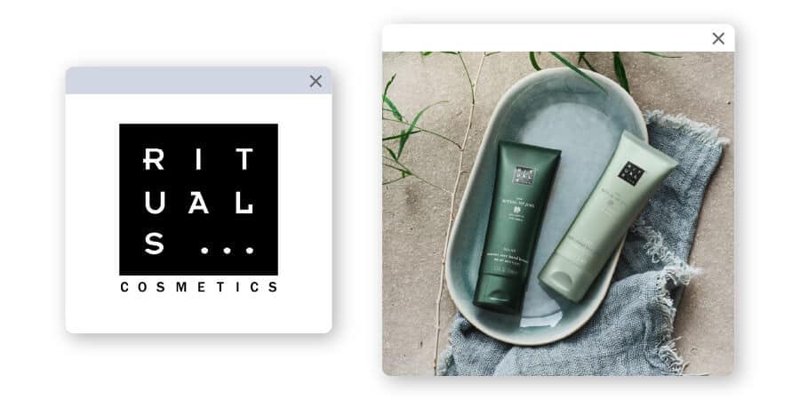
Using a cultish-looking emblem, Rituals creates a deep, almost spiritual connection with its audience.
The brand logo helps it look complex and grounded in old cultural traditions. And, the black, tan and white colors used help add to the natural power the brand embodies.
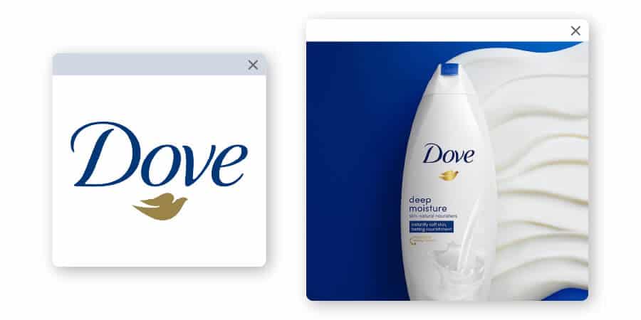
Dove has made strides to be a “for everyone” kind of brand that is affordable and gentle to all skin types. The brand offers value products that aren’t quite generic, represented by the classic blue script font and gold dove—easily identifiable and displaying a kind of purity.
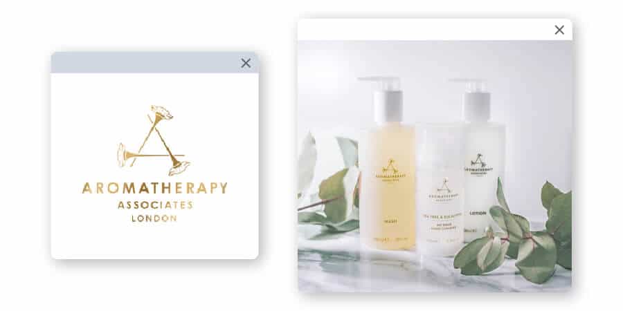
Essential oils have taken over with a mainstream craze, and Aromatherapy Associates is here for it. The logo image has 3 simple flowers making up a pyramid shape to show the power of nature. The gold and purple colors give off a luxury feel, which is further backed by the sans-serif font choice in all caps for the logotype.
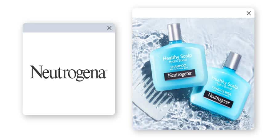
With a similar target audience to Dove, Neutrogena also holds a mainstream place in most store shelves for bath and body care. Their promise is to help every skin type for an affordable price. The brand’s logo is extremely simple with a logotype in a basic serif font, using the colors gray and white or black and white.
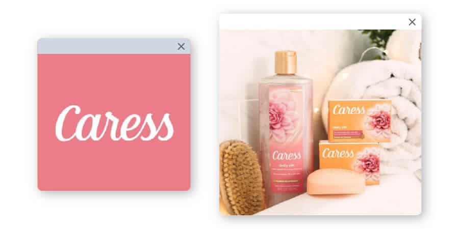
Caress takes affordable skincare to a slightly higher level, with a brand dedicated to comfort and simple luxury. The rounded script of the brand’s logotype evokes feelings of gentleness and care to match the product’s direction.
Now that you’ve seen how different beauty brands approach their logo design, it’s time to create your own! These examples should help you design a beauty logo that will have an impact when used on your website, social media and product packaging.
If you need any help with the design process, our logo maker can help you come up with the perfect design for your brand.
This portion of our website is for informational or educational purposes only. Tailor Brands is not a law firm, and the information on this website does not constitute legal advice. All statements, opinions, recommendations, and conclusions are solely the expression of the author and provided on an as-is basis. Accordingly, Tailor Brands is not responsible for the information and/or its accuracy or completeness. It also does not indicate any affiliation between Tailor Brands and any other brands, services or logos on this page.
Products
Resources
©2025 Copyright Tailor Brands