Designing a business logo that speaks to your target audience and captures the heart of your business is key to success.
Generally, all logos need to communicate what your business stands for, as well as foster a connection with your customers.
Specifically, logo design best practices vary across different industries. From the best color combinations to nailing the perfect font, there are design elements to keep in mind for your own particular industry.
To clear things up a bit, this guideline will discuss how to design a business logo according to 13 different industries. Plus, there are some examples, so you can see how businesses have managed to stand out in their field, and how you can do the same!
Among all the food and beverage businesses competing for attention, it is important to make your logo stand out from the rest. Meaning, you aren’t just offering great food, but also a memorable experience as well. That’s what makes food and beverage logo design a bit trickier than other industries.
Whether you are an aspiring food blogger or selling baked goods in your hometown, you need an effective logo that will strengthen your business’s recognition value.
So, one of the first things to consider when designing your own food and beverage logo is color psychology. In this industry, the most popular colors are red, orange, and yellow. These warm color combinations can be seen in almost all of the biggest fast-food chains– likely because they tend to stimulate appetite and create an air of excitement. Think of fast-food giant Wendy’s cartoon drawing of a beaming redhead girl.
Another logo design consideration is typography. Although there is no best typography for the food and beverage industry, it’s important that the size, weight, and color of your text is unique to your brand personality.
Basically, you need to keep in mind that your logo should express who you want to be. If you’re going for a modern niche style, like Shake Shack, then a simple illustrative icon in neon green will tell your consumers that you’re an approachable modern take on the hamburger joint. Even the typography (Shake Shack chose Neutra) exudes a casual, yet trendy vibe.
Whether you are entertaining through song, smartphone screens, or the stage, the entertainment industry is saturated, and that requires your logo to be bold, eye-catching, and creative.
Being an entertainer gives you a lot of room to push boundaries compared to, say, the healthcare industry. Above all else, your logo needs to make your audience feel. A good entertainment logo communicates to your audience that you might make them laugh or cry or learn something new about themselves.
Your job is to entertain, so your logo needs to promise that you’ll deliver.
If you are attracting a younger audience, then you might want to take some notes from Disney. The most magical logo around, Disney’s castle and shooting star logo immediately sparks imagination and inspires dreams. More technical, the logo pairs contrasting fonts that have a similar mood, while keeping the color palette restricted to simple blues and whites.
Universal Pictures also uses an icon in its logo. The recognizable globe is illuminated, mimicking the bright lights used in the industry. The dark colors in the background and bright colors in the foreground draw viewers’ attention and keep them there.
When designing your own entertainment logo, focus on isolating one element to stand out. So, if you choose a decorative font, consider a muted color palette; if your icon is the main event, use a classic serif typeface to offset the design.
As a photographer, you know that you only get one chance to make a first impression. That’s also true when it comes to your photography business’s logo.
You’ll need more than a nice icon, font, and a picture-perfect color scheme to make your photography logo stand out. You want your brand to be noticed by your target audience.
So, let’s say you’re a wedding photographer you might have a circle logo to represent harmony and unity, as well as an elegant script font to add a classy touch. But, if you are a club photographer, your logo will be edgy, with bold font and loud colors. Pretty different, right?
That’s where the right colors and imagery will help appeal to your target audience and make them feel like your business is right for them. But, no matter what, you don’t want a plain logo.
In this industry, it’s best to stick to some basic design principles. First, choose just 1 or 2 colors. Using multiple colors can, in many cases, distract the viewer from the main messages of a brand. Similarly, abstract logos are not in your best interest, as they can confuse your audience.
Take one of the biggest names in the industry, for example: Kodak. Their logo is in the shape of a square, conveying Kodak’s professionalism and reliability. But, the use of red and yellow evokes a fun, happy emotion, making sure that people still view them as approachable.

Safety, security, expertise. This is what people look for in a healthcare provider. They want to know their health is in good hands, and that the group responsible for taking care of them is trustworthy.
Healthcare is an industry where things must be done in an orderly manner. So, your logo design must be simple, clean, and humanistic. Any complicated logo design might confuse your customers. Think of visiting an acupuncture clinic for the first time only to discover the signage was too graphically complicated to match the holistic vibe of the place; you might think you walked into the wrong place.
Caring, for example, did a great job making their logo clear and simple enough that customers can remember it with ease. Plus, the purple color evokes a feeling of calm and trust.
Color is at the root of strong healthcare logos, like the world-renowned Red Cross or CVS’s bold red heart icon, which is directly inspired by the company’s purpose to help and heal all people. (Fun fact: The heart icon’s geometry was created using a teardrop shape!)
The one underlying factor that does work for tech logos, however, is sleekness. From Apple’s fruit to Twitter’s bird, tech giants are known for taking a simple icon and turning it into the focal point of their logo.
It’s worth noting that a popular design trend in the tech world is flat logo design, which both Apple and Twitter use.
There’s no one-size-fits-all logo design in the technology sector, as tech companies span a wide range of products and services.
And, as technology influences every aspect of our lives, there are a million different tones tech brands can take with their design, depending on the message they want to get across.
Another design element that comes to mind when brainstorming tech logos is geometry. From circles to polygons, curved lines to abstract patterns, their mathematical nature matches perfectly to the tech sector. Biones.ai cog icon is a case in point.
Maybe you promise your customers utmost safety and security as they walk on the bridges you build. Maybe you want to focus on the sense of community your work brings to a neighborhood.
Or, like the Bechtel Corporation, you aspire to be the world’s premier construction and project management business in the industry.
Whatever your business goals may be, building a construction business requires a strong logo that will lay the foundation of your brand. A construction logo design must communicate that your business is the right one for the job.
When potential clients see your logo, it should tell them that you know what you are doing. But, most importantly, your construction logo should instill a sense of trust.
In the construction industry, there is something to be said for a good, old-fashioned quality logo. Choose a traditional emblem to show clients that your business holds old-fashioned values like integrity and hard work.
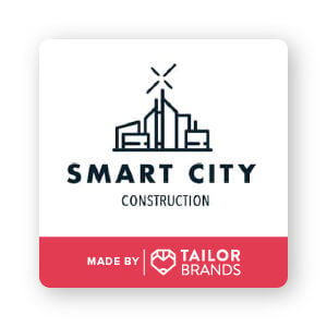
On the other hand, a modern construction business communicates that you use the latest technology to get the job done. You might go with a modern logo if you are a solar panel installer or a green architect. Just look at Smart City Construction to get the gist.
You might be in a rock band or starting your own record label. Either way, the right logo will speak volumes about your music. As a creative person, you already have the tools to compose a killer music logo design.
But, like the great Picasso once famously said: “Good artists copy; great artists steal.” While I am in no way telling you to copy someone else’s logo design (that’d get you in some trademark trouble), I am encouraging you to look to others for inspiration.
Check out Sennheiser’s logo. Specializing in design and production of audio equipment, Sennheiser is loved by big artists like Ed Sheeran and Avril Lavigne. The logo’s black and white color palette looks strict, reinforcing their reliable reputation.
Conversely, you could create a logo icon that is seemingly random, like The Yellow Cats. Although their name doesn’t explicitly tell the audience it’s in the music business, it does point to their out-there vibe. That might be something you want to do if you are a hipster, underground band.
Real estate agents know how to find the right place for the right person, and your logo has to do the same. A beautifully designed real estate logo should resonate with buyers and sellers alike.
To create the best logo for your business, you need to browse the market. Learning from the best will help you define the different elements that work in realty design best practices.
In general, wordmark logos work really well in the real estate industry. Take international real estate company RE/MAX, for example. Their logo is simple in design, and yet, instantly recognizable. The typography is bold and legible, while the letters spaced far enough away from each other provide room for the text to breathe.
This is a good technique to consider when designing your own real estate logo if you want it to be easy to read at larger distances, let’s say, on a ‘For Sale’ sign in someone’s yard
Whether it’s high end or fast fashion, your business aesthetic must appeal to your target audience. A good fashion logo is carefully tailored to your niche within the industry.
Regardless, there are some best practices to keep in mind when designing your own fashion logo. First, don’t be afraid to use color. H&M’s logo has been criticized for being too generic, but it works partially because of the bright red color that seems to pop off the white background.
Second, play around with the wordmark! As you can see, Stella McCartney and Anna Wolf’s logos are simply their name, but they make it special by using an unusual pattern to stand out.
When it comes to beauty logos, the industry is pretty large, and so you need to have your angle down pat. Who does your beauty business target? What are their needs? Try to think about these things when designing your beauty logo.
If you look at some different types of beauty brands and how they use their logos, it might give you some inspiration.
As a highly creative, edgy cosmetics company, MAC’s logo is a sleek and powerful sans-serif font that calls back to the art deco era. Drunk Elephant, on the other hand, is designed for self-care Sundays and Instagram influencers. With its abstract elephant icon drawn using line art, the Drunk Elephant brand is made for Millenials and Gen Z-ers.
Kelly’s logo falls somewhere in between. The script wordmark is sophisticated and yet provides a personal touch, as does the lipstick kiss icon hovering above the name.
You might be an at-home barre instructor in need of a logo or a gym for bodybuilders. Regardless, both niches require a logo that gets your business into tip-top shape.
If your fitness brand targets the wellness crowd who enjoy practicing yoga and Pilates, you may want to look to Martha’s logo for inspiration. You can tell that Martha’s is a wellness fitness center just by the color choice and icon alone. Green is a great color choice for anything organic or natural. And the abstract icon speaks to clientele who are more in touch with their spirituality. s.
On the complete other end of the spectrum, you might need a fitness logo similar to Gold’s Gym. A marine veteran and bodybuilder opened up Gold’s Gym built specifically for the bodybuilding community. The iconic black and yellow emblem showcases a bodybuilder figure holding a barbell, making it perfectly clear what the logo represents.
To sell your spa as the go-to spot to unwind, you need a logo that tells potential clients they’ll be in good (and relaxing) hands.
Before you begin designing your spa’s logo, take a look at other designs to see how they brand themselves. Also notice how their logo looks on a variety of different products, such as bottles, uniforms, and even as the sign on their brick and mortar store.
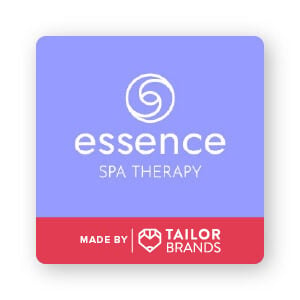
As spas are a place to relax, you’d naturally want your logo to reflect that de-stress vibe. Many spas like Essence Spa Therapy use an abstract ornamental icon in their logo design. The circular shape is used to convey the zen-like completeness a wellness center provides. And, Essence’s use of purple relays a feeling of calm, stability, and luxury.
As a freelancer, you know that you work best with creative freedom. That unrestricted boundary-breaking energy is what needs to go into nailing your own freelance logo design.
There’s fierce competition in the freelance market because there are a lot of freelancers bidding for the same jobs (and there is always someone who will price lower than you).
Set yourself apart by creating the perfect freelancer logo to represent the services you offer. Speaking of, try to find an icon that represents your specific craft. For example, if you are a jewelry designer, you may want to go with a diamond, or maybe create an abstract jewelry symbol to make it unique.
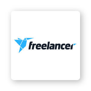
Take the Australian freelance marketplace website, Freelancer, as an example of how to utilize an abstract geometric logo to represent a service. The icon consists of various triangles forming the shape of a bird, a subtle hint at their service of connecting freelancers with clients.
Industry leaders are always a good source of logo design inspiration, but ultimately, it’s up to you to decide which values you want expressed to your audience and how best to do that in a way that speaks to them.
Let your creative juices flow; play around the fonts, color combinations, and layouts. Just remember to always design with your target audience in mind and you’ll be well on your way to the perfect logo!
This portion of our website is for informational or educational purposes only. Tailor Brands is not a law firm, and the information on this website does not constitute legal advice. All statements, opinions, recommendations, and conclusions are solely the expression of the author and provided on an as-is basis. Accordingly, Tailor Brands is not responsible for the information and/or its accuracy or completeness. It also does not indicate any affiliation between Tailor Brands and any other brands, services or logos on this page.
Products
Resources
©2025 Copyright Tailor Brands