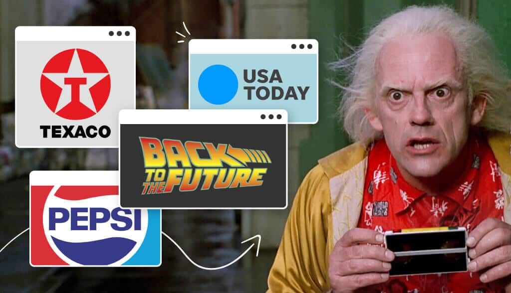
What will famous company logos look like in 50 years from now?
Will McDonald’s give up their yellow arches in favor of a color-changing ‘M’? Is Nike still going to sport the same old swish?
It’s a cool thing to imagine—which is exactly what the creators of the Back to the Future franchise did when they propelled their characters over 20 years into the future.
For those who are unfamiliar, Back to the Future launched what became one of the most successful Universal Studios movie franchises of all time.
In the first movie, 17-year-old Marty inadvertently enters into the space-time continuum, disrupting its natural pathways. This leads to an immense problem that will eventually cost Marty his life if he doesn’t find a way to make his mom and dad fall in love.
Unfortunately, due to his presence in the 1950s, his mom is mistakenly taken with him instead of his more reserved and somewhat awkward father. Thankfully, Marty does succeed in pairing the rightful couple up once again and ensures that his own life, as well as his siblings, will happen as is planned.
By the end, he’s able to send himself back home to good ol’ October 1985 where he belongs, thankfully with his life on the right trajectory once again.
This was the first offering of the cult favorite, taking us to the next movie in the series:
The second movie of the franchise picks up right where the first one leaves off. Marty and Doc launch themselves into the year 2015, which, at the time, was 30 years into the future.
Though many of the overarching plot elements are the same as the first film, the most interesting aspect of the film is the look into what filmmakers imagined 2015 to be like—from the technology in the film to the way they saw the evolution of branding.
It’s a fascinating glimpse into the nostalgic 80’s era and where society was believed to be headed.
Of course, in many cases, these proved to be off by a bit—which we’ll see now, as we take a look at how the movie creators imagined the world’s famous logos would change in the new millennium.
The following is an interesting collection of the most notable brand placements throughout the BTTF2 movie. While the movie did its best to “guess” what logos and brands would look like in the way distant future of 2015, you’ll see that many of them are pretty far off the mark.
Let’s take a look at how!
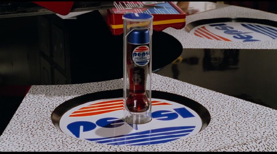
The BBTF2 movie’s version of the Pepsi logo has the Pepsi name situated inside the circular logo, which is diced up in slices of blue and red. Its font seems much more futuristic and sci-fi-esque, while the current font is much cleaner and more modern-looking.
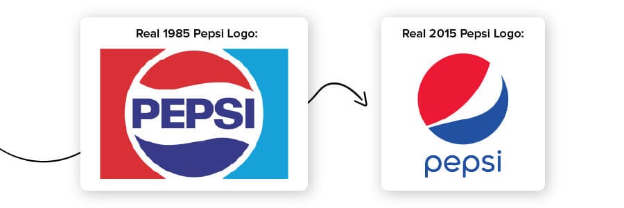
The real-life 2015 version also has the word ‘Pepsi’ hovering below the iconic blue, white and red circular logo, while the 1985 version also featured the word ‘Pepsi’ in the center of the circular logo instead of it being somewhat floated underneath. Also, in the BBTF2 movie version, on the glass itself it says, “Pepsi perfect,”—not just ‘Pepsi’.
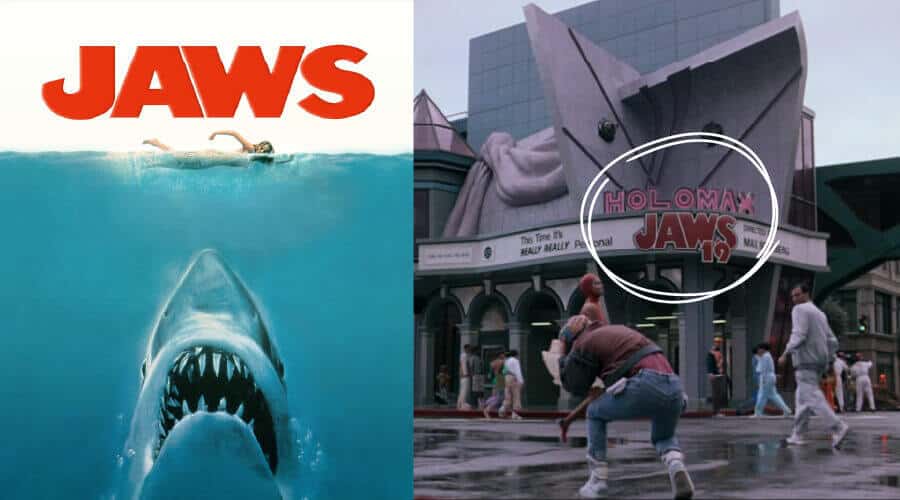
Jaws, another cult favorite in its own right, was a beloved thriller released in 1975 directed by Steven Spielberg. It followed a rogue, man-eating Great White shark that terrorized a summer resort town—successfully creating a fear that kept beach goers well away from the ocean waves for many summers to come.
While Jaws did have some sequels, it wasn’t ever turned into a hologram as pictured in the BTTF2 logo version. It does remain a culturally iconic movie, though, so perhaps its inclusion in the 2015 BBTF2 theater does make some sense. The real 2015 logo version also features a realistic shark looking up at his human prey, while the BTTF2 logo doesn’t include any living elements—shark nor human.
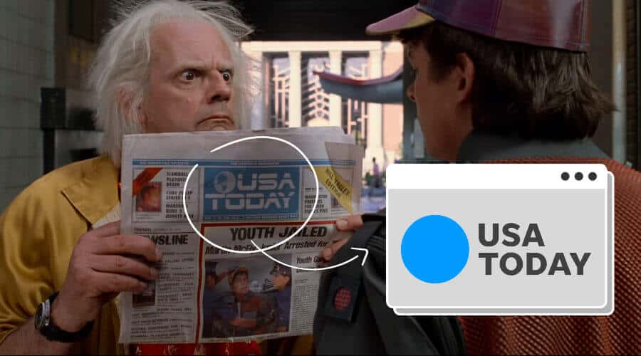
In one scene of the movie, Doc holds up a newspaper featuring a criminal Marty McFly. The makers of BTTF2 used the 1985 version of the logo, thinking the newsprint wouldn’t change their logo, and it would remain the same even into 2015.
It didn’t exactly work, though, as the newspaper did rebrand—removing continent shapes from the globe and changing the font on the words USA TODAY. And, the color palette changed from white and blue to blue and black, while they also did away with the line that was going through the USA TODAY logo in the real 2015 version.
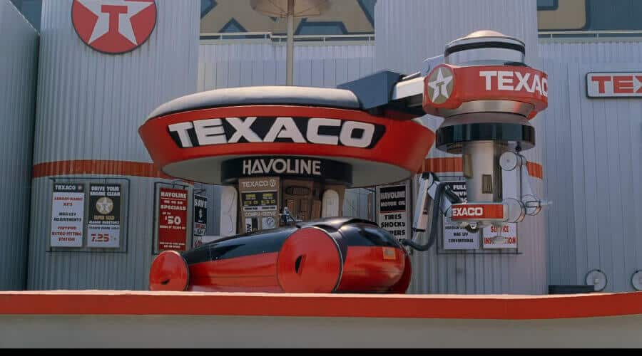
The BTTF2 Texaco logo is pretty close to spot on!
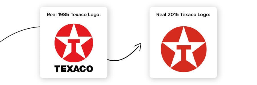
The actual Texaco logo word when written out is in a different font and the real-life Texaco logo doesn’t feature the full wordmark. However, the red circle and capital T inside the star is very similar, as it is nearly identical to the movie version of the logo.

Not only was the Nike logo a big part of the BTTF2 movie, but it was also a prop feature that included some pretty tubular shoes.
Thankfully, in 2015, as a way to make the magic come true as it were, Nike issued some specialty Nikes, the Nike Mag, which were designed to look just like McFly’s pair in the movie. Of course, they also designed the original pair from the BTTF2 movie as well.
Is this art imitating real-life or real-life imitating art? Who knows, but the end result was an incredibly cool pair of shoes that forced some movie magic into real-world existence.
Mark Parker, Nike President and Chief Executive Officer said the following about the 2015 release, “We started creating something for fiction, and we turned it into fact, inventing a new technology that will benefit all athletes.” The new tech shoe was then gifted to Michael J. Fox, aka Marty McFly who just happened to be the shoe’s most celebrated wearer.
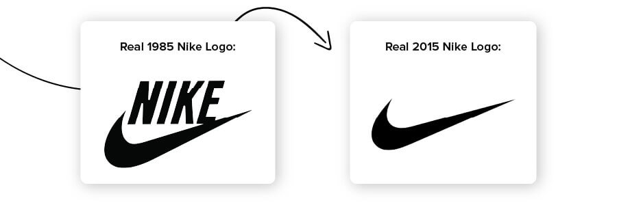
In the movie, the word NIKE is a big part of the logo, similar to the 1985 logo. It features the word and the famous brand swoosh. However, in reality, in 2015, the brand had all but erased the word Nike in their main logo in favor of the simple swoosh symbol that the world has come to know and love.
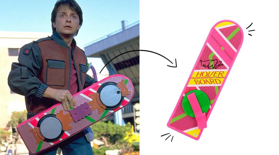
As an added bonus to this post, the hoverboard cannot be overlooked. After all, other than the self-tying/tightening shoes and the flying cars, which we all know are still many decades away from happening, the iconic hoverboard has got to be the coolest futuristic piece of tech featured in the movie.
While Marty is able to use a hoverboard just like a skateboard with no wheels, modern technology has not quite gotten there as of yet.
Many brands tried to become the brand that would release the anticipated hoverboard, but not one has actually been able to duplicate what was seen in the movie in its entirety.
The Hendo was likely the closest to the movie version. However, most modern real-life boards have to be ridden on specific surfaces due to the way they operate, and there’s no “hovering” to be found. Therefore, this is one product that simply cannot be duplicated to the specifications of the beloved movie—at least not down to the specific operating details as of yet
When the 1980’s tried to predict what would be popular in 2015, it was, of course, hit-and-miss.
While some modern logos and brands are very similar to the movie’s versions, others are far from it.
That said, we’re here to help you come up with a timeless logo that’s never going to go out of style. While we can’t predict the future, we do know the industry and can help you foresee your brand’s future success. Try out our logo maker to get started!
This franchise includes 3 separate films, the first one simply entitled Back to the Future; the second— and the subject of our current post— Back to the Future Part II; and the third, Back to the Future III. Each film follows high school student Marty McFly played by the beloved Michael J. Fox and eccentric scientist Emmett “Doc” Brown played by Christopher Lloyd. The Back to the Future series begins when seventeen-year-old heartthrob Marty accidentally travels through time to 1955 in a time machine made by Doc Brown from a DeLorean.
This portion of our website is for informational or educational purposes only. Tailor Brands is not a law firm, and the information on this website does not constitute legal advice. All statements, opinions, recommendations, and conclusions are solely the expression of the author and provided on an as-is basis. Accordingly, Tailor Brands is not responsible for the information and/or its accuracy or completeness. It also does not indicate any affiliation between Tailor Brands and any other brands, services or logos on this page.
Products
Resources
©2025 Copyright Tailor Brands