Home » Logo Maker » The Meaning of Logo Colors
When you create a logo one of the biggest decisions is selecting your brand’s colors. Picking the right palette helps establish your identity better and adds versatility to your designs.
Color choices also give your logo depth by forging a visual connection to your company’s values and personality. The right combination can visually communicate the feeling your company is projecting to consumers.
More than just aesthetic appeal, colors help your brand connect with consumers on a deeper psychological level. When you choose your logo and brand’s color palette, you’re also selecting the emotions and associations you’re seeking to evoke.
This psychology of colors is an important consideration when you build a brand identity. The right palette can convey deep meaning about your values and elicit specific behaviors. By extension, the wrong choices can be harmful to your brand image.
Science has shown repeatedly that our brains react in diverse ways to specific colors. By understanding how each color affects the mind and the emotions it stirs up, you can create a more effective brand. It’s important to remember that this is a nuanced and complex field that requires careful thought. Consider how each of these colors affect emotions and psychology:
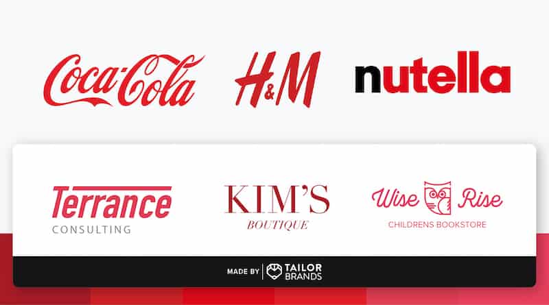
One of the primary colors, and a universal symbol of passion, anger, and excitement, red is a popular color in branding. If you’re looking for a loud, playful, and young brand image, red is an ideal option. If you prefer a more understated, conservative approach, red shouldn’t be on your color radar.
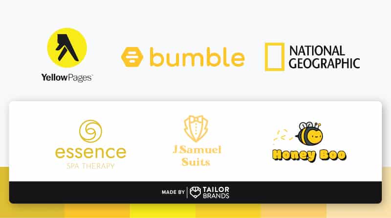
This warm color is the shining example of friendliness and cheer. Brands which are seeking to draw in consumers with a comforting, warm embrace and youthful energy should look towards Yellow. Additionally, the color can radiate a playful and affordable identity.
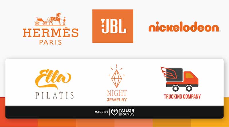
Orange is yellow’s more playful and energetic cousin. It mixes a more invigorating and active emotion associated with red while employing yellow’s mellower tones. Orange is great for brands looking to elicit feelings of vitality and happiness, such as travel companies. Its aggressiveness tempered by friendliness presents a great color for calls to action.
For brands trying to exude an air of sophistication and royalty, purple is a top choice. It’s also a great choice for those attempting to display their creativity and soothing identity. Purple is a top choice by brands like cosmetics and high-end retail companies. Those looking for a broader, down-to-earth appeal should avoid deep purples.
Green is one of the more restful colors, as it doesn’t force the eye to make any adjustments. The color suggests a sense of balance and calm as well as a connection to nature. Brands which are looking to portray an opportunity for fresh starts and security can consider green as a way to relax the mind. It doesn’t pack the energetic punch of the warm colors, so companies pursuing a bold statement may not prefer it.

Like the calm seas, blue inspires a sense of calm and spiritual awareness along with feelings of trust. Blue is a great choice for healthcare and medical brands which are attempting to inspire a sense of calm and healing. On the other hand, deeper blues offer corporate brands a sense of confidence and professionalism. However, overusing blue can make a brand appear cold and detached.

The deep hues of brown inspire a sense of seriousness without black’s stronger overtones. It remains softer and its connection to natural tones makes it a more grounded choice. Brands looking to portray a sense of quiet supportiveness and reliability could do well with brown. Its connection to nature also offers a sense of rugged, yet warm feelings.

Often considered the most feminine color, pink shades are nonetheless versatile. Being a lighter shade of red, brands which employ pink can retain a sense of energy and cheer blended with a perception of soothing calm. This is a feeling sometimes associated with sex and sexuality. It also shines a nurturing light that soothes and reminds us of the feminine principle.
Unlike many of the other colors, gray is one of the most neutral shades available. Brands often choose it for its timeless, practical, and unbiased feeling. It’s ideally used as a secondary color to provide a calmer and more neutral background to bold colors, though some companies (like Apple) use it with resounding success.
Considered the absence of colors, black can still be a powerful color to include in branding. Black is traditionally seen as a symbol of professionalism and seriousness. However, it can also be used to elicit feelings of elegance, substance, and power. Brands which pick black are looking to make a powerful statement and convey a sense of authority and respectability.
White tends to be ignored or relegated to the background, but this neutral color is important. It can work as a secondary color to provide contrast, and can deliver a clean, simple background for a logo. White is a reflective color that represents purity, sophistication and efficiency. Brands trying to convey a level of exclusivity and luxury can use white to resounding success.

Colors are an important aspect of your brand’s identity. When you create a logo, you should take some time to consider what each color says about your company. Understanding the right blend of colors can help you better communicate your message.
Think about the emotions you are trying to elicit, and how you want your consumers to respond to your brand. By choosing the right color combination, you can help your brand leave a lasting impact that shapes a more powerful connection with your audience.
To start your design process, create a logo online with Tailor Brands, and automatically get on-brand color choices for your logo design.
Products
Resources
©2025 Copyright Tailor Brands